Park / Treasure Islands
-
 31-May 16
-
 Treasure Islands
- Views 7,115
- Downloads 917
- Fans 6
- Comments 33
-
-
 73.13%(required: 70%)
 Gold
Gold

Louis! 85% Chocotopian 80% Liampie 75% Poke 75% Sulakke 75% Cocoa 70% csw 70% G Force 70% inthemanual 70% nin 65% 73.13% -
 Description
See the Readme in the download.
-
6 fans
 Fans of this park
-
 Full-Size Map
-
 Download Park
917
-
 Objects
1
-
 Tags
Tags
Ended up going with a 70%, felt like compared to some of the more recent scores that was more fair than 65%. Congrats on the gold!
Fair score, apologies I couldn't get around to voting on this as I've been very busy with papers/exam prep at the moment. Hopefully will get a review to you eventually.
Cool, my very own gold medal! Ah shucks! I wasn't sure what kind of reception this park would get, thought borderline silver/gold. I realize everyone is pretty busy this time of year, so I appreciate everyone who took a look at it, those who were able to leave comments. Hope to hear more from others when they get the time.
Congratulations on the gold!
I fucking loved this park.
Congrats BSG. Can't wait for what you'll do next.
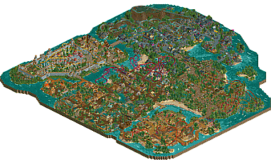
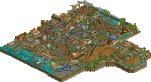
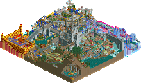
Looking back at this and Gill's other work, we're not giving the man enough credit for how nice his overviews look. This, Breakneck Buff and Carter's Beach all look stunning from up high.
I agree with you chorkiel. The overview looks incredible. One of the best I've seen, I think.
The park is nice too. I can't say I like the style very much, but you did a good job keeping me interested. I really like the log flume, Tarzan's Treehouse, and the area next to Catapult Crusader. The small area for archery lessons is really nice as well.
Good job bigshootergill and congrats on the gold! Looking forward to seeing what you do next.
I absolutely loved this. It had a real old school, LL type vibe to it and I find your style really refreshing. I'm not sure what my favorite thing here is. I really like the architecture, I really like the vibrant colors but I think rather than isolating one specific element the thing I like the best is how it all works together cohesively to create a fun and visually impressive atmosphere.
I honestly feel like you're on your way to a spotlight sooner rather than later. The next big hurdle for you is coaster layouts but honestly I feel like you're making big strides in that area too. They're still not perfect but they're improving rapidly and even if they're not necessarily perfect right now you have a great way of masking it by surrounding it with awesome architecture and visual elements.
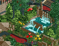
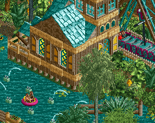
While I really enjoyed everything, the real standouts for me are the "Jungle Mania" area (especially that mini golf course OMFG) and the area around beach raiders. Seriously though, jungle mania is top class. I love the full queues (lol) and large number of peeps as I feel like it adds a lot of atmosphere but aside from that it's the type of area that you could stare at forever and still find new things. The little building by the interlocking corkscrews is adorable as is the zing and pep queue and the little restaurant near the "enter the jungle" sign. Also great path choice... I may or may not steal that.
Other highlights for me were the boat and the drop tower mast and the small rocket coaster and junior suspended coaster (I've always loved your small coaster layouts actually). While the area around it (while still good) wasn't on the same level as the jungle area I also really liked the invert. I feel like it was your best "big coaster" layout and followed a believable B&M pattern.
All in all I loved this. I can't wait to see what you do next. Congrats on the gold!
Well, better late than never - I think it's been over four months since I said I'd review this...
Basically, I love it. The overall style you have going on is one that really works for me. Some call it 'old-school' or 'nostalgic' but I think it's a style that's never really left, and you capture it perfectly here. It's a wonderful mix of busyness, vibrancy and life, but with the clarity and organisation that prevents it from being too cluttered - well structured paths, prominent rides etc.
After watching G Force's review, I've got to say I feel quite the opposite on a lot of his points, in that the parts he marked you down on actually appealed to me :/ I personally think your colour choices are great, and I've never had a problem with people using colour as a main aspect of an area's theme. If anything, I think it adds to the fantasy element of the park. The bright oranges, purples and even the grey on The Black Hills, all add distinction to the areas and prevent everything from becoming too green and brown heavy from the foliage, path and general woodwork. The stylistic and textual choices between areas are evident too (and are well done), but the colours just tie it together, I feel.
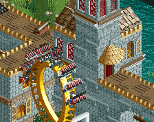
I also really like your buildings. Yes, there are lots of them, and the majority are small, but I think this suits the complete picture of the park. There are no dominating structures drawing attention, which instead allows the areas in their entirety to be appreciated as a balanced mix of buildings, foliage, pathing and rides. The only exception to this would be the station for Storm The Castle, which I feel jars against everything else as a result. That, and the encompassing wall, gave that island an altogether different vibe to the others, and probably makes it my least favourite area. I feel that had you removed the wall, and instead surrounded the castle with structures similar to those in The Village section, it would've retained the cohesion with the rest of the park while still having a distinct theme. The castle would've still been a large structure, but would've blended in more with its setting. Nonetheless, what is there is still good, and it was fun to search for the little details like the archery lessons and the paintball arena.
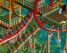
The coasters are great. The cobra/invert-top-hat interaction on Zing & Pep is cool and well executed, and Blurzig's Fury is a standalone beast. The smaller coasters have appeal too, with Tarzan's Treehouse interacting nicely with the foliage and Splashdown ride, and Cerrado Cruisers sitting neatly along the coastline. The supporting flat rides are decently situated, and the custom track rides weave through the areas elegantly (particularly Savage Plunderers, I feel).
Overall, I was impressed by this. I think it definitely deserves its Gold rating, and it showcases your talent very well. Any more parks by you in this style would be greatly welcomed by me!
(btw, I've inadvertently got a ride in one of my parks called "Walk The Plank" too... hope you don't mind!)