Park / Treasure Islands
-
 31-May 16
-
 Treasure Islands
- Views 7,479
- Downloads 1,018
- Fans 6
- Comments 33
-
-
 73.13%(required: 70%)
 Gold
Gold

Louis! 85% Chocotopian 80% Liampie 75% Poke 75% Sulakke 75% Cocoa 70% csw 70% G Force 70% inthemanual 70% nin 65% 73.13% -
 Description
See the Readme in the download.
-
6 fans
 Fans of this park
-
 Full-Size Map
-
 Download Park
1,018
-
 Objects
1
-
 Tags
Tags
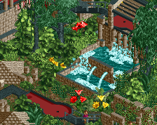
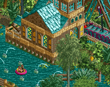
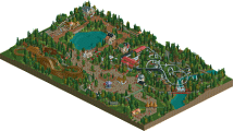
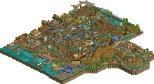
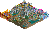
That wooden is a monster! Love the colors and the unconventional coasters and the whole spirit of the park.
I've been watching this with my mouth open and a smile on my face... Wow!
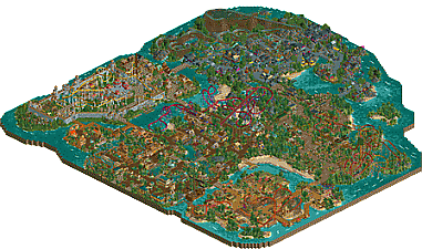
Where to start? The park is friggin' HUGE!
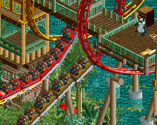
The coasters: awesome layouts and good choices. Each one fitted their respective theme and teh colour schemes were brilliant. Especially Beach Raiders looks great in that red and purple. I apologise, I might going to steal those colours... Blurzig's Fury felt like a layout you might find in an old RCT scenario, the way it winds around the rocks. Great coaster. Serengeti Express is also nice, as were the other smaller coasters. The interaction between Zing & Zep was nicely done. Nothing but compliments on this part.
The themes. Let's start by the lesser good things. Quite a lot of the architecture felt a bit repetetive. The same shapes kept coming back, also the same style of windows and walls. But you can also see this as a good thing. With the same objects and shapes, you still managed to give every zone a distinct identity. This has also to do with your use of colours. They're quite bold, but it works. Where you would normally see tons of brown in a jungle zone with the occasional dash of colour from a flower, it was a sea of red and yellow thanks to the coasters. The fact that all the guests were wearing hats was helping too of course.
All things considered, I think you've managed to not only capture an old style of RCT building, but you've managed to give it a modern update it desperately deserved. I'm a massive fan and I look forward to your future stuff!
Hope to write a proper review soon.
^I actually disagree Liam. I think his style is a much cleaner version of J K/JKay, which I prefer. It's more refined and pays more attention to aesthetics where I felt both JK's tried to put as many random stuff in as they could..
Great job BSG, it reminds me of how parks were build in the Nemesis Chris era (speaking of which, your style reminds me most of his )
)
Not sure what it is, but I can't really get into this park. The colors and composition just don't really seem really inspired. Lots of great ideas sure, but overall they don't really add much to the park.
Usually I can appreciate a style like this in throwback parks, but this one just does nothing for me. Its neither new enough to really separate itself nor does it do enough to push the old style to a new light. There is a word I'm trying to remember that posix or someone used to describe modern realism (might even have been some of my work), however its escaping me now. To me it feels a bit like that, just go with the flow and manufactured parkmaking I guess.
Still, I can appreciate the effort and the park enough to say it deserves somewhere in the range of a 65%. Its good parkmaking I guess, just super forgettable and nothing really interesting.
Hopefully you understand what I'm trying to say, maybe I'll do a full video review on this to elaborate on my position. But I wish you would try to do something new rather than this hybrid throwback-modern style that seems to have you stuck in the mud. Approaching your parks from the macro and looking at areas in the big picture rather than the micro detail and style of your park would be a good place to start.
EDIT: Formulaic is the word I was trying to think of. I think that formulaic is the perfect description for this park.
Just a few thoughts I wanted to mention:
~ First off, ever since I started looking around NE, I absolutely loved the 2005/2006 era of building. I know this isn't mirroring those styles, but it's in the same ballpark, plus I wanted to put my own personal touch to the style with a modern bench. Ultimately I had a blast building this park, I love everything I've built here. So much fun!
~ I had a few people assist me with park testing and advice that I greatly appreciated: Coasterbill, alex, Faas & posix, plus Xtreme97 made me an object in the nick of time to finish off the castle, along with his own feedback. Thanks a billion guys!
~ I realize this isn't a style that everyone appreciates, but for those who do, I hope you enjoy it as much as I did building it. I'm looking forward to hearing some reviews when you guys have time to check out the park in more detail
This is like RCT Master's Pacific Island in a lot of ways and I love it.
Holy mother of custom rides. There's like 15 included with this thing.
I'll give you a review once I stop verifying objects.
First of all, I'm really impressed that this park even exists. A big, old school rct2 style park? Hectic. You should definitely be happy with pulling it off!
I thought the park had some good bits (some of which were really good) and some average bits. There were definitely scattered pieces of really lovely atmosphere, interaction, detailing, etc. Especially in the entrance and jungle area, and the outside of the castle. Some bits felt a bit more... uninspired? though. Like a lot of the time it felt like the different themes were just different colors or textures of the exact same thing. Even the africa and black hills area both felt like the actual structures and layout and everything was very similar except you used warmer colors and some wooden textures in africa, but nothing else about it really was different. Maybe this is a criticism of this style of parkmaking, but I found that left the park a bit samey and bland.
That said, there was a lot going on here, lots of fun bits and nice ideas. I'd love to see some more unique, original shit going on in your next park, but whats here is definitely nice.
I'll leave a review later but I told you guys BSG was legit. Believe me yet? lol
As I await some more feedback, I'll jot a few responses:
@jappy - Layouts aren't my strength, you made me feel like I'm improving! Glad you enjoyed the way I attacked this old style of building in a fresh light.
@liam - I highly doubt I'll ever hit spotlight quality, to me the bar is freakishly high, and rising all the time. Can't wait to hear your detailed comment
@sixfrags - Pretty cool to lump me in with those guys actually, I admire their work a lot.
@G-Force - I enjoy your video reviews, I hope to see one if you can.
@cocoa - Appreciate your feedback. I'd like to finish my Forces of Nature park, which is more original than this park, but I also have other irons in the fire that will be fresh styles for me, all in due time.
I am so torn on this. On one hand, I love the buildings and the details and just the way things built are so reminiscent of early Artist or X250 work, but the colours are just a huge turn off. I really think that if this had a more conservative use of colour, it'd be high gold quality, but as it is, for me personally it's borderline silver/gold quality.
Great park. Keep improving at this rate and you'll have a spotlight in no time.
A very nice piece of work. I like the retro vibe of it, and I think you've proven what can be achieved in it with an updated object selection, that it's still a viable way of building. It feels fresh, stands out nicely from all the realistic work that's so prevalent nowadays (not that I don't like that style, but some variation is nice!).
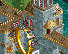
On the other hand, I think you should've gone with at least one more themed area that wasn't tropical. As it is now they all kind of blend together, with the castle area (which in itself was very nice) feeling a little out of place. While the "black hills" area may not be tropical, I felt it shared too many colours with the tropics (so much turquoise and purple).
I'd say the jungle area with the LIMs was probably my favorite, the LIMs were amazing and I think the architecture and the path choices worked really well, conveyed a nice jungle-y, ruins-y feel.
I'm looking forward to see what you come up with next!
https://www.youtube.com/watch?v=WV2coCWDyOQ
Don't take this to hard, its a good park, you just leave a lot of potential out there. Much of its frustrating to me because there are just a few little things you could do to really improve. So don't take it as me just bashing the park because its not realism.
Whew. Finally done.
This park is impressive! Chock full of a bunch of great, fun ideas, and it's very colorful and fun throughout. Colors do seem a bit strange in that they're very traditional in some areas and very bold and unusual in others, without a clear indication as to why.
Layouts were interesting, incoroprating several underused ride types, and using some creative elements. However, I felt that most of them were very slow, and often lacked flow. A smooth flowing ride featuring the same kind of creativity you've shown here is sure to be a showstopper.
The way you compose areas is probably the thing I liked least about this. Absolutely nothing stood out, because everything in any given area looked the same. I understand that you were going for an older, throwback style, but I still think you need to do something to distinguish structures and areas from each other. When everything looks the same, nothing seems interesting.
The ruins area was probably my favorite. It may be small, but it unique and interesting, especially compared to all the bright colors of the surrounding areas.
Overall good work, and an enjoyable park.
Still not voted on? Tisk Tisk It is taking a while though.
Only 3 votes left to go