Park / Splashdown Water Park
-
 28-May 16
-
 Splashdown Water Park
- Views 11,274
- Downloads 1,107
- Fans 11
- Comments 34
-

-
 74.38%(required: 70%)
 Gold
Gold

Kumba 85% nin 80% alex 75% Chocotopian 75% csw 75% Liampie 75% Sulakke 75% pierrot 70% posix 70% Stoksy 65% 74.38% -
 Description
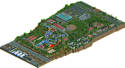
A semi-recreation of Splashdown Water Park in Spokane Valley Washington. Featuring a main slide complex with four massive slides, a bowl slide, a high speed plunge, and various other attractions, this is a park that's sure to provide fun for the whole family.
The map also includes a fairly extensive surrounding area. I included so much depth in surroundings, both because I enjoyed it, but also because I felt that the park really works well with the suburban feel. It's a park that could be in any neighborhood, and I felt that these surroundings could help it feel more relate-able.
Cocoa, Scoop, and Pac all helped build at various times on a poorly advertised multiplayer server. Cocoa and Scoop each built the house that their respective staff member occupies, and Pac built the skatepark. Liampie and Robbie92 both also provided help during testing. -
11 fans
 Fans of this park
-
 Full-Size Map
-
 Download Park
1,107
-
 Objects
441
-
 Tags
Tags
Back to the Future references = 100%/yes
This was quite a different park to review.
I doubt I've caught anywhere near all the details but I'll try to give this as best a review I can. My first 'problem' is not knowing where to start. The entrance to the wave pool + swimming lanes (which were fucking brilliant btw) was more obvious and grander than the entrance to the actual waterpark. The entrance is a slightly underscaled grey-brick building. I get that it's a recreation, and I appreciate that, but surely you could have taken the liberty to add a sign or something indicating that this was the waterpark. Just some indication that it was an entrance rather than just a block of buildings. Maybe I'm misunderstanding how this waterpark 'works' or am too used to park entrances, but I just felt that this was missing something.
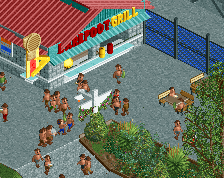
Anyways, with respect to the outskirts. Absolute quality. I personally don't really attribute much interest to outskirts when it comes to judging a park, but upon subsequent viewing when I'm just looking to find all the details, outskirts are a pleasure to explore. I'd argue that these were some of the best I've seen. From the brilliant car yard, to the Back to the Future reference, to how beautifully you portrayed the contrast between the main highway and more residential areas was a pleasure to look at.
The large grass area with the skatepark, playground, and baseball field worked a charm. I cannot, and probably never will, be able to build large grass patches and be satisfied with how it looks but it's perfect here. The functioning skatepark is nuts (huge props to Pac for that!!), the playground was well-built but I think a tad overscaled (maybe that's just based on what I'm used to in playgrounds near me irl), I loved the idea of a functioning baseball field, and the peeps playing Frisbee is one of my favourite thing ever.
The main swimming pools are excellently executed (especially the functioning swimming lanes) with so many brilliant subtle details like the underwater lanes and the dip to signify a transition to the deep end.
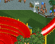
Unfortunately, like many others, the actual waterpark felt the weakest part. Maybe it was the setting, how sharp the contrast was between slides and landscape, or the use of tarmac, but it just didn't quite work for me. Again, it's a recreation so I can't necessarily fault you for execution, but the slides just did not fit with the expansive, natural landscape and features previously mentioned. They just looked like really tacky slides added to such a natural and flowing environment. I did however, like the wavepools and smaller slides; they were better integrated with the landscape, as was croquet. Interestingly, the amount of grass in the slide complex was more problematic than the other area. It fell back on a lot of problems that I think about when I try to build open areas and I have no idea how to fix it :/
A bit like how I simply refrained from voting on the landscape-only park that was released relatively recently, I'm torn as to how to view this. The outskirts are enjoyable, but slides as the main focus (especially in this landscape/environmental context) aren't really what I want in an RCT-park. It's probably simply because I can't relate to an area such as this in my life; slide complexes are simply not done like this and the appeal of such a natural setting just looks too much like a weird contrast of features. It's enjoyable and well-executed, but no more than a silver for me. 65%
Great to see you finish something though Tim, I only wish that this park appealed to me more than it did
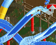
When I opened this initially, the first thing that struck me is the houses. The fact that they all look like actual houses, are unique, and have details that make them alive shows a level of care that even some spotlights care not to take. All of the surroundings here are perfect, and add a sense of location and narrative to what would be a generic waterpark, that they become equally as important to appreciating this submission as the park itself is. Some may want to judge this submission by the waterpark itself, without the brilliant context surrounding it (as trav put it, "in a vacuum"), but doing so is wrong and misses the point. This is more than a park, this is a slice of life. Inthemanual didn't create a park here, he created an actual area, and so few parks today have proper spatial context as-is. Really, only Thorpe Park and Six Flags Carolina come to mind. You really don't see a level of detail and attention taken to the little things outside of H2H, and this submission fufilled that completely. If there was something that can use peeps/can move, he made it move. It definitely makes it feel so much more alive than it could have been. The waterpark/recreational areas are all excellent. The slides are honestly the best executed, even surpassing CP6's SFC waterpark (not in scale, but sheer execution in rides, mind you). That bowl looks amazing tbh. The landscape definitely sells the idea of this waterpark well; I can easily picture a small scale park built on a hill like this. The other rec stuff, like the courts, swimming pool, and such are fantastic. The fact that you added movement in the baseball diamond and skatepark meant so much to its credibility. The little things, like the beer pong table and moving playground rides were also fantastic. You did a great job in immersing me into this, and that is a feat that is seldom done.
ITM has meshed together 2 realism philosophies, RRP's detailistic imperfection and CP6/Geewhzz's modelistic building, has taken the best aspects of both, and now has made something reflecting those both. Execution wise, this is easily spotlight, and I am still tempted to vote this over an 80% even though quantity wise it's about a gold park's level of stuff. I really hope you take the principles you've shown here, tim, and use them for even more ambitious parks. I haven't looked at a park this long since H2H7, and that is saying a lot I believe. I think you have a grasp of realism that only a very few can claim to have.
85%
Post-note: This park and the way people are receiving it reminds me of canyoneer. So little appreciated that to the level that it deserved too.
The frisbee players might win Best Idea 2016.
I really enjoyed looking at this map. I agree that the waterpark actually was the least interesting on it, while that should have been the main focus. I felt like there were some pools lacking, especially a bigger (wave) pool within the waterpark itself. The foliage could have been better as well. There was no need for the ugly mangrove trees and I wasn't too sure about the flowers under the trees. And it is kind of a shame that you didn't make the floating letters of entrance banners invisible. That is possible nowadays, I believe.
The surrounding area was executed so well though, that a gold accolade is more than deserved. It was packed with details and a charming atmosphere. All buildings, park features, roads, etc. are executed perfectly. Not sure if it was you or Pac, but the use of the carrot object as a new plant was great innovation. I would love to see more of these small parks surrounded by a (sub)urban area.
P.S., there is something wrong with the map overview.
I love this park a lot !! Although if you ever make another water park make a bigger one. Like i was expecting way more slides to be honest.
Gold! I wasn't expecting that. I honestly thought the lack of park content would bring this down a bit.
@Steve, Trav, Shotguns: The spotlight mentions are completely unreal. I'm baffled, but thank you, sincerely.
The waterpark is small, but it's meant to be. We get a lot of things on here that try to be the biggest and best, and i felt like something small and personal could really stand out, and it seems it has. I did feel that the park actually NEEDED almost everything I included. The fact that it's settled into a hillside between a public park and a highway lends a lot to its story: this was the land they could get, and there's not a lot of room for expansion. The neighborhood affords some personality, allowing people to hopefully connect with the park. The details, or "h2h ideas crammed in just to push out a few more votes" were all things that i felt were needed, in order to highlight or bring to life certain areas. I wanted the whole park to be fun, not leaving people staring at an empty field.
The slides themselves, the 4 blue ones, I thought were the real highlight of this, so it's interesting to hear otherwise from a lot of you. I kind of blew them up, made them larger than life, especially compared to the surrounding buildings and such, because I had wanted them to be a bit more of an attention grabber. The real slides these are based on are white, but that looked bland and atrocious in game, so I switched it to the baby blue, which really made everything pop, and gave this park a look I really liked.
RE: Gray path: I tried kumba's off white paths, they didn't work here, and really washed things out. Bricks or darker pavement doesn't really work in a waterpark setting, with bare feet everywhere, so i felt this was my only real option. I understand the issues with the lack of theme, as well, but putting a theme to this was not something I wanted to do.
If I am to do another standalone waterpark , I think I'd try something based on Yas Water World, with some massive, high-tech slides, a lot more theming, and a lot more content, and aim for a spotlight with it.
the overview was a mistake on my part, and will be fixed at some point.
Thanks again for the votes, reviews, and general appreciation of the park! I'm glad to finally have a non-contest solo released.
Very undecided on how to think about this park.
When I ask myself:
"is this park showing high quality work?" the answer is a definite yes.
"is this park showing new and interesting work" the answer is yes.
"is this park unique and does it stand out?" the answer is yes!
but then I ask myself:
"do I enjoy looking at this park?" The answer is not really.
"does the park make me interested in seeing more" The answer is not really.
"would I ever want to visit this park" The answer is hell no.
I'm very divided as the work is really well done, the little details are wonderful and it is a fresh and original idea / theme and subject. The outskirts are very true-to-life and I appreciate that dull suburban feel, and the uniqueness of such a submission makes it stand out among the very cookiecutter-esque parks we've been seeing lately. I appreciate the meticulous attention to detail and craftsmanship, the world crafting and the very strong realism that's shown through those details. On the other hand, the park itself was dreadfully atmosphereless, had a dull collection of waterslides, it was small and under developed, themeless, and held my attention for less than 2 minutes. Tragic little recreation you've decided to do. It doesn't translate well into RCT despite the high skill level shown.
Either way, a big congratulations to ITM for achieving a strong piece of finished RCT. Gold may have been high for me but it is still well-deserved.
But I seriously hope to not see another park like this again...
Very creative park. I always wanted to see a water park in rct2. Some parts seem kinda bare but the rest is pretty good. The hacking is amazing, the bmx, the croquet, the slides,ect. I really like the boll slide. The supports of the slides look very good. foliage is good. the cars on the road look way to fast and give me a headache. I really like the fastball ride, reminds me of a ride at my local water park. Guests (not peeps ) look very good in pale shirts for skin. Lifeguard stands are very creative same with the park. The canvas awning. Sport fields and swimming pools look amazing. Those green condos look pretty good. Could use more water slides, perhaps a slide like the one below.
Anyway pretty good park, some small details are missing, but overall pretty good. 85%
Congrats bud, looks fantastic, much better than the screens you were showing me throughout, so full of life now. Well done! Sorry I couldn't get to vote on it.
https://www.youtube.com/watch?v=Z65sBe_kc84
This was tons of fun to explore, I loved checking out all the hidden details you scattered throughout the park! Not to rehash all the previous comments, but I loved the ball park (because baseball is awesome!), frisbee toss, croquet game, the traffic (some thought it was too fast, but, um, well it's a HIGHWAY!!!!... unless Spokane is full of grandma drivers), bmx-ers, junk yard machines, operational parking lots and gas station --> It was all gold! I didn't spend much time looking at the slides, but that obviously wasn't the point, but good slides anyway.
I loved how you're screens of this park didn't hint as to the surroundings of the park. I think the panel nailed the score perfectly btw! Great park!
Question for my own ambitions: Is there a way to make a waterslide without having a return chain? Or do you have to build the whole thing and then Crooked House the track?
@AVC: I completely understand your point, even though the language is a bit harsh. It's an EXCEPTIONALLY generic water park, but it's supposed to be. I wanted to make something relatable, and i think I succeeded at that, for most people. It's not meant to be something to make you want to go visit, it's more like the thing you go to because it's close to home.
@nicman: thanks! I agree that if it were expanded to a more full-size, well-rounded park, it should have either a wave pool or lazy river (or both) and a mat slide like that. I could have planned for that, but it wasn't my initial goal, and by the time i considered doing anything like that, i was too far along in the process to make those kinds of major changes.
@lou: thanks, no worries, i know you're busy.
@G Force: thanks for the video review. I like seeing dissections of particular aspects of parks, so that was very helpful. It seems we have very opposite philosophies on foliage, especially seeing how extremely dense your work is. RE: the highway hack- i don't like having things off the edge of the map. The way i've got the peeps going off the map bothers me already, so adding some flying cars is not something I'd really like to do. You also keep mentioning that you want something more out of the park, or that something's missing and it feels unfinished, but you fail to articulate what that is. I've got guest interactions, gardens, path decor, benches, foliage, rides, games, and sports. the only things I can think to add are more buildings, but those would be completely out of place in such a small park, or a theme, which is also out of place within the realm i was emulating. Thank you though, for the review.
@BSG: Each slide is 3 rides, plus the merged bits of bobsled track. There's an invisible feeder track, which is the actual "ride" as far as guests are concerned, and the entry and exit that they use. This merges into an invisible circuit, which has a lift, the merges into the bobsled bits, and the stations that the ride will stop at. Then finally, there's the visible pieces, built backwards to avoid merges entirely, that you actually see in game. It's possible to combine the two invisible slides into one, but it's more complicated, and makes having offset entries/exits a lot more difficult (although still not impossible).
to actually answer your question, yes, you can make slides without a chain as well, using the process i used for bermuda's zipline. it did involve some hex editing to get entry huts in the right places, but it may be possible to get around that now with openRCT2, but i haven't yet tried it. This method also has it's own issues, including that any merges have to be done in both directions, and that the time between riders is HUGE, and that there can only be one rider at a time. an advantage to this method, is that you can actually have riders start on ANY track piece, so things like vertical drop starts, like many new slides are using, can be done like this.
Sorry for the hack rant. PM me if you (or anyone else) wants help with something, or more details to work on a hack yourself.
Is there a reason why the map isn't fully zoomed?
because i fucked up when making it and never got around to fixing it.