Park / Splashdown Water Park
-
 28-May 16
-
 Splashdown Water Park
- Views 11,222
- Downloads 1,102
- Fans 11
- Comments 34
-

-
 74.38%(required: 70%)
 Gold
Gold

Kumba 85% nin 80% alex 75% Chocotopian 75% csw 75% Liampie 75% Sulakke 75% pierrot 70% posix 70% Stoksy 65% 74.38% -
 Description
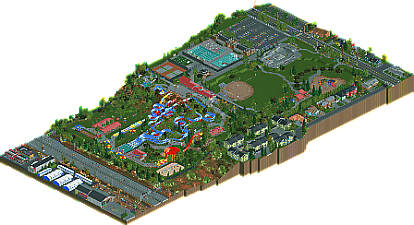
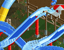
A semi-recreation of Splashdown Water Park in Spokane Valley Washington. Featuring a main slide complex with four massive slides, a bowl slide, a high speed plunge, and various other attractions, this is a park that's sure to provide fun for the whole family.
The map also includes a fairly extensive surrounding area. I included so much depth in surroundings, both because I enjoyed it, but also because I felt that the park really works well with the suburban feel. It's a park that could be in any neighborhood, and I felt that these surroundings could help it feel more relate-able.
Cocoa, Scoop, and Pac all helped build at various times on a poorly advertised multiplayer server. Cocoa and Scoop each built the house that their respective staff member occupies, and Pac built the skatepark. Liampie and Robbie92 both also provided help during testing. -
11 fans
 Fans of this park
-
 Full-Size Map
-
 Download Park
1,102
-
 Objects
441
-
 Tags
Tags
the horse and the motorcycle at the playground tilted...that was such a cool detail.
the waterpark is oddly enough not the main focus for me. so many cool amazing details that were hacked so great. I don't want to spoil them but it was fun to happen on all the little things in the map.
hey I also built a lot of fence poles
and banter
I'm speechless. This is thing is just...wow.
So many great details and little things to find. I haven't had this much fun exploring a map in I don't even know how long. I'm still finding new things and I've been staring at this thing for 30 minutes.
I too agree that the waterpark wasn't the highlight for me (although it is fantastic and in my opinion, the best we've seen in the game thus far), but rather the setting outside the park's walls. Absolutely a joy to look through all the homes and shops. And the highway! Ugh, so good. I, too, won't spoil the fun things to come across while viewing this, but damn, outstanding work dude.
If this came down to it, I would probably 'yes' vote this for Spotlight. This is at least a high gold, anyway.
Did you make a gay joke at Louis' expense?
I was just about to write the same thing Steve just wrote, so I'll just say Holy Shit this is incredible!!!
This is so fantastic, and it hits so many "nostalgia points" for me. I'll provide more detailed feedback once I have some time, but for now, I'll say that this is my favourite park release in a long time.
Brilliant stuff on this map. Well done!
Why is the aerial so zoomed out.
I don't know how to feel about this...
On one side, it's a fun thing to watch. We don't see waterparks that often so it's a nice and original release. The playground, BMX park and baseball field are brilliant. There also much fun little details to find like S_F grabbing a drink.
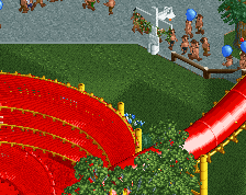
The slides seems fun, the bowl is impressive. But I've got mixed feelings about the waterpark itself. There's almost nothing there except the slides. It kinda lacks a theme, it just lacks atmosphere The grey path doesn't work for me at all, another path type would make the whole park way more comfier.
And then on the other side... You've spent a lot on those outskirts. But... Why?! The outskirts are bigger than the waterpark itself. I don't get why, and it seems to be a trend on NE to spent more and more time at the outskirts and detail it more. I do admit the working parking, the riding cars on the highway, the gas stop etc looks cool and such. But I don't really care about it. It seems more like transport tycoon than rollercoaster tycoon. I wish you made the waterpark bigger and more atmospheric than the outskirts.
Sorry if I sound offensive but this park doesn't work for me at all. For me it is silver quality, spotlight like Steve suggested seems ridiculous.
Silver seems ridiculous, honestly. If anything, parks in general need a level on context like this to really make sense spatially and realistically. I'll talk more later.
I strongly disagree on that one. The quality of the water park wouldn't change a thing if the outskirts weren't there. I think it would be way more interesting to use the space with more water park instead of parking lot, highways etc.
Yeah but the intent wasn't to make a large, big budget waterpark, and the context makes that clear.
Yeah and my opinion on the water park itself wouldn't change a thing if the outskirts weren't there and he made the map smaller.
Now this is really cool. Like the others said, the water park isn't the main focus, but rather a part of something bigger. It seems to me you've tried not to make a water park, but to create a slice of world, a slice of suburbia which by coincidence also has a water park in it. I love the setting, all the hacks and ideas are brilliant... Only the path choice inside of the water park let this one down, a bit too bland, grey and dull. But for the rest.... I'm blown away.
This is the most functional thing ever. Gold park for me as it lacks so much of what Golds usually come with, but has a lot you've never quite seen like this before. Nice to see H2H-meticulousness outside of it.
Definitely more deserving of a gold than some of the more recent winners of that accolade. But in a vacuum I dont think its quite to that level. All the extra details and touches are great, but to me dont really add all that much to the park. Almost feels like a H2H park where people are desperate to add those little details that have nothing to do with the concept just to push a few more votes in their favor.
I really like the slides and water park itself, some great hacks that really make this one of the best water parks we have ever seen. Kind of wish it was a bit more interesting though, just seemed ultra standard which is a little disappointing. I think if you combine this sort of content in a more interesting and full package it could be a great park.
In the 65-70% range for me, foliage probably was the biggest offender. Some was great but in others places it felt a bit sparse or clumpy (near the Vball courts).
Still a really cool release, nice to see some stuff other than the standard mid-sized park. Seems the age or small and one-off parks like this has passed, and its nice to see something bring that back a bit.
This has a great atmosphere, I definitely feel like this could be a smaller, suburban water park and the surrounding area. There are just so many details and I really enjoyed the houses and areas outside of the park. I loved the LARP guys and the NE guys having a picnic next door. It was just fun. I'm no expert, but I think the water park itself looked great and I enjoyed what you did with the hacks, etc.
The best part was definitely the Back to the Future reference! ;D
i think this was really awesome! it be nice to have a water park like this! still im waiting for your beachside amusement park that i have been watching!
This sums it up completely. The waterpark it's self isn't particularly interesting and doesn't hold my attention for particularly long. The outskirts are fantastic yes, and I love the little details, but really I feel like the actual main content of this map brings it down. I'd love to see some outskirts like this with a small amusement park rather than a generic waterpark with a few slides.
I'd put these in the 70% - 75% category, but those surroundings are spotlight quality if put with the right content.
Certainly an interesting and entertaining park! And rather difficult to vote on too, I felt. As has been said, it seemed as though most of the emphasis was on the surroundings, which is an unusual concept and made me consider what I was actually judging here.
Aesthetically, I think you've done a great job. Each structure is well crafted, there's good attention to detail and I like the basic colour scheme within the water park. It certainly has that realism to it, fully supported by the surrounding houses, stores and facilities. I liked the foliage too, with good attention paid to the aridness of the land.
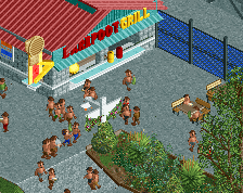
As the highlight of this submission, the hacking and technical concepts were fantastic, with clever reuses for rides and peep animations - the Frisbee players in particular were a very creative idea. In terms of using the mechanics of the game to create something new (as opposed to using the scenery), this submission certainly excels. Given the significance of the hacks in this park though, and by contrast a lack of actual "park", it made me wish the Concept Creation was still a thing, as this would score very highly there.
Overall, I really liked the concept and its presentation, but felt that the brilliant technical tricks were somewhat show stealing. Had they been implemented into a full-blown park of this level of detail, they would certainly have pushed it into spotlight quality for me. However, here it felt as though all the focus was on them rather than the park (or even the surrounding buildings), and for that reason I only voted it at 75%. This was 50/50 excellent detailing and ingenious hacks, but for quantity, I'm afraid I couldn't give it higher.
A brilliant park that deserves gold in my opinion, but that felt somewhat small-scale for the creativeness put into it. Thoroughly enjoyable nonetheless, and a great showcase of the ideas you have when building.