Park / Fred's Ultimate Coaster Kingdom
-
 14-May 16
- Views 11,101
- Downloads 1,240
- Fans 2
- Comments 44
-
-
 71.88%(required: 70%)
 Gold
Gold

Louis! 80% alex 75% Chocotopian 75% Cocoa 75% disneylandian192 75% inthemanual 70% Poke 70% Stoksy 70% Liampie 65% nin 65% 71.88% -
 Description
Almost day to day, 2 years ago, I decided to build my own coaster paradise with as many coasters on it based on my own favorite coasters. Today, it is here. FUCK!
OpenRCT2 only! -
2 fans
 Fans of this park
-
 Full-Size Map
-
 Download Park
1,240
-
 Objects
1
-
 Tags
Tags
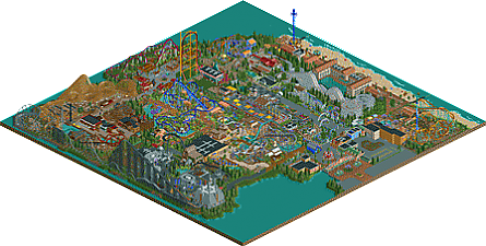
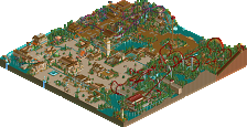
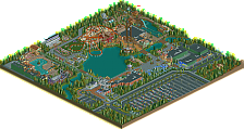
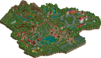
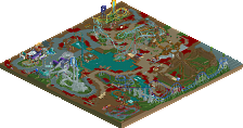
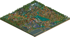
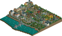
It's the future, but the peeps are horrible. But I consider them also horrible in regular rct so...
I basically gave this 70% because of its sheer size more than anything. Sorry Fred, but the quality wasn't quite up to par in my opinion.
Excuses re: object limit are fine, but I'm still going to review this park as if you didn't hit it. I've seen enough comments to know that you built this very inefficiently anyway haha.
I still don't understand the use of coaster track on the entrance, nor are the overall entrance outskirts particularly appealing. Possibly the ugliest backstage area I've ever seen, but that's not too relevant. I also felt that the scaling was a bit odd here (as it is throughout the rest of the park). TGI Fridays was enormous and took up nearly the same amount of space as an entire mainstreet. Skyride was fine, but had a completely unnecessary turn at the end (why??).
The transition into Egypt also could have been handled better, but the actual area was decent. Some really nice structures like the coaster station (although about an entire floor too high) and darkride façade (which had better scaling). The actual coaster layout could have done some nicer things, and the flume was okay but had some very forced interaction with the coaster e.g. that turn + s-bend under the half-cobra roll.
The more tropical area with Manta was lovely but lacked architecture. One of the better coasters in the park imo. The purple + blue platform with the jet skis was an eyesore for sure, not least because the railings didn't slant with the path.
Asia was bare bones. I imagine because of the object limit, but the coaster surroundings + architecture just felt a little weak. Another problem was the massive support structure of TTD which just ruined an entire viewing angle (arguably one of the better viewing angles of the area as well). It's one of the reasons I really dislike coasters like the intamin launched - it might be exciting irl but not for RCT. Lots of straight track, large top-hat which has to be supported and inherently blocks the actual interesting RCT-content (eg architecture).
Moving on, coasters drive-in was another over-scaled building. This was a pleasant area though, even though the queue covers for the racing woodies were really ugly. On the layouts, as mirrors of each other they're a little uninteresting. might be realistic but not super unique/exciting to look at in RCT. I did however, quite like the Maurer Sohne, and thought the interaction with the swinger was pretty good.
The beachfront was probably one of the best parts of the park. Everything was just 'solid' here, and the beach was full of 'stuff' and therefore life which I loved. Not sure how I felt about Mistral and the surrounding area. Bit of a ridiculous queue line (especially that enormous bridge over the coaster), and although I think the extreme elevation changes were a bit much, it worked with the architecture (although that may be a reflection of the scale you build on rather than excellent execution).
Nothing really to complain or praise about the midway, it did what it had to. The huge canvas covers and stadium seating were quite nice. Actual coaster was not to my liking at all, the arrow was okay but supports could have used some work (needed steeper crosses and thinner objects - geewhzz made a thin rail version).
Star Wars was probably the biggest scale-offender. That enormous structure for the insanely paced hyper was completely unnecessary, as were the weird heartline coaster queue covers. Unfortunately I didn't think the canvas awnings fit at all for the hyper queue. Needed more of the X-wing academy/entrance arches style of architecture rather than the oversized structures that you ended up using for the area I think. Would have looked a lot better I think.
The western area was probably one of the strongest. Good architecture overall, solid mack layout and landscaping (although bare surroundings), interesting wild mine ride, not flat or too overscaled architecture block.
70% for size, probably about 60-65% for quality. Impressive that you finished this, especially after hitting the object limit relatively early.
Thanks for your review Stoksy. Will take all the feedback into future projects. It's kinda funny how the Spinning is liked I think it's the weakest coaster of the whole park lol.
Congrats on the Gold. I'll have a review for you when I have more time and that should explain a bit better why I voted 80%.
I loved it though, great work Fred.
https://www.youtube.com/watch?v=sfahaKndVZw