Park / Fred's Ultimate Coaster Kingdom
-
 14-May 16
- Views 9,915
- Downloads 1,110
- Fans 2
- Comments 44
-
-
 71.88%(required: 70%)
 Gold
Gold

Louis! 80% alex 75% Chocotopian 75% Cocoa 75% disneylandian192 75% inthemanual 70% Poke 70% Stoksy 70% Liampie 65% nin 65% 71.88% -
 Description
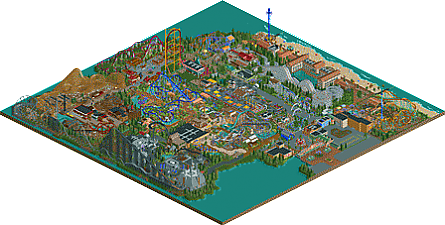
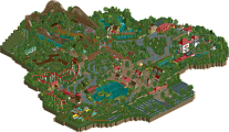
Almost day to day, 2 years ago, I decided to build my own coaster paradise with as many coasters on it based on my own favorite coasters. Today, it is here. FUCK!
OpenRCT2 only! -
2 fans
 Fans of this park
-
 Full-Size Map
-
 Download Park
1,110
-
 Objects
1
-
 Tags
Tags
Congrats. This was beautiful. You should be proud, you've come a long way.
Mistral and its area were so very awesome. I loved this park, here's hoping we don't have to wait two years for your next work
Althrough, it's a great park, it has an unfortunate name.
wow really great work. I'll be back with a proper review later, got to go now, but congrats on finishing this thing!
im really glad i got to see this, im so thankful for you that its all completed! somehow i imagine this park being real somewhere!
good park, was cool to see it progress, buildings and planning are really good, the only thing I miss in this park is a standout coaster to be honest, a lot of coasters lack some flow or the transitions are weird or feel cramped in a way. I suggest in your next park play around more with your coasters, and I don't mean this in a realistic sense because what is realistic anymore with what we're seeing in china with those new intamin launchers and mack hyper loopers, I mean the limit is where physics end atm with coasters so I'd say try to make sure your coasters, flow better and have good transitions and spacing in between everything and your next park should be even better.
Bg, I voted 80% for the community score High gold for me, no spotlight though in my opinion
either way this goes, a release to be proud of for sure!
Very nice park Fred. Congrats on finishing such a large solo park. It was a lot of fun watching you stream this and watching it progress. I gave it a 75% on the community score and I think this deserves gold not quite a spotlight.
Pros:
-Desperados, Manta, Mistral, Hor'Uz, and Colossus were definitely the best coasters. Desperados had some cool elements and the pacing seemed to be pretty good. Manta looked beautiful and just stood out to me. Mistral was amazing as well. That area was by far the best section in the park architecturally speaking IMO. Hor'Uz had some great elements, especially the tunnel. Colossus was great I really like the use of those unbanked turns. I definitely got an old school roller coaster vibe from it.
-The park seems like you built what you enjoyed building and if you had an idea then you incorporated that. I feel like sometimes that builders, I'm guilty of this too, build what they want others to like rather than what they enjoy and with this park I can tell you had a lot of fun making it.
-The Beach Front and hotel were very well executed. Some of the best architecture in the park, and it was pleasant to look at.
-The Star Wars area was also neat. The Kylo Ren's Lightsaber ride was a cool idea, and I really thought it was cool that the peeps could walk around and see X-wings, At-Ats and such on the paths.
Cons:
-The object limit absolutely killed this park. So many more details and foliage that would really bring this park together are missing.
-The Morgan Hyper is awful, I'm sorry. The turn around is way too fast and too long. I fell like the coaster itself was forced and rushed.
-The block brakes at the top of the lift hills really bothered me. Just nit picky stuff but would have been nice if your could have messed around with the timing.
-The Trackitecture on the entrance seems forced as well. It really felt out of place.
-A lot of the architecture was lacking IMO. I feel like you could have done a lot better with the western, and entrance areas and could have gotten to whole park up to par with the architecture in the Mistral and Beachfront sections.
-The Starflyer is off a tile or two. Again not a big deal really, but is quiet an eye sore.
Overall the park was pretty good. I really enjoyed it. I feel like there's a lot of room for improvement but it was some of your best work and I can't wait to see your future projects.
Belgianguy: Thanks for helping me out with Manta, mine was really bad compared to the adjusted version! Overall I'm happy with the coasters but I get what you are saying.
Bubbsy: thanks for the first proper review man! Glad to hear you liked the Star Wars zone. And yes, I had so much fun building on this I have to say I realized the timing sucked because I didn't take it in account. I assumed they would ride fine just when testing. Big mistake which I won't make again in the future. I've got a lot of comments on the wooden coaster track at the entrance but I never felt it had to go. I liked it and some real themeparks have real coaster track near their entrance. At the end, I must be happy I didn't replace it with objects cause imagine how many object slots I would lose on that
  I know the finishing touch isn't what it is supposed to be... thanks to the object data limit. It is finished but not in the way I had in mind when starting the park. I've hit the limit for the first time when building on the western area and it gave me a kind of fear of not being able to finish the park I wanted to save on object slots and it affected my building over there. So yeah, I'm not happy with the archy in the western area, could have been way better.
Thanks for the positive reactions. Keep them reviews coming
This was really cool. Reminds me of when I played the game as a kid and just built as many rollercoasters as possible. Considering what a mess that always became, it's all the more impressive how good this park looks.
This was silver quality for me personally. Parts of the park were definitely gold standard; Mistral, Manta and Hor'Uz were all great little areas, but everything in between was much lower quality.
I'm guessing that the ones I mentioned are much newer than the rest, and if you can keep up with the quality of work there, then I'm excited to see what you build next.
Fred, first things first: well done on getting this done, dude. Despite all the hurdles you've endured with this map, you still pushed through. That right there is a feat unto itself and something a lot of the best players have yet to master.
Secondly, I want to say that I apologize if anything I say comes off as harsh or nitpicking on things. This is not to slight you -- it's to help you. One of the biggest things about this release for me is that it was SO frustrating to look at. I understand how much the object limit held you back, but I found endless missed opportunities to make this park look more "full." Again, I know it's not your fault you hit the limit, but it is your fault for handling it poorly. Rob sort of got it right with BGA, but even then it was treading dangerously close to looking just straight-up unfinished. For me, this park is in that same boat.
The entrance area, first off, I get that sense of unfinishedness: bare parking lot, dirt patch in the backstage area, huge empty walls backstage (why'd you put windows on the TGI Fridays when there's trees in front of it when you could have used windows on the empty walls? Things like this are what I was getting at earlier). Also, the FUCK promo on the wall...is that a joke or did you just mess up? One ticket for the price of two? Damn, who'd want to even visit this park? Hahah. Anyway, architecture was okay here, scale felt a bit off. I really liked the chairlift station though. Corkscrew layout was solid but the dueling woodens were just okay for me. The stations aren't even synced so they weren't even actually racing. Intentional? TTD didn't really do much for me, but it was good for what it was. I think you could have done away with the kiddy coaster version for more object space. Bumper cars building was really nice, here.
Egypt was pretty great area. Horus was decent, some of the elements seemed weird to me but overall it interacted with everything in a great way. You could have saved tons of space here if you lost some land blocks in this area; I think you underestimate how effective just full tile rock work would've been here. Architecture again was just okay. Everything was colorful and the atmosphere was there. Nice work!
Manta was above and beyond the best thing on this map. Wow. I get the vibe this is newest part of the park, or at least this was your favorite thing to build. Coaster is the best ride on the map. Great flow, great elements, great interaction. Atmosphere here was on point and the architecture and colors were excellent. Again, you could have saved tons of space by losing the land blocks and even a couple flat rides. I know how tedious it sounds but it would've elevated this greatly. Still, this is my favorite area in the park and the best thing on the map in my opinion. Build more stuff like this and you're golden.
The Star Wars area did not do much for me. Buildings were huge and to be honest, a little ugly. Whether you were going for realism or "that's how they are in the movie" it doesn't excuse the fact that they just don't work here. I did enjoy the sculptures and the diver coaster was fine. The hyper coaster was okay as well, but I agree that the turn around had me scratching my head. I think you could have done away with this area to conserve even more objects.
The Western area has it's moments. The main block of architecture is decent here and I really like the mill used for the water ride's station. That whole ride was pretty well done. While I applaud use of the wooden wild mouse, it just didn't work for me. Again, this could have been easily dropped I think. Desperado was nice ride and I really liked the little post office shop. What's up with the path type though? Doesn't seem very western to me. When's the last time you saw cowboys walking down intricate stone paved streets? Good stuff none the less here.
What theme is this Asian area? Just generic Asia? I think this area lacked to do a true sense of identity. The architecture is fine but it just misses for me. I really like this Intamin ride though. Might be my next favorite ride in the park. Queue is really nice too, but could have been shortened to save objects. And hey! More land blocks on the water! You're killing me, dude. Also, just noticed how short the chairlift height is. 30ft? For reference, the Disneyland skyway is twice that and Cedar Point's is nearly 70ft taller. What gives?
The spinning coaster was pretty fun; it brought a fun energy to it's surroundings. The Coasters diner didn't really do much for me. Not sure if this was a victim to the data limit but it seems clunky and kind just, eh. I like the station and queue for Colossus (which is driving me bonkers because the trains aren't synced, hahah).
Remember when I said this park frustrated me? The boardwalk area of this map is the main offender. WHY, dude? Yeah, it's nice and well done and pretty and all that good shit, but why is this even here? For a couple of flat rides and a beach? This would have saved the park if you nixed it. Even if you wanted to keep it though, you could have saved a billion objects alone by deleting most, if not all, of those rapids and the beach chairs and umbrellas and life guard chairs and vending machines and flags (who knows what else I'm missing). Regardless, you kept it. And like I said, it's nice. One of the better areas actually. Is that why you kept it? Probably, but it didn't need to be there and could have been recycled for any of your future parks. Architecture and atmosphere are great here, so despite what I think, good job!
The area with Mistral was nice but ALL THESE LAND BLOCKS. I'm coming to Europe to murder you, Fred. And even 1K ruins, too. I'm pulling my hair out and it's everywhere and they're grey from the amount of stress this park has caused me. Also, this is a stand up coaster? What?! Is there a hearse at the exit to take people away after they've perished? I know some stand ups are pretty ruthless, but this is the first time I've seen a cobra roll on one along with a zero-g and interlocking corkscrews (I know both of these exist in real life but shit, I feel like this would be painful, hahah). Overall though, atmosphere and architecture and all that good stuff are, well, pretty good. I'll look past your yellow death machine for now.
All right, that's the whole park. Right? I hope so, I can already tell I've drifted off into insanity rereading this post. And it's a huge one! It's huge because I want to see you do better next time, Fred (that's what she said(?))! Right now, this park is probably a high silver/low gold for me. If you didn't turn this into Fred's Ultimate Land Block Kingdom, this might have been a high gold. So, good job on finishing and I am looking forward to your next stuff, dude! I'm done posting forever and not checking this for spelling/grammar (Kumba, a little help?).
Wow, what a review! But I like it, it helps me a lot
- I did get frustrated with the data limit and couldn't deal with it. Lucky for me Liampie helped me out big time. I didn't want to redo the park in order to gain object slots, I had to redo a part but definitely not everything. Could I do more? Sure. But after almost 2 years I just wanted this park to get finished. You're right when you say I could have handled it better. Though I never thought I'd hit it when starting the park. It was something I've read but never saw in the game... Well lesson learned, for sure. I just hope people can look after the unfinishedness because of the data limit.
- Yes, the fuck promo sign is meant as a joke
- Stations of Colossus aren't next to each other (and thus not synced) because first I had another kind of station in mind which didn't allow the stations to be next to each other. It changed but the placement didn't. I know it wasn't handy but I didn't expect someone to get so frustrated about it You could say I solved it the Belgian way haha.
- I really really wanted a boardwalk. I loved my stay at the Breakers hotel at Cedar Point where you could stroll on the boardwalk, go on the beach,... I wanted that too and gave it a Southern-French theme because I love going on holiday there. Boardwalk is mostly meant as a piece of resort, in the park. Maybe weird but I thought it would be cool if you really could sleep in the park and not outside of it
- I only did one stand-up coaster (Mantis) and liked it. I don't really care if it doesn't look like the most stand-up coasters, just wanted to build an impressive B&M coaster! And since I find it said they made Mantis into a floorless I was even more decided to keep it a stand-up
A big thank you for your review. And maybe we can visit a European park before you murder me? Would be fun.
I'm laughing out loud. Best review 2016
I think I'll do this area-by-area:
entrance:
probably the weakest area in the park. its a bit themeless/awkward and doesn't really excite me, and seems to be less... skilled than the rest of the park.
south france (?)
much higher quality. some pretty good architecture, although I think the landscaping is still really weird and has some strange blocky bits all around it. nice atmosphere here though
seaside
really lovely hotel and seaside setup. great architecture, some sick custom rides, all very clean and good looking. good job here.
american area (?)
a bit mish-mashy here. the rides themselves are pretty nice (dueling woodie, wild mouse) but the area doesn't really have a purpose it seems. I like the diner though.
racing area
another excellent area, you pulled off that little chunk of cedar point quite well. clean, detailed, stylish, etc.
asian area
I really like the coaster and colors but its a bit... empty? the architecture is sort of the classic, unassuming rct asian style. not bad, just nothing so impressive.
western
I also quite liked this area. its nothing new or special but its pretty nice all over with some interesting rides. I especially like the water coaster, that was well-themed and had some lovely details
manta
this area was lovely, very good tropical vibes and a solid flyer layout with excellent colors. All good work around here, very enjoyable and atmospheric.
egypt
probably the best area in the park. solid themeing, good rides, landscaping, etc. its so little though! loved the invert.
star wars
a bit of a random area but quite good. nice structures and detailing, although it felt a bit bare in spots. I'm not sure I'm a huge fan of the morgan, maybe it was the color scheme looking a bit... bland.
overall, its quite a nice park, if a bit inconsistent. If you did the whole thing with the level of skill and planning that some of the areas have (egypt, tropical, seaside) then you'd have a really amazing park. Easily a gold for me, and I reckon you can see your skill progression throughout this park- by the time you do another one, it'll definitely be fantastic.
Thank you for the review Cocoa.
The asthetic of this park is amazing, the architecture and all, i think you nailed that aspect of it.
However I think the coasters could use some work. I'm not sure if you were aiming for realism, but these are some of the things that bothered me:
- - the top hat on the accelerator shouldn't really be using the steep-to-flat pieces
- - the supports on the lift hill of the hyper coaster are done poorly in my opinion. It would've been a better idea to look up how they were done on coasters such as Magnum or steel force, and maybe would've made all the supports white on that coaster
- - on almost all of your coasters, the bunny hills you use are /\/\. I'd include a flat top to make them more like /T\_/T\
- - on the flying coaster, you use the same tri-element twice, where the train flips on its back, makes a turn, then flips on its belly again. it would've been a better idea to include a twist somewhere in there in my opinion
- - the first half of the inverted is very awkwardly linear to me. you include turn arounds like the dive loop signaling a 180, then you immediately 180 back into a loop, only to 180 again as a result of the immelman. in the end, you still end up facing the same direction as the dive loop put you in the beginning. there isn't much flow in the first half and it is very linear
- - I thought your spinning coaster was the best and was very well made
- - as for the gci, stand-up, racer, water coaster, corkscrew, and mini giga, I thought they were satisfactory. but again the bunny hills, and turn-arounds, and extensive linearity are issues with me.
I do base a majority of my vote on coaster design. your asthetic is good, the scenery was good, usage of space was simple, yet effective, but the coaster design was slightly below average to my liking. I'm going to give this a 65%. nice job
I thought it went slow, you'd think people would look forward to a park (this size and with this many coasters) being released?!
Thanks for the feedback Gil. You too Sneakyfranky but I don't agree with some stuff.
- I had to do the supports of the Morgan like that. Please take in account that I already had hit the object data limit so I had to use my free objects slots wisely. Of course it would look better with custom objects but it would be pretty stupid to do that when you almost have no object slots left and have a park to finish.
- I don't get the feedback on the bunny hops?! In real life they don't have a flat piece on them and I think you'll experience less airtime with a flat piece.
- Well yeah, the fly-to-lie element is what makes Air so good. It's more original and way more fun than just an inline twist. Maybe I had to make the part riding on the back longer, but ok.
- The invert is basically a rip-off from Oz'Iris from Parc Asterix. It's the closest B&M coaster to my home I think And a very good coaster too, one of my favorites. People build more the bigger inverts based on Raptor etc so i thought it would be refreshing to see a smaller layout more based on finesse than power and height.