- Views 17,111
- Downloads 1,404
- Fans 24
- Comments 61
-

-
 89.38%(required: 80%)
 Spotlight

Kumba 95% yes pierrot 95% yes ][ntamin22 95% yes Chocotopian 90% yes chorkiel 90% yes Cocoa 90% yes Liampie 90% yes csw 85% yes Poke 80% yes Louis! 75% yes 89.38% 100.00% -
 Description
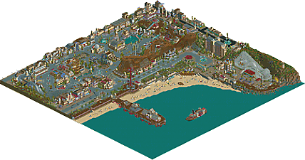
A fantastical caricature of a golden age amusement park.
-
24 fans
 Fans of this park
-
 Full-Size Map
-
 Download Park
1,404
-
 Tags
Tags
You don't HAVE to go by this, you know. Over time you just know that anything over X% equates to some level of accolade, and you start giving things scores rather than rating how much you liked it. I don't look at those suggestions as "I only liked 55% of this park and the other 45% is just garbage".
As for the park I need to look at it a bit more before giving it my final score, but I do agree with a lot of the comments stating it's a bit hard to decide on. What's there is fantastic, but I'm a bit torn on the overkill of water even though it surely does fit the theme. Parks like this are always hard to decide on because of that.
Thought this was really good. Probably the most detailed one could/should go in LL.Your use of trackitecture is very inspiring. You did a good job on making this not look repeatitive even when there's so much concrete in a huge part of the park.
One thing I believed this park could use in some places, though, was a bit more life. Obviously making this peepable wasn't the way to go, but there were so much places where everything looked quite stiff. Where the only thing moving was a small ride or tunnel in a building or even just a fountain.
Nonetheless, good job on finishing such a magnificent park. I look very much forward to what you've got for us next.
Sure, however, giving a park a low scores simply because its a style you dont like or a type of park that doesn't fit your preference is kind of dumb. Someone shouldn't be voting on parks if they hate the style, its a bit unfair to the builder.
I'll try to get a review done this weekend, still trying to decide on the score I'd give it though, definitely 85% plus from me.
I cant' wait to check this out. The overview looks great.
Otsdarva Fan Offline
I'm not good at giving reviews but I want to let you know this some of the best work I've seen and I like basically everything in the park. The hotel is great, the billboards with the use of the mini suspended coaster for supports, the fountains, the entire pier, parachute drop's trackitecture, the billboards again, train turntable, the street lights with the hanging car as a the light... so much brilliance.
@mintliqueur: Cyclone's stats were not like that by design.. haha. I genuinely couldn't get them 'normal' without sacrificing the aesthetic, however I'll agree it is fitting!
@Cocoa glad you liked the monorail detail! I tried many different tests (on a different map) of ways to get as much movement and life as possible into the park - this was one of the few successful experiments . Also yes you should play LL more.
@nin: would you rather it be black tiled?
BTW I really don't care about anyones internal struggles r.e. scoring or difficulties with the scoring system - I just want you to tell me about all the cool shit I made haha.
I appreciate the huge area of water, it makes sense. Although I thought it might be even better if you filled that area with something like buoy as warning signs, perhaps subtle waves with rapid track.
This is one of the hardest things I've had to vote on.
I still don't know what to vote, think it could take me a few good looks over before I come to a proper opinion.
On the one hand, I like it, on the other, I dont. I think the skill required to pull everything off is incredible, and some of the little details are incredible and I don't doubt that this is some serious quality LL work.
But for me, I don't think I actually like the park itself. In individual screens everything looks fantastic, but when it comes together as one, for me, there is something missing. Texture choices are questionable in places, which I think is understandable in an experimental park such as this, but it doesn't work throughout for me, the coaster layouts also aren't anything amazing.
I don't know, kudos to you for achieving a feat such as this, I do generally love boardwalk/seaside parks, I just don't know what my opinion is when it comes to scoring, especially when I'm not sure whether its better than Lake Chronus.
Congrats though.
Unvotable....
alex, you're the most creative player on the site for me right now.
I just love the geometries.
Just reinstalled LL to look at this park. How anyone is questioning whether this is Spotlight or not is beyond me. Fantastic work, so many little things that are new in a game almost 20 years old.
While I can't open this since I haven't bothered to get LL figured out, the map overview is amazing! Alex has done some incredible things in this park, extremely creative... a hotel made of railcars... those S-curve fountains... ferris wheel gable ends... street lights... making space pathway actually look good... custom flats... unique trackitexture --> all amazing work!
As for spotlight or not, I wouldn't have enough LL knowledge to really give this a vote, but what else could we ever expect from another LL park to ever achieve spotlight? Or is the size of the park holding it back? No idea! Glad I'm not on this panel!
Great job!
if this doesn't win spotlight then it will prove that all ne is is a elitist conspiracy where the "panel" assembles and decides mafia-style which parks live and die. and for that i blame louis 100 percent.
once im arsed to install ll i'll look at this and give you a proper response, alex
So, 95% - Yes from me. The Spotlight call was a little harder than the >90% call.
This is almost unquestionably a watershed park, and will stand as a landmark for how far we've come in LL during the past ten years of Codex-enabled building. There are literally dozens of examples in this park of clever and exceptionally well-executed ideas, and as seems to be the case with many of NE's finest works the subtle ones are somehow the most impressive.
If there's anything holding Luna Park back, it is essentially covered here. Allow me to break down some of my for/against Spotlight thinking:
Against (No spotlight):
1- Is this truly an impressive parkmaking effort when not considering the hacking efforts?
2- Weakpoints in coaster design
3- Map layout - weird edge bits, lot of empty space
4- Size
5- Inconsistent effort in naming/theming elements that aren't lifted directly from Coney
and now some rejoinders.
1- Is this truly an impressive parkmaking effort when not considering the hacking efforts?
(tl;dr - yes.)
There's a limited number of people who can appreciate how deeply inventive Alex has been with Luna, and the trouble here is that Alex has seemingly handled the LL limitations so smoothly in Luna it's hard to even tell these are things that are supposed to be difficult.
If you remove the lens of "wow, that's an impressive hack" from an RCT project, you're often left with what bears a remarkable similarity to much of Kumba's work; jaw-droppingly cool ideas, but the ideas sometimes struggle to look good after being frankensteined out of train bits and z/c'd scenery. Not so in Luna. Alex has had great ideas, ideas that stretch the fabric of what can normally be accomplished in LL, and made nearly all of them look fantastic in-game anyway. Nothing jumps out as being oddly out of scale or out of style just because it was a complex hack to complete or a difficult idea to get down in pixel form. The truly staggering part of Alex's work (here and elsewhere) is how he has taken the intensity of new ideas and not allowed the bizarre niche skills of LL building to block him.
2- Weakpoints in coaster design
The Flying Turns and Virginia Reel are excellent. The Cyclone is a clear homage and well-appreciated, although I wish it weren't just squished up against a sheer cliff face - that's a little odd.
Moonlight Magic and A Day at the Races are a little lackluster for me. Races is a melange of all the right ideas - a pinch of Grand Nat, dash of Derby Racer, etc. Sadly, it seems like a first half with no second half. For as big as it is the ending comes very quickly, and the trains do a good job of racing up until they take a weird jog to the left and scream into the station with no brakes. Not sure if the intent was an older John Miller style handbrake in the station deal or what, but it was really disappointing to watch the ride sputter into an early demise. Moonlight Magic feels like a wasted opportunity. It isn't a "classic boardwalk" Big Dipper, and the big element that would distinguish it seems like a pale comparison of Cyclone's wild spirals. I honestly would have preferred to see some further variety, maybe a Steeplechase.
3- Map layout - weird edge bits, lot of empty space
and
4- Size
There's no denying the water takes up a lot of potential content here. LL maps are already smaller than what an RCT2 spotlight is expected to fill out, and even when it befits the theme and adds some value to the overall atmosphere, it can be hard to argue that a solid 1/3rd of the map empty could possibly add enough value to overcome the opportunity cost. Additionally, the other three edges of the "park" proper are a little tenuous, with ~10 tiles or so on all three sides being what I would describe as filler so well-executed you can hardly tell it's filler. Once again, that's the sort of genius we're dealing with. Give Alex five tiles on a map edge and he'll make clever atmospheric, theme- and period-correct work - a Model T dealership and a 1900's promenade park that looks like it belongs in Bioshock Infinite.
Still - it isn't just the water that's a negative. It's hard to fault Alex for making a ludicrously good-looking park and a scale-accurate boardwalk and beach, but in doing so he basically swamped the map with path. It's all fantastically executed and used as a base for even more head-shakingly good ideas that further drive home the park's feel (street lights, cars, and streetcar stops!) but it is a lot of space soaked up. When I put this up against something ultra-dense like BGSS or Ouest, and even something only sort of dense like Silver Valley or TTA, it doesn't feel as meaty. This was a big sticking point for me, but I ultimately decided that the strength of content was enough to merit a Spotlight call. It doesn't feel right to give something a number north of 90 and then say it wasn't enough for Spotlight. If anyone takes issue here, I'd understand - that really is a lot of not-park - but I'd rather see this land as a "weak spotlight" than another in our current pantheon of "platinums" if the quality isn't in question.
5- Inconsistent effort in naming/theming elements that aren't lifted directly from Coney
Okay, so in spots the quality is in question a little. Here's my essential premise- everything on-screen is a delivery vehicle for your design. When we invent whole new themes and rides and areas, the way we sell that idea in the imagination of the viewer is to block in the main points as strongly as we can and then fill in details with smaller, nuanced touches. In Luna Alex has the benefit of having IRL material to draw from, and as viewers that works out great because A - we already know the details and Alex doesn't have to sell the idea as well B - because Alex has a clear pattern of details to draw from he can sell the idea better anyway. This is wonderful for the Virginia Reel, Flying Turns, the Funhouse with the human roulette, the dance hall, etc. We can all go "ohhh, I see what you're doing here" with ease. It falls down a little when Alex has to invent his own material. Not a tremendous amount, but you can see it in an un-labelled restaurant, a building that's just there because it feels like a place a building should go, generic naming and re-used materials that are missed opportunities to tell individual stories and build vivid detail for every place in this tiny, unique world.
I'm probably a little more realist in RCT style than I used to be; there are parks and styles in which a building just there to look nice is a laudable and expected element. This park, probably because it uses real historical attractions so heavily, does not feel like one of those parks. I want the hotel to have a name and a history; I want the movie theatre to be showing D.W Griffith and the Music Hall to be playing Irving Berlin. I'll admit this is personal and probably criticizing a perfectly-good apple for not being Red Enough, and there are some uncontrollable factors here - Alex is dangerously close to the ride limit - so I don't hold it too strongly against the park.
For - (Yes, Spotlight)
1- Strong execution of theme
2- Exceptionally strong use of unconventional elements
3- Strong skill displayed in parkmaking
4- Exceptionally Strong detailing, hacking, and creativity for the medium
5- Abreast or ahead of current stylistic trends
6- Named a handyman ][22
Number 6 is clearly the most important.
1- Strong execution of theme
An aside:
Basically, Alex has taken an an already strong set of source materials and hit them out of the park. There's some content in Luna that isn't immediately recognizable as Coney stuff, but there's always another nugget just over at the edge of the screen to pull you along. There's a lot of smiling and recognition when viewing Luna, which is a testament to how neatly Alex has packaged up these old rides and shows and funhouses in ways that remarkably preserve that identity while adding a neat twist of LL magic. It's great. As I mentioned in the negatives post, I'd love to see things pinned down a little further - what year is it exactly in Luna? - but perhaps leaving that open a little to fuzzy nostalgia is preferable. The use of period-accurate themes, rides, and general infrastructure is fantastic- love the funicular, love the streetcar, love the beach changing tents, love the old-timey cars, love the model T dealership, love the lights, love the virginia reel and flying turns.
2- Exceptionally strong use of unconventional elements
I don't think I need to elaborate much here. It takes a heroic effort to use ice as the path backing and space-style path/lamps on an entire park that isn't either of those themes. It's done fantastically. The foliage mix is unique as well, the extensive use of purple walls somehow works, and nobody ever uses the ice blue. My only complaint is that Alex didn't lift my snow-fence-as-coaster-lift-lights idea from the PT4 prelim thing or find another way to light the coasters. (path with lights under the lifts maybe?)
3- Strong skill displayed in parkmaking
Architecturally the park is outstanding. The foliage is sparse but used to good effect. There's a clear guest flow to and from the boardwalk and hotels, there's nice path and color distinctions to break the park proper into nice digestible areas, and everything just looks so effortlessly good. Color and textural choices are excellent; even though castle wall dominates, there's pagoda roof and trackitecture and space houses everywhere and they all blend seamlessly into the look. A great deal of the park's feel is thanks to the consistent choices of muted colors - I think the "pair of dark orange and dull brown coasters" is now an Alex trademark - although in spots I think it's really cool how adventurous Alex gets with the colors to try and push the nightlight idea. Coasters are sufficiently good enough to avoid an early-Liampie-style "The coasters are bad but the park is great" Spotlight.
4- Exceptionally Strong detailing, hacking, and creativity for the medium
Look, can I get back to you? I'm busy taking notes on all the ridiculous new or unexpected uses of the LL parts catalog.
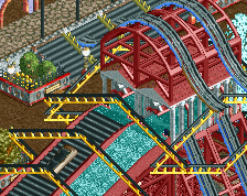
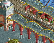
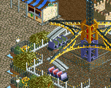
You can probably already see them yourself, but I'd particularly like to highlight the glass objects as revolving doors, beach showers and lifeguard hut, coaster-car theatre seating (a nice step up from the Chronus solution, btw), and the simple purity of using the odds and ends of the LL coaster lineup - bobsled, ultratwiwster, and single-rail - for perfectly-suited uses as awnings, ironwork, and lamposts.
5- Abreast or ahead of current stylistic trends
Like it or not, that's a salient point in Spotlight votes. Does it bring something exciting and new to the table, is it likely to get strong votes from active players who are into that style, and will it leave a lasting impression? I'd say pretty certainly yes to all three.
If I may - it's fascinating to see how Alex and I are independently converging on a few design solutions to LL problems. There's a lot hidden in Vermillion at the moment that I see reflected strongly in Luna. I think that going forward Alex is going to be the torch-bearer of this LL neo-realist brand that's developing based on his build speed. Loopy's been at it in this vein for years, but he's not as active as he once was and his work strays a little towards Roomie's style of oversized environments that work better with LL's full-tile-as-smallest-unit toolkit.
6- Named a handyman ][22
10/10 park of the year
TL;DR - just read bigshootergill's post since he covered everything in about 1000 fewer words
Please never leave us intamin.
Damn that was an interesting read. Thanks, ][ntamin!
Unfortunately I don’t have LL, so I won’t be able to look at it in-game.
I guess it’s obvious nonetheless, that this is an amazing park - so well made! Your creativity is inspiring to say the least.
The hotel, the boardwalk, and the pier are my favorites! The hotel is mind-blowing, and I really love the atmosphere next to the ocean. The shower and the huts on the beach are so nice.
The custom flats are incredible. They look so clean. I love the flat in front of the ferris wheel building. It’s so good. The building is great too. There are so many cool and innovative buildings in this park. I adore the little village next to the spiral coaster, so cute!
So, this park is amazing - without a doubt - but I guess there are a few things that, well, made it less interesting to me. Even if the coaster layouts were extremely clean and beautiful, I couldn’t help to feel little bit bored. I would have liked to see a different coaster type in there, instead of one of the wooden coasters. However, it’s not really a problem, and I guess it’s realistic the way it is now.
Despite the sun chairs, bath towels, and sunshades on the beach, I couldn’t help to feel like this park is an autumn park – based on the colours of the foliage and the colours in general. Maybe that was what you were going for. I guess the absence of peeps had some influence to that too. I really think you’re good with colours, but I missed some stronger ones.
There are so many good things in this park; it’s hard to mention all of them. I would just sound like a broken record. Even if I love your LL work, I can’t stop thinking about what you could accomplish in RCT2. I can’t deny I would love to see a full scale NCSO park from you. With your creativity I’m sure it would be something special. Well, I not going to blame you for playing LL. Your work almost makes me want to buy and play the game again. That doesn’t happen too often.
Well alex, congrats on a truly amazing park!
Truly a fantastic piece of work, in every sense of the word. There's detail layered upon detail layered upon idea, and it was all so much fun to explore! The brilliant ideas for the neon lights alone, with the tubes, monorails et al, were all well executed and had me smiling at their cleverness, and they brought a much welcome action to the scene.
Usually, trackitecture is a bit of a turn off for me as I feel it blends with the rides too much and comes across as scrappy. However, not was the case here, as you have a great eye for complexity mixed with cleanness. On the odd occasion it got a bit heavy (particularly with the single rail coaster tracks), but on the whole you used the rides at your disposal to create many excellent shapes, structures, decoration and new rides without cluttering the place.
One of the main things I enjoyed about this park was its atmosphere. I certainly got the early 20th century vibe you were going for, and the entire park felt like a showcase of wonderful attractions, much like an exhibition of the times. The operating rides were of course great, but the range of other shops, theatres, fun-houses, tourist spots, amenities and decorations all added up to make the whole place a jungle of discovery.
I'm very reluctant to deem anything spotlight-worthy, but Luna Park held the perfect blend of jam-packed ideas with beautiful presentation, and so I certainly voted 'yes'. Congratulations on a superb park, and I eagerly look forward to your future releases!
When is this thing getting to 10 AP votes? Give it a damn NE Spotlight already... Going to hold my full comments till then, but I loved it and was I a 'yes vote.'
I'll try to do a longer review at some point. But the only thing that really stood out to me as negative were the dulers. The colors really stood out, just white would of been fine. The layout and scale was also a bit off on them, I love a towering coaster but I feel for a park like this they should compliment the architecture not overpower it. Grey coaster was a little short too, but I liked everything else about it.
So many great touches and great interpretations of rides that no one has really done before. I honestly can't understand any "no" spotlight votes on this one, people preach creativity and newness and here is the most creative and new park since before H2H, and people still find ways to claim its not worthy of spotlight. By the end of this year you could easily be up there with Nate, Fatha' and Mantis with the other LL greats, please keep building at this pace.