Park / Lake Blue Amusement Resort
-
 17-July 16
- Views 2,191
- Downloads 564
- Fans 0
- Comments 2
-
 Description
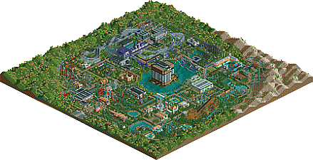
This park was created in a collaborative effort that was part of the Scenic Railroaders Steam Group. Special thanks goes to all of the OpenRCT2 contributors including SensualEthiopianPoliceBrigade, Foresh, Ruhtra, PopsiclePenguin, RCT123, and Dobieshep. Special thanks also goes out to general cool dude, RCT.FM.
-
 No fans of this park
-
 Download Park
564
-
 Objects
1
-
 Tags
Tags
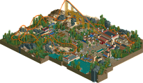


I like this, it has a very clean feel to it and reminds me of a lot of early parks.
I liked the big building in the middle. Otherwise seems like standard rct with a touch of scenery here and there. One thing I would recommend to help yous next time is to choose a theme for each area based on real life styles of architecture/geography/parks. Here you've settled with different colors (ie purple area or turqoise area) as enough to make the themes stand out but I don't think it works for you, because everything looks the same just in different colors.
Also don't be afraid to mix in warm colors with cooler ones, they'll make the vibe you want (sort of an oceany, modern vibe here?) pop more and make it more interesting to look at. its all about the accents