Park / Left Behind
-
 07-May 16
- Views 2,927
- Downloads 689
- Fans 2
- Comments 14
-
-
 57.50%(required: 65%)
 Design Submission

Cocoa 65% Poke 65% alex 60% inthemanual 60% Stoksy 60% Chocotopian 55% csw 55% Sulakke 55% Louis! 50% posix 50% 57.50% -
 Description
All you need to know is in the readme.
I included a savegame with and one without peeps.
Having huge numbers of peeps in the park works against the theme of the ride, but I understand that some of you like peeps. So I did both.
Have fun guys, feedback is appreciated!
Whoever put that 100% in there without even downloading the park: What the fuck? -
2 fans
 Fans of this park
-
 Full-Size Map
-
 Download Park
689
-
 Objects
1
-
 Tags
Tags
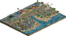
![park_3229 [MM2014 Final] Cavumus](https://www.nedesigns.com/uploads/parks/3229/aerialt2949.png)
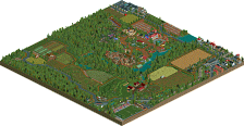
Not bad. Haven't played the game before but I have an appreciation for The Walking Dead.
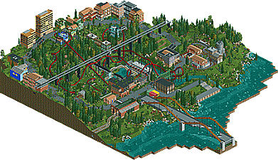
The layout of the coaster was solid. I liked the queue interaction and the use of the slides as drainage pipes. Another highlight for me was the train's station.
Still, there were some errors. The architecture was boring and boxy. Foliage was meh. And frankly, I was bored within 3 minutes of viewing. There was nothing to see.
If you were going for a Last of Us vibe, you didn't really hit it. Everything was a bit too neat and open. The Last of Us is claustrophobic, messy, and creepy. Your style of RCT doesn't really fit with any of those adjectives. So I applaud your attempt at the theme, but I think you missed it.
I would try to work on different styles, especially with the foliage. That will allow you to nail various themes without having to think about it too hard.
Its a strong effort, layout could of been a bit better maybe, but the architecture was stronger than your usual. Not really sure how I feel about the whole thing, guess I need more time to digest it all.
So I guess you played the game?
I wasn´t going for the close quarters, nerve wracking style the game has in it´s city-chapters. I was more trying to get a different setting. Like the scene just before Joel and Ellie reach Bills Town, when they walk through that little forest dividing the two parts of the city. Or the Jackson County Chapter, just with more town going on.
Not bad.
Some thoughts:
- Avoid heavy supports hitting the rooves of small buildings
- Avoid too many buildings directly touching a main path. Add a tile of space with gardens, or add awnings, entrances, patios, etc.
- If you find you have to do too much foliage to fill things, ask yourself if you have enough content in the park.
- Don't raise land too early and too freely early on in the project. Raise it with ideas and intention behind it as you go.
Nice work MCI. I thought the layout was strong. It had good pacing and used the hillside effectively with some nice interactions on the turnarounds and the cobra roll. Overall I found the atmosphere lacking - I don't think it looked post-apocalyptic enough. The green grass didn't help, I would have opted for dirt grass and some areas of brown dirt. Some more dead trees or at least less lush foliage would have been more appropriate. Likewise I would have stuck to more dull architecture. Where you used the some of the urban walls and red bricks worked well. But a bright blue building with yellow windows? Really? The way you made some of the buildings look like they were overgrown or falling apart was very good however. The monorail bridge was good too. It gave a nice sense of depth to the landscape.
Overall I'm not sure what to score this. I feel there's a lot of missed potential however there are some nice Ideas and I do like the layout. It's gonna be a tough decision.
The layout, i'm sorry to say, didn't flow at all. Some really sketchy transitions from element to element. To be fair I didn't like very much of it. You played this safe, very much so within the aesthetic confines of vanilla NCSO, and none of the design choices work towards the theme, atmosphere, or vibe that you want to encapsulate. You took a minimal amount of effort in some places to show decay but it wasn't enough to convince. The landscaping and foliage was definitely played safe as well
The biggest issue though really is the composition. It felt that you made a terrain invert, and wanted to build around that, so you make this 2-wide path circle lazily around the coaster and put a smattering of buildings along the way. It certainly didn't help the theme at all, and whatnot. There's really 2 ways you could have went with this. The first is to really tell and sell a narrative with the coaster, which would have took more integration of park elements as well as a clearer thought to achieve. You had it in some areas with, for example, the station, but you played that safe. You didn't seem interested in going the realistic route here, either, though.
yeah not bad at all. There was some pretty good architecture around, mixed in with a bit of average/bland stuff too. the layout was pretty solid, although I'm not sold on all the landscaping. that said, it came together pretty well. maybe not that memorable overall, but a pretty nice design anyway.
I think you did a pretty good job with the coaster. The pace was maintained and I think it incorporated some nice over/under interactions. I thought the cobra head was well placed too. Like others have said though, I wasn't feeling the vibe you were going for. To me, everything had a sort of pleasantness, with elements such as the leaking pipe looking like a fountain, and some of the buildings looking quite cutesy. I don't think the lush green landscape helped either, and perhaps a bit of experimentation with the dirt, rock and even sand textures might've added some darkness to this.
I'm not normally one to suggest this, but I think adding more trackitecture would've opened up further options for creating the decaying theme. I feel more sharp edges and twisted beams would've been fitting, and there's plenty of coaster track options for creating different shapes. A couple of dummy tracks splaying off the main coaster, beams splitting up the pathways... that sort of thing.
Overall, in terms of a ride, I think it's solid, but in terms of theming it (or rather, achieving the theme you set out to achieve), it falls short. Personally, it felt a little too fantasy rather than horror. However, I appreciate that you're breaking away from your normal building style and trying something new. It's evident that much of your original style has spilled into this and that doesn't quite mesh well at present, but I feel you've begun to try something new, and further exploration of the NCS object uses (which, again, you've started here) will allow you to be even more creative with future releases.
The 2-across path layout killed this. The architecture was passable but didn't really flow together (because of the path layout), interesting theming choice, the bridge was nice but lacked details, foliage was okay but didn't really work for me. I agree with the comments about using more trackitecture; I think that's one of the good things that you've been doing with Spreepark.
The coaster did some nice things, I can appreciate the way it flowed with the landscaping at times and the positioning of the cobra roll was pretty great. Unfortunately, nothing in the surroundings really went *with* the landscaping - see posix' comment re: landscaping and foliage. Maybe try to use something other than grass. It's very common in your work and detracts from you portraying the themes that you want (eg a dilapidated city built on grass? Even if nature was taking over the actual land wouldn't be clean grass already it'd be climbing the buildings out of concrete no?).
It's better than most of your previous work, but still doesn't quite do enough (although the architecture in this was definitely a step in the right direction).
Yeah the concept was weak but I did enjoy this for what it is. I don't understand some of your design choices like if you wanted to create this dark atmosphere, why would you use such bright mushrooms and those pink trees as well.
Well, so that´s that, I guess.
Thanks for the feedback guys!
It was decent, but not good enough to win a design in my opinion. It is really hard to win one with NCSO, especially when there are no revolutionary ideas present. I think it would have won if it was build with custom scenery, to give it just that little bit more refinement. I enjoyed watching this, though.
I quite liked this. I don’t know much about coasters or layouts, but I really liked this one. The first drop into the corkscrew and the turn down the mountain were great – very nice. I also loved the broken sewer pipe with the water coming out of it. It was a nice touch with the queue under it.
Overall I liked the architecture - the coaster station, the warehouse, David’s butchershop etc. The hospital was great too. However, there were a few buildings I didn’t like at all; for example, the one inside of the helix, and the Venezia building. I’ve never been too keen on your buildings with that much yellow and blue. To me they look odd and out of place. Some less “screaming” colours would have been better I believe.
Nonetheless, I enjoyed it. Good job. As you may know, I can’t wait to see SpreePark 2.0 finished.