Park / Baker Lake Amusement Park
-
 07-April 16
-
 Baker Lake Amusement Park
- Views 14,747
- Downloads 1,271
- Fans 7
- Comments 59
-

-
 86.25%(required: 70%)
 Gold
Gold

Chocotopian 90% no disneylandian192 90% yes geewhzz 90% yes alex 85% yes Austin55 85% no Cocoa 85% yes inthemanual 85% yes Kumba 85% yes Poke 85% no posix 85% no 86.25% 60.00% -
 Description
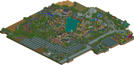
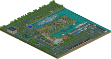
After 4 years in the making, it is finally finished. Welcome to Baker Lake Amusement Park; a family-owned park with a rich history. What started off as a small lakeside getaway, has evolved into one the Northwests' premier amusement park.
-
7 fans
 Fans of this park
-
 Full-Size Map
-
 Download Park
1,271
-
 Objects
1
-
 Tags
Tags
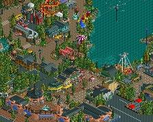
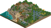
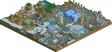
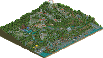
![park_4098 [H2H8 R2] Studio Ghibli](https://www.nedesigns.com/uploads/parks/4098/aerialt3844.png)
The good: this park proves that it is possible to make a realistic park that has an identity, as well as having the creator's signature all over it; something posix talked about in the Westwinds comments. Baker Lake feels like Baker Lake, not an imitation of another RCT park or a real world place (although of course there are some obvious inspirations, most notable in the launcher area). Aside from that, I think the park is quite atmospheric, has a lot of content for its size, and the ride line-up is in my opinion credible and nicely varied. Same for the theming, archy and other things: there's enough variation to make it interesting, but not so much that it becomes unbelievable.
The bad: finshing touches. I thought it was necessary to make the park minimally functional before you'd release it, which I did, but it's not up to me to name stalls and make alterations. I wish that instead of replacing the go karts by that horribly generic splash boat thing, you would've spent one hour just polishing the park. What I also don't like about this park are the colours and textures, often they clash horribly and seem random. This is especially true for the kiddy area, the boardwalk area, and everything around the arrow and mouse. Orange and red? Green and peach? Green and black? Orange and purple? Good lord. The farm area and the mainstreet were more consistent in this regard I think, they came together quite nicely (although that mainstreet is framed by bright blue awnings on one end and bright orange on the other, good lord). Also around the Togo the colours seemed to make more sense. Another thing I think was bad: the foliage. What an awful mix. At least you used it consistently... Although, almost too consistent. There seemed to be no difference between natural foliage (the forests) and man-made foliage (gardens, planters)... It was either thick forest (even in 1x1 planters) or nothing at all.
The ugly: the waterpark. I think having a waterpark makes sense for Baker Lake, but I wouldn't have done it like this. Dead, unconnected, devoid of life, small with half of the thing cut away. I would've left it out (more object slots to use for the park) or built it on a second map. Multi-map parks have gotten out of fashion, but this is where it would've made sense.
I'd vote 80% + yes or no. Whatever happens congratulations on finishing (again). Glad it's out of your system now, so maybe you can focus on new things whenever you have time. You've come a long way Coupon!
Agreed 100% with Liam on this.
Really wish you would have nixed things like the water park and maybe a couple of the farms or parking lot to free up more slots for actual park content. I do love how you gave this a real life setting with those aspects, but ultimately I think it (slightly) hurt the park. It made me think you were just rushing to get this out.
However, this is still a release to be proud of. Entrance is fantastic, as well as the Main Street. And the area with the flume/launched coaster was one of the best I've seen in recent memory. Overall, well done on this Coupon! Can't wait for your future works.
https://www.youtube.com/watch?v=T5EfBuor5tw
Excluding H2H, this is my favorite release since Starpointe without a question. Not only was the realism incredible, there were so many little, thoughtful ideas executed to perfection. Only complaint was the B&M hyper, which felt out of place.
FINALLY COUPS, goddamn, finally
For sure this is one of the better releases. 2016 will be a grand cru for rct and NE. It is fine to see a family owned park after seeing a lot of realistic chain parks. That you've succeeded to get this feel into the game is amazing. I love the archy and the colors, you've picked the colors so well and it helps the atmosphere a lot.
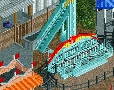
The Crop Duster must be the best themed kiddiecoaster I've seen in rct. Lovely! It's very noticeable which parks that inspired you. The Coal Blasters and its environment takes me back to Silver Dollar City which is one of the most (or maybe even the most) beautiful parks in the USA. And then the fair area, been to Kennywood It's nice to see some old fashioned themepark in rct.
Overall, the coaster layouts are very good. Coal Blaster is my favorite. But the Corkscrew and Tempesto are also very well designed. A special mention for the wild mouse, that must be the most original wild mouse layout I've seen in ages. The coaster line-up itself is also very good, it fits the park very well. Only thing is that Tempesto doesn't fit in right imo, a B&M hyper seems a bit unrealistic for a family owned park this size, but hey, Holiday World got a B&M launched wingcoaster so maybe we are talking crap Though I like Tempesto, even the way the station is cramped in, I think a nice GCI or even RMC woodie would have fit the park better.
You spent a lot of work on the outskirts and it helps the park a lot. So yeah, I really love it. Only thing that bothered me was that Tidal Wave seemed very rushed, you could have done it better. Does this deserves spotlight? Imo, yes. I would give it a 85% and a yes. The size of the park is not a problem for me, smaller parks can be more beautiful and more fun to look at than bigger parks. The quality of this is high, that's what's matters to most. And considering you have hit the object limit I don't think you could have made the park bigger. Seeing the other reactions, it will be on the edge. Whatever it will get, be proud.
I'm definitely going to post a video review of this soon.
A wonderful park with identity, atmosphere and beauty. I loved the colours, the ride layouts, the architecture and the overall pleasant feel of the park. I also thought the setting was very apt and believable, with a lot of attention paid to the surroundings .
However, the main thing I found myself enjoying - and it's not something I've really considered before - was the size. Again, it was believable considering it's a developing family-owned park, but I found it to be a very comfortable size for viewing. The park was large enough to display its style and atmosphere, but not so large that areas felt superfluous, neglected or, basically, a bit of a chore to examine. The waterpark area was perhaps "additional", being somewhat out the way and sadly deserted, but what was there was clear, colourful and well-crafted.
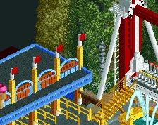
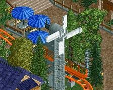
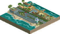
The touches of realism throughout were great, particularly the surrounding service road with all its path crossovers and gates, which I enjoyed looking at probably more than is normal. I also really enjoyed the area surrounding the lake. The wooden boardwalk was lovely, and I really liked the way the Octopus ride overhung the water, resting on its wooden structure.
As a minor negative point, I felt there was perhaps a slight misdistribution of objects. Given that you hit the object limit, I feel you could have cut down on the surroundings, such as reducing the car park, having some of the surrounding fields barren instead of lined with crops etc., and instead used them elsewhere. However, I know this contradicts my earlier comments, and I by no means felt that the park was lacking or needed expanding - I was merely commenting that, if the object limit was a hindrance to the construction of the park, it was partly down to misplaced/misfocussed distribution. I didn't judge the park on this though.
What I did judge the park on, and what ultimately kept it from being a Spotlight for me, was the hints of unfinishedness: the collection of handymen outside the park, the lone guard in a fenced area, the unnamed/misspelled rides, Steve walking on air etc. Given the immense amount of time that has been spent on this park, I found it strange that it was so carelessly looked over before submitting
Overall, I thoroughly enjoyed viewing this. It lacked certain "wow" elements, or anything that I would deem breakthrough (resulting in only a 90% from me), but I understand that's in-keeping with the park's style. For what it was, it was wonderful and full of character, and I am so happy to see it finally completed! Great work.
I don't think I've posted for this yet, hopefully I'll do so soon (besides this one). Man, you missed spotlight by just one 'yes' vote! Sounds like that platinum metal would fit in quite nicely for this park! Great job, awesome to see this park complete! Congrats!
James The Furry Offline
Platinum Parks would be great!! 85% +
how so?
One yes off of spotlight. I don't think anything gotten this high of a score outside of H2H and not one spotlight.
I really enjoy this. Easily the most interesting and vivid 'realistic' style park out there. The boardwalk area was great, as was the togo coaster. However what really stole the show was the area around the hyper and Coal Blaster. The hyper was just fantastic, the colours really made it stand out and the station was so good.
Coal Blaster and Log Jammer are literally some of the best Rct work I've seen. So full of atmosphere and so beautifully crafted. The rockwork around the drop; the stations for both of them; the diagonal tunnel; THE LAYOUT OF COAL BLASTER. So good, I could watch this area for so long.
Congrats Coupon on the Gold, I will do a detailed review when I get a chance.
But really... watching GForce's video review was so cringeworthy. So absolutely critical and very little praise for the great work that was put into this park in comparison to all the complaints.
Backhanded compliments everywhere. Complaining about the smallest things. Nitpicking. Even when he says he likes something he immediately says "I don't know..." and then launches into another complaint.
As valid as some of the criticism was, it's extremely excruciating to listen to 30 minutes of it when there's so much good to see in the work that you DON'T touch upon. Really exasperating to be honest.
From my experience, and preference, its much more helpful to hear a review of criticisms and complaints than someone saying "this is great" or "I love this" for 30 minutes. If someone just says they like everything, well, that won't help you get much better will it? Plus, I dont think Coups needs me telling him what is good in the park, he certainly knows his many strengths and all the things he can do well and far better than I can. Guess its all up to preference though.
I'm sorry but I agree with avanine on this one. He worked on this park for almost 4 years or so. I think he deserves a bigger pat on the back than what was given. I'm not saying you didn't like his work. I'm just saying that the review came off as harsh is all.
You already know how I feel about critiques and you know we both agree on constructive criticism.
I think it's your exasperated tone and overall negativity when you're talking that makes the whole video review very irksome. For example your critique on the backstage roads were spot on. But instead of saying straight up "your backstage area is a little convoluted, planning out the roads so they are functional would improve the backlot areas", you sigh and say "I don't know, it doesn't make any sense, but... *sigh*...I guess... I don't know".
It's overwhelmingly negative. Your compliments were almost like concessions. "Well, I DO like this coaster....but I don't know..."
I feel like I could almost hear you saying "ew" in your head as you go around the park and point out all the mistakes and things you don't like.
This should be a celebration of a great achievement. Critiques are always welcome as we are part of a very critical community, but they shouldn't overshadow praise which is always due for a park this great.