Park / Baker Lake Amusement Park
-
 07-April 16
-
 Baker Lake Amusement Park
- Views 13,533
- Downloads 1,150
- Fans 7
- Comments 59
-
-
 86.25%(required: 70%)
 Gold
Gold

Chocotopian 90% no disneylandian192 90% yes geewhzz 90% yes alex 85% yes Austin55 85% no Cocoa 85% yes inthemanual 85% yes Kumba 85% yes Poke 85% no posix 85% no 86.25% 60.00% -
 Description
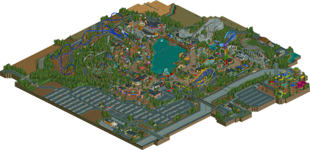
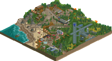
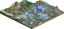
After 4 years in the making, it is finally finished. Welcome to Baker Lake Amusement Park; a family-owned park with a rich history. What started off as a small lakeside getaway, has evolved into one the Northwests' premier amusement park.
-
7 fans
 Fans of this park
-
 Full-Size Map
-
 Download Park
1,150
-
 Objects
1
-
 Tags
Tags
![park_4098 [H2H8 R2] Studio Ghibli](https://www.nedesigns.com/uploads/parks/4098/aerialt3844.png)
FINALLY
Starting off, the entrance is fantastic. The main street buildings and the tan park entrance are detailed great. The park flows really well too. Having the older rides in the front works really well. Corkscrew (typo? lol) has a great placement. I loved the details like giving Shockwave only 1 train, likely due to its age, the crop waterers, the parking lot.
The farm area is by far my favorite (I love the log flume/Coal Blaster interaction), although I see why you took so much time with the boardwalk part as well. I didn't like how many non-peepable rides were put into one area (boardwalk), plus the Fun House didn't work/couldn't open.
My only other complaint is that a lot of rides block the line of sight with a lot of other rides, giving the park a bit of a cramped feeling. Maybe the pacing on Tempesto and Golden Zephyr were a little too fast (I love the curved station on Zephyr by the way, although it could have used 3 row trains, and making sure there wasn't two trains in the course at once with better block timing).
I can see why you took so long with this park. Spotlight quality IMO
^Right! Came out of nowhere. Who is this "coupon"
wow, incredible work. the park has improved sooo much since you last uploaded a version of it. IMO it deserves to be up there with the best realistic parks.
outskirts:
I really enjoyed the outskirts here. The farms with watering things was spot on and really helped set the atmosphere of the park. the amphitheater was also excellent, as well as all the other buldings, roads, foliage, etc. the water park felt a bit random but overall the outskirts did a great job setting the feel of the main park
architecture:
spot on throughout the park. loooved the entrance and all the coney-islandish art deco work throughout the park. I'm also a huge fan of the foresty area with reminds me so much of silver dollar city. probably the closest I've ever seen to someone capturing the atmosphere of that park, so big kudos to that. there's a lot to see all around the park and it never feels awkward or strangely placed, it all just fits in where it should be.
rides:
loved the selection. zephyr was definitely my favorite, which was just a fantastic, spot-on layout. worked so well. I also enjoyed the togo looper, haven't seen that before! the powder-keg style ride was also excellently worked into the thick foliage, just right so you could see it but also still have that wooded atmosphere. great job. there were also a ton of flat rides here, worked into the park and landscaping excellently, as well as a few great custom rides. definitely a strong suit here
atmosphere:
as I said before, the park is brimming with atmosphere which is a bit special for a realistic park. It feels like somewhere I could be and I could imagine loving this park in real life. you did a really good job with foliage with definitely helped frame the park being in seattle as well as set the classic smaller-park, lots-of-trees vibe that feels so nostalgic.
realism:
pretty top notch everywhere. lots of little details like the golf carts, extensive backstage detailing, etc. I'll probably need to check it out more to find everything
misc:
park layout was pretty solid and the park really comes together as a whole. I wished you'd properly named/checked your rides though, as there's a lot of 'miniature railroad 1' or 'ciorkscrew' . overall it feels very polished and finished though, which is very impressive considering you hit the object limit!
I owe you a full review but at first glance this is fucking outstanding.
As far as realistic parks go, its realistic on a ultra micro sense in that if you look at each individual aspect in a vacuum it is very realistic. Some of the rides are executed incredibly well, (Togo and Premier), while others are pretty horrible (Tempesto and Tidal Wave). There are some really awkward moments with backstage roads as well, especially under Tempesto and the Togo, making them kind of pointless.
Also, the S&S swing doesn't have any swings, whats up with that?
However it seems you approach the game, or at least this park as an additive entity. Attempting to put as much content and stuff on a map as possible to drive up the "quality" of the park. While it could work its gone way to far here. Some of the rides feel completely forced and not believable for the location or the type of park that this is. The water park, while nice, is completely separate and dead compared to the rest of the park, which kind of drags down the overall quality.
Macro wise there are a lot of things that kind of ruin the park, the lineup is not believable at all for a park of this size, especially one that isn't a chain. The fact that this has a Premier, Mack, and B&M, make it pretty non-believable for a non chain park, and like I said earlier, even more so for one as tiny as this. If a park is trying to be realistic and also trying to portrey a style of realistic park, it should at least feel like that sort of park outside of the most micro of viewpoint.
You have obviously outstanding skills in this game, the architecture and theming is fantastic in a lot of areas, especially around the log flume and Premier. However, this park comes off as something make with almost no understanding of the content being put into the map, which I think its important for realistic parks.
Its just a bunch of really nice things shoved into one small package that doesn't make much sense as a whole. To be honest, I probably would of liked the older version better if it had proper surroundings, peeps, and some of the updated architecture. Other than that I feel a lot of the stuff you added feels more like a side grade rather than an improvement. Its all nice surely, but doesn't add anything to the whole.
Despite all of this, I can't not applaud the effort and skill that has gone into this. Its still a great park, a 75-80% from me.
Video review will come this weekend, or next at the latest.
Anyone who critiques the size of this park should remember that it hit the object limit.
G Force, I'm not sure I agree with you about the park's believability. This lineup is not far removed from parks like Kennywood, or Herschend parks, even whatever that park in Idaho is called (sorry itm... ). the rest of your review is your own opinion but I'm not sure this is really a fair criticism. there are parks in the us which aren't cedar fair or six flags
Kennywood and Hershend parks are all chain parks though (or at least operated by companies who own multiple parks), which allows them to have larger rides like B&M's etc.. All of those parks are much larger, even Kennywood, than this. This is extremely dense with coasters for its size, that's just me though. I have no problem with it not being a chain, just that it isn't believable to me as a non-chain park.
ok here are ur options if u make a chain park:
-six flags (make it intentionally shit)
-cedar fair (make it sylistically similar to starpointe and never get spotlight)
-herchend (still a SHITload of work to do, not as much as busch or disney but close)
its bullshit that "hey i made a park its good and i didnt wanted to be constrained by the molds that i'd have to fit under chain parks" isnt realistic.
this is some of the most refined stuff out there tbh.
That entrance is so so good.
@ Austin; Size of this park is indeed a valid point of critique in order for this to be spotlight imo, as the majority is just farm fields, parking space and forest. Also, the point you raised about him hitting the object limit and that validating that the park is large enough to be spotlight is invalid, as I can point out a couple of ways to save tons of object slots (for example on the farm fields and parking)..
I'll check it out more ingame soon, but it seems a nice park, right between gold and spotlight again. Get this damn platinum category going already!
Great job getting this done over such a long time to this standard coups
Louis did a great job on the woodie layout and that corkscrew. Best layouts in the park, alongside the Togo and the wild mouse. I'll give this a more thorough review once I have the time to dissect this.
I checked this out in depth last night in-game but I'm writing my review from the overview so if I forget a few ride names that's why...
Anyway Coups, this is remarkable. the architecture was outstanding, it was a great display of realism and unlike some recent parks it was full of color, life and had a tremendous fun-factor to it. This is what RCT is supposed to be.
This really felt like a small, American park. A Lake Compounce, a Rye Playland before it went to shit, a Canobie Lake, a Holiday World on a smaller scale... you nailed it.
I don't even know where to begin with this other park so I guess I'll start with the elephant in the room... Tempesto. Personally I wish this ride wasn't here. The rest of the park feels like a small-budget park with small-budget coasters and solid flats and I have a hard time believing the park would be able to afford a B&M hyper, even a small one. It takes away from the believably that you worked so hard to inject everywhere else BUT I'm okay with it. Holiday World does have a B&M wing rider, it's a small hyper and most importantly you built that ride for you. It's obvious you wanted it and if that's what it takes to make you happy with the park then go for it... having fun is the most important part of this game and it's not THAT farfetched I guess if you're really open minded.
Really though everything else is perfect... as far as rides go I love Blue Canyon. I remember not liking the pacing but you must have either sped up the launch or the simple addition of peeps fixed that issue. I love the station, I love the interaction with the flume and the brake run area is one of my favorite things about this park. It always has been...
Golden Zephyr fit perfectly. I love the curved station, I love how it was so central to the park. A ride like that would be the star of a park like this... Yankee Cannonball, Dragon Coaster, Wildcat at Lake Compounce. An old, classic wood coaster that's been the centerpiece of the park for generations. The layout with slow elevated turns and the area around it really made it feel classic. Great stuff here.
Pacific Coaster was great. I liked that new mouse style and curved drop. It fit that spot perfectly and it's nice to see such a unique approach to a mouse.
The arrow was nice also. The supports were true to the timeframe (thanks for not doing that impulse thing over the corkscrews for a change). It was a nice little ride and I appreciated the lack of a transfer track and single train. That's a very small-park thing to do. Just like Canobie Corkscrew or a similar small park arrow.
And honestly the star for me was Shockwave. You never see this type of ride on NE and you pulled it off great. The layout is very authentic and clean. I like the fact that since it's a small park they totally gave up on the second train. I love the loop because combining the sit down looper track with this track made it look much more like a Togo loop than the game default (that was brilliance) and the trick track like on the CW ride really sent it home. You picked ugly ass colors that somehow look awesome. Seriously... this ride is perfect and you get bonus points because nobody ever builds these. Excellent, excellent work!
Aside from the coasters you had some great flats that were not only technically impressive but they added splashes of life and color that really put this park over the top. I love the ring of fire, the rainbow and the top spin. Colorful things like the old style swing ride and the S&S tower added great atmosphere to the park.
Aside from this there were great little details everywhere. The tractor, the climbing wall (which was really great), the Ropes Course. The theming around the S&S swing... Seriously... I loved all of it.
The architecture was awesome too. I still think this is one of the best entrances in RCT history but architecture was consistently good everywhere. I actually really liked Tempesto's station also which is the best part of the ride.
Sorry I had very little to actually critique but I loved this park. It's a tremendous example of realism but shown in a unique way. This was stunning, if it doesn't win Spotlight that's a crime. 90% from me. This is what RCT is all about.
I don't think I have ever seen a park that was this good and this bad. Most of the park was amazing and then some little things were just so fucked up I laughed.
The Good:
- Details! This park has some details that are on a DAW level. To me the look of this park is kinda the best I have seen in this style and tops Starpointe.
- Coal Blaster was awesome, just didn't like the supports sticking out. The Q and exit was really nice.
- I love the screaming swing (just where's the damn ride itself?) set in the barn with the biplane and silo.
- Very nice entry area and I love the diagonal bend on it. In general you did well adding diagonal elements, most notable the drop on the wild mouse.
- Great amphitheater and I also really liked the little seating area on the lake.
The Bad:
No. It's not...
- Enterprise 1 pretty much sums up all the most disappointing things in the park for me. It has no name when most others have a name, manufacturer and year. The peeps don't just walk through the Q rails on this, but also magically walk through a wall right before the not-rotated entry hut. The floating invisible Q entry sign is visible, tho everyone seems guilty of that these days.
- The water park is a ghost town. 0 peeps and no naming. At first I thought it looked really nice, but now I feel it's kinda pathetic.
- Not a huge deal imo, but a lot of things in this park look like recycled Pac work. Still, you did it well.
This was a very hard vote. I hated the lack of finish. I mean, after years of working on this you send it in with a staggering amount of mistakes that your testers/co-builders must have mentioned. It's very disappointing to see, I mean I spent the last 6 months combing through Logos to make sure it functioned at 100% and you seem to have made no effort at 100% finish. The object limit is not an excuse in this case like it is on BGA. You had like a 40x10 unneeded parking area you could have removed.
However, I realize those are smaller picture things even if they really bug me. Big picture is a wonderful lakefront park that is built at a very high level. I was very on the fence with my spotlight vote here, but went 85/yes.
Great stuff and way to show why I though you were a steal with the 25th pick in H2H7
It really sucks to see so many pretentiousness here.
Is it necessary to argue in such detail about a manufacturer and the question if a park this size is allowed to have one of those coasters? Come on guys.
Sorry to use you as an example, but G Force, you wrote a review of seven paragraphs, and you used only one sentence to describe what you thought of the content, the rest was all about manufacturers, believability, vaccuums? micro sense? additive entities?? Did you enjoy the park? Did you like what you were looking at?
Every park nowadays has a stream of comments that talk about believability, manufacturers, chain parks, accolades, new rating systems, just look at the freaking park guys, that's where the builder has spent time on.
Coupon, I loved this park. I especially liked the architecture. Quirky and colourful, just how I like it! I also loved all coasters. The B&M layout was pretty good, although I thought the station area was a bit too cramped. The TOGO was pretty cool as well, I love how ugly those rides look, well done.
I think you could have done a bit more with the lake itself, now it looks more like an inconvenience that you built around instead of something of added value to the park and its guests.
Entrance area, as was already mentioned, is also top notch.
80% for me, congrats on finally finishing this!
I always really liked the first version of this park, I'm so glad you expanded it! The surroundings are very well done and add tons of atmosphere. Also, kudos for building a Togo!
This is a fantastic little park. Everything from the outstanding entrance, to the incredibly detailed back-of-house lot, to the neatly and timely placed ride layouts. I know I don't post here, like at all haha (just got RCT up an running on my mac... been out of the game for 6 years), but this is the first full blown park i've been able to see in-game in a long time and it is just brilliant.
I'm a complete sucker for realistic parks because I love that feeling of "yeah I can totally see myself walking there or riding that". The architecture is one of the biggest highlights in this park for me.. you really pushed the object limit on that, but it is so worth it for all the little details (i mean the golf carts for staff, the rock climbing wall, the ropes course, the mine train exit path, and just about everything in the boardwalk/arcade area). Baker Lake is a great achievement.
Though there could've definitely been some improvements here and there, I think it goes without saying that this is Gold worthy, if not Spotlight. Here is a small list of pros and cons:
Pros:
- The entrance/main street is PERFECTION.
- The whole island of Crop Duster, The screaming swing, & restaurant.
- The neatly placed Tempesto as if you can tell it was squeezed in there in the later years of the park and built on the outskirts of the park.
- Golden Zephyr's layout was very well paced imo.. fantastic layout!
- Everything about Macklemouse/Pacific Coaster & Everything about Corkscrew (the colours of both pop perfectly against the backdrop and support work is great!).
- The old school TOGO!! I already miss Skyrider from my hometown park Canada's Wonderland lol
- Crop fields and sprinkler system
- Amphitheatre is also amazing
- I feel it doesn't get mentioned enough, but great work on all the "behind the scenes"/"back-of-house" roadways and dumpsters and whatnot
Cons
- Park layout in general could've been more creative (lake with wraparound path system is almost too typical nowadays.. realistic yes, but there is definitely room for creativity)
- Hate to repeat others, but Enterprise 1. Why was this not named?
- While amazing, the parking + highway weren't really all needed.
- The waterpark was very bland and small (maybe it extends more off map)... sort of wish there was some music going on over there too.
- Wasn't the biggest fan of the Coal Blaster layout (but land interaction was great)
- Not enough peepable rides... sooo many great custom flats, but I wish I could've seen more rides in action.
- The shoot-the-chute just sort of felt "there". Maybe this was the intention, but it was a bit of an eye sore at the back.
Everything else was great. Congrats on the future accolade and best of luck!! Also congrats on finishing! I have definitely seen this park many times throughout the years so i'm happy to see you finally complete it! well done
High Gold and a well respected park for the ages. 85% for me.
Imo, the best realism release in a long time. Yeah, personally I think the unfinishedness means this doesn't deserve spotlight and sorta let you down a bit.