Park / Spiritwind
-
 28-March 16
- Views 4,783
- Downloads 659
- Fans 1
- Comments 39
-
 66.25%(required: 65%)
 Design

Louis! 80% geewhzz 70% Kumba 70% Liampie 70% posix 70% Cocoa 65% nin 65% alex 60% Chocotopian 60% csw 55% 66.25% -
1 fan
 Fans of this park
-
 Full-Size Map
-
 Download Park
659
-
 Tags
Tags
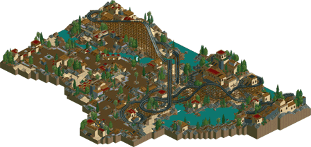
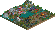
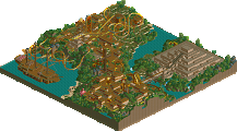
![park_4217 [H2H8/8] MS Office Suite 2003 Resort](https://www.nedesigns.com/uploads/parks/4217/aerialt3972.png)
It reminds me so much of Nagas.
And thats why I keep coming back to this, its gorgeous <3
I'm very glad you like it so much Louis
Interesting one this. Landscaping/rockwork was perfect, you captured that barren feel beautifully. Shame so much of it was borrowed from Posix - it seemed to be a mix of Nagas and the dark area in Audrix towers, with a touch of the arabian area from Kronecraft mixed in too. Nevertheless I thought the architecture was sufficiently your own and looked great, particularly the station. Coaster was decent, nothing special. Quite a nice overall shape/footprint for an out and back layout. I think it needed to be faster over some of the hills and through the double turnaround at the back, this would have made it more impressive. Good macro design - the composition was nice with big flowing paths and the colour scheme was strong.
Overall it's an attractive and atmospheric park but didn't hold my attention for too long - partly because it's a poorer imitation of posix but it also just lacked interesting details and ideas. A stronger layout could have potentially lifted it into design but I'm afraid I gotta vote this 60, sorry Poke. Seems like this was a useful exercise in minimalism and composition anyway - I hope you keep building and at some point you combine this with a style that is more your own (and create a new solo!).
How to win design on NE: 100% copy some ones style and tickle peoples "Nostalgia" bone.
I kinda like it...
It's not perfect, and I think the score is about right, but just about every single thing made in the last few years is derivative in some way. The problem is compounded in LL as there is no possibility to add new rides or objects. I think the fact that it feels like something from 2004 is new in itself. There's no need to get hostile over it.
I have no problem with things that aren't 100% original, obviously. I do have an issue with people praising something like this for being nostalgic and copying another players style completely, while also railing others for doing the same. Favoritism is something that's always been an aspect of NE, obviously, but when it becomes so blatant that it ruins a whole aspect of the site, it can be a little frustrating.
All I ask for is a little objectivity and consistency, I mean it is a panel right? Isn't their purpose to give objective scores for a park? If that's not them sorry I have misunderstood for the past eight years.
I don't think there's anything to get upset about, 66% is a very modest score. The lack of originality in style probably hurt the score a little, isn't that exactly what you want? If your opinion is that parks that copy someone else's style shouldn't win accolades at all, then Westwinds shouln't scored 45% or something like that. Westwinds was more Pacificoaster than Spiritwind is Posix. Where would the objectivity be in that?
edit: Look at the scores the panelists gave. Pretty consistent. Do you see any friends of Poke that scored absurdly high compared to people that aren't friends with Poke? Can you make the distinction between friends and non-friends at all? Favouritism, come on man...
for like five months the guy that owns the site's server brought your park up in every thread for every gold park
That's kind of the thing though, its a mainstream style, its not like your are specifically mimicking one builder. I mean, Starpointe if far from all original either, there are quite a few rides and buildings that are near exact copies of elements in other parks. To start the blame on one specific park for a style that is mainstream is a little unfair. And you say that super realism isn't a difficult style? I remember you always say it is easier to build with themes, meaning it would probably become increasingly difficult to build the less theming there is. I'd definitely agree with this, building themed areas in WoF was far, far easier and faster than the bland and theme-less areas of Westwinds.
Granted, I think my problem lies more with not understanding the appeal even past the stylistic mimicking. Its alright, but even if it was completely original, I highly doubt it would have gotten Design. Seem's to be a lot of the appeal people see in this map is not its quality, but its very good stylistic copy of another builder. I mean, perhaps its cool to see something like this, but I have a huge problem with people liking things simply due to nostalgia and references. This goes for anything, movies especially, which is increasingly something that we're seeing a lot of. Content that is nothing more than a reference to something that can bring nostalgia to the viewer, or appeal in familiarity to a once common style.
Not a huge fan of this, there wasn't much going on. Congrats on another accolade nonetheless.
It doesn't tickle my nostalgia bone. I just like this style. I don't consider it to be nostalgic. It is simply built in a style that I appreciate and enjoy viewing.
I don't get how people can claim favouritism, its not like Poke is part of some outside group of people that constantly bitch about what goes on at NE, and has all of those people on the panel scoring him highly.
I thought we decided at the last IllumiNEti meeting that we were going to make Poke the next LL superstar.
I just realized I downloaded this, watched it in game and never commented on it. Sorry about that... I suck. lol
Anyway I really enjoyed this. Loved the pacing and flow of the layout. This type of thing really wants me to pick up LL (for the first time in almost 15 years) and build something. Now all I ever do is use it to view other people's work.
Great atmosphere here and congrats on Design.
Personally I don't think innovation should be necessary to receive an accolade. Solid work is solid work, whether it presents anything new or not. While perhaps not the most exciting design ever, this is clearly accomplished work. And it's not like the score is outrageously high. To me it seems unfair to just dismiss this park, and the panel's opinion of it, as nostalgia. They're both part of a more complex discourse.
I think one of the greatest things about NE is that there's a history of styles, it's like a miniature art history. The fact that we can recognize and have arguments about different RCT styles past and present, and about the point in reviving old styles instead of trying to break new ground, is really very interesting. There's a certain beauty in the way we are aware of the site's stylistic heritage, and in the way this awareness is expressed through pieces like Poke's work here and the score it got. To me it seems the score reflects not only the panel's knowledge of and shared appreciation for Poke's influences, but also a serious consideration of how his work compares to those influences as well as to other contemporary RCT work, by Poke himself and others. Nostalgia may have played a part, but if that had been all there was to it I think the score would've been much more inflated.
G force it's fine if you don't like this design but understand that that it is your opinion, and not fact, therefore it does not mean that other people aren't allowed to enjoy and appreciate it.
Thanks for the accolade guys.