Park / Spiritwind
-
 28-March 16
- Views 4,379
- Downloads 545
- Fans 1
- Comments 39
-
 66.25%(required: 65%)
 Design

Louis! 80% geewhzz 70% Kumba 70% Liampie 70% posix 70% Cocoa 65% nin 65% alex 60% Chocotopian 60% csw 55% 66.25% -
1 fan
 Fans of this park
-
 Full-Size Map
-
 Download Park
545
-
 Tags
Tags
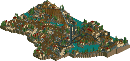
![park_4217 [H2H8/8] MS Office Suite 2003 Resort](https://www.nedesigns.com/uploads/parks/4217/aerialt3972.png)
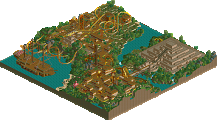
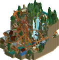
Since I don't have LL I can only comment on the map, but that's a great woodie layout Poke, I love the footprint you've created here. Your atmosphere is an interesting mix of a rocky desert kind of feel, and I love how you've integrated the buildings into this setting with the coaster, very nice interaction. Great design bro!
I thought this was a lovely little layout in a nice environment. Reminded me a lot of posix, had a very relaxed but mysterious atmosphere and felt very intentional. The layout had some really nice symmettries and stuff which made it very pretty also. Good work all around- nothing groundbreaking but still some good LL work.
Almost all of this feels 100% Posix with a touch of Iris. The rest, mainly around the turnaround and on the far side of the coaster feel like you're attempt to copy their style, meaning the forms and planning seem like you're work, but in their style.
Not quite design worthy, perhaps a 60% or so. It's not bad, but intentionally building in 2003 style and bringing nothing new but a few modern details isn't enough to warrant Design. The layout wasn't your best either, both the wooden coasters in your past two full parks were much better.
Where is it written that designs must be modern and innovative?
(please, correct me if i am wrong poke. this entire post is based off of an assumption. i am also going 100% off of the overview as I do NOT have LL installed as of current.)
I love seeing master studies, and this is clearly one of posix. I feel that, while you got a lot of the superficialities right, some of the more basic stuff about his work I missed. I feel that the composition isn't nearly open enough nor was the structures you've built all entirely deliberate. This, I feel, is key if you are going to learn anything style-wise about posix. Still, I felt that you got the "make buildings feel like buildings and not 2x2/2x3 blablabla" right, though there was too much emphasis on creating facades than structures as a whole. I liked most of your design choices and the general flow of the ride seems well. I think to end this, I'll quote something corkscrewed said about natelox's work except that in this case with posix even rings more true:
Now, outside of that assumption, what you made was good, probably design-worthy. But still, what seperates people who are good and who are great at this game is the level of thought executed. You've, of course, fleshed that more out with your full-scale solos, but this doesn't ring as well as me.
I have a photographic memory lmao. Corkscrewed's post on natelox's pt1 park.
I love how someone else's release generates feedback on my work. Beautiful Corkscrewed quote. Nate was much more gifted at RCT than me though.
This reminded me of Nagas and the area I did in Audrix Towers. Poke, it's always heart-warming to see someone devote to the style we both idealise. I do agree though this wasn't your strongest work. I felt it was underinspired and a bit loveless. I know concept or reference never matter much to us, but I did force myself back in the day to incorporate a bare minimum, and it helped. Especially with naming things. Still, we are "Art for art's sake"-Romanticists. So build what you want and what you feel.
Oh, get a room, you two!
LMAO csw.
bsg & cocoa: thank you for the compliments.
g - force: you seem to critcise me for not being innovative yet build in a completely uninnovative realistic style so...
Liam: I felt I needed a big structure cause there's not really much exciting in this design. And you know it is me and all...
shotguns: yes this was heavily inspired by nagas. I wouldn't really call it a master study as such, I just really like the quick, almost careless style in old LL. That's why it may lack some deeper thought and compositional choices.
posix: All your criticisms are valid. As said before, Nagas was my main inspiration. it was probably underinspired as it was rather experimental.
csw: you're just jealous.
I critizise you for this because of two reasons. Firstly, so you seem to bank this designs appeal completely on the nostgia for the old style, rather than the actual quality. Secondly, and more importantly, you have the talent to be innovative and do really interesting things yet chose not to, I dont think I have that talent.
Not necessarily, but if it was someone who doesn't constantly copy old styles and rely completely on that style for the map, then maybe. My reason for giving this a 60% are separate from me thinking he has the talent to do better. The reason this is a 60% for me is because its not design worthy, mostly because of the fact the style is old and it doesn't match the quality of recent LL designs.
This design is spot on. Just pure atmosphere and top notch quality.
Another great release Poke! Keep them coming buddy!
saying that a certain style is objectively worse than another is very risky waters, russ.
I love this. Its simplicity is only overshadowed by its lovely atmosphere.
A well structured coaster with some lovely interaction and an interesting theme.
However, I felt as though you were throwing back to an era before my time, and as I therefore don't have any nostalgic attachment, this mostly came across as rather dated and simplistic to me. Additionally I can't say I was too fond of the rockwork, which dominated a good portion of the map. It's not that it wasn't suitable or attractive, but it's a style choice that I consider to be a bit of a cop-out in that I believe creating it doesn't take much expertise or planning, i.e. it's hard to get it wrong/anything looks right. As said, it suited the theme well, and the coaster traversed it beautifully, but given that it took up the majority of the map, this held the score back a bit for me.
As a positive point, I certainly liked the coaster which I thought had good flow and pace, if maybe a little slow over the crests but that didn't really detract, and I imagine it would give guests a good opportunity to view the park... shame there were none . The random spots of brown track were a curious choice though - what was the decision behind that?
I thought the architecture was nice, particularly the largest structures and the smaller 1x1 buildings. The red paths worked well in bringing some colour to the area, and I thought the ruined monuments fitted the theme. I enjoyed most of the foliage too, with the shrub/flower combo lining the path neatly. I thought some of the tree choices were a bit illogical though, mostly due to the mix of palm, oak and fir, but the palette suited the area and their placement made sense.
Overall, I'd say a lot of thought went into the actual coaster, but I wasn't overly impressed with the bulk of the surrounding landscaping. As others have mentioned too, I didn't feel that there was anything new with this, which while not necessarily a bad thing, didn't keep me intrigued. Usually, I am very fond of your old-school style, but I believe that is because you infuse it with creative ideas and a fresh approach. Here, I felt rather underwhelmed. A decent coaster, but only 60% from me I'm afraid.
g force: stop acting like you know everything. I like the old school LL style, and it's fun to play and that's it.
disney: glad you liked it!
choco: the brown track was meant to represent rotting. Yeah, it's understandable this is quite underwhelming; it was more experimental rather than anything else which explains why it's not really creative or interesting.