Park / Skylands National Park
-
 26-March 16
-
 Skylands National Park
- Views 5,263
- Downloads 707
- Fans 16
- Comments 24
-
 75.63%(required: 70%)
 Gold
Gold

Liampie 90% nin 85% Austin55 80% Louis! 80% Chocotopian 75% Cocoa 75% geewhzz 75% Kumba 75% Stoksy 60% posix 55% 75.63% -
16 fans
 Fans of this park
-
 Full-Size Map
-
 Download Park
707
-
 Objects
1
-
 Tags
Tags
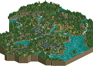
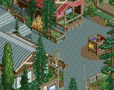
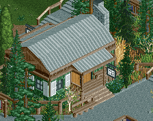
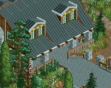
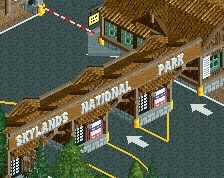
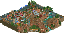
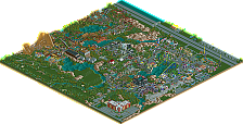
![park_2849 [PT4 R5] Fox Glacier National Park](https://www.nedesigns.com/uploads/parks/2849/aerialt2502.png)
Great park. I'm not really an expert on foliage or landscaping, but I did enjoy both of these aspects very much. But, most importantly, it took me back to actually walking around in american national parks, and that's what it's supposed to do, right? Great park.
Great landscape and architecture, probably one of the better we have seen in this category. TBH I almost like this better than wasteland. Hope you build a real park next, you have a great style and potential.
I think this is more bronze/silver due to the size and content level than gold though. 88% for a Pro Tour sized map with just landscape and some buildings is a little insane.
Yes, this definitely shows some awesome skills. Almost every screenshot you released got NE excited! I'd agree with G-Force and say it's in the low silver range as well. Really nice work!
Have you ever built rct parks with rides before?
Beautiful. Massive fan.
This is excellent. A great idea executed incredibly well. Your landscaping is probably second only to RRP.
I think this park is deserving of some sort of accolade, yes. However, I think this park's biggest flaw is it's missed opportunities -- mostly opportunities to add some LIFE to this thing. Peeps would help tremendously. I also thought it would have been cool to include shops in the buildings, even if they had signs on them on not. Maybe even some horses in the field where the little barn is? Then you could have made a horse back trail using the steeple chase ride. Maybe even a bike shop would have been cool and you could have had a bike trail and used the cycles ride. Just little things like that really could have brought this to the next level.
Still, a great park. Had a great time exploring the landscape and following all the little trails and platforms and such. Can't wait to see a full blown amusement park from you.
Oh yeah I have made plenty, but I never have the motivation to finish them. I always get really into the game for a month and then stop for 6 months. I posted a screen of a wooden coaster I was working on,a while back, that will probably be my next project.
In your project description you say:
"I am not basing this off of any particular park but rather it will hopefully feel like a "greatest hits" collection of features from all the American and Canadian parks I have visited"
Sorry, while I don't know exactly what parks you have been to, I just don't think you did it. It's a great park, but has no true standout landmarks. Yellowstone has Old Faithful, Yosemite has El Capitan and of course Niagara Falls National Park is self-explanatory. If you had something like that, this park would slap people with a lot more wow-factor.
Also, underwater hacking will glitch if it's not shallow, like 3-4 water tiles down at most.
While I feel you could have done those things much better, this is still outstanding work. The small detail on your buildings is fantastic. Your landscaping is clearly amazing and I love that you did all of this with none of my damn 1K Ruins that people use to death these days. I love the waterfalls and guess they would be the main draw the park has to offer. That tractor... so great. That's the type of thing I love to see. This park is very well thought-out and that's a great realistic touch that most people might never think to include.
Really looking forward to whatever you do next!
Beautiful landscape/setting but these kind of creations don't really appeal to me unfortunately. Same feeling as with Wasteland, no idea how to vote on this.
I'm not personally put off by the lack of movement that everyone else is, as I feel that is part of the intent. I think that critique in general is rather normative. That being said, your landscaping is up to par with RRP's, and your architecture is really tasteful. I love the use of the stone deco objects to make new and better textures. I will agree with Liam on the fact that the beauty of nature sometimes derives from the "unexpected moments of wildlife".
I also have to disagree with Kumba in the fact that the lack of landmarks actually makes this more special. More parks achieve better results with nuance than they do with brute-force wow factor. How well thought-out this is, alone, makes this deserve gold.
A truly beautiful piece of work. As others have said, the landscaping is excellent, and I liked the way certain areas became subtly more prominent as I viewed them, such as the marsh-like area.
I'm unsure where I stand with regards to bringing life to this though. While I think cycles would've looked good dotted around, or perhaps a single boat travelling round the lake, there was something attractive about the stillness, with just the waterfalls and occasional ducks bringing natural movement to the scene. It was like looking at a moving picture. The silence only added to this, but when the rain started, it really brought something special to the scene. Incidentally though, I feel that you could've used sounds to your advantage, and placed a couple of hidden rides to play custom music. Just pond noises (ducks splashing, fish swimming at the surface, water trickling etc.) or general forest ambience would've gone down really well, I feel.
Forefront contender for #BestLandscaping2k16
This is absolutely stunning!
wow, this is beautiful work. hard to sort an accolade to, but just beautiful anyway. You've done an amazing job with the landscaping, that looks like a lot of effort! There are tons of realistic trails and small details that really make this feel like a real park to me (I like the sunken boat!) So many beautiful waterfalls and little bridges, I'd love to come here in real life. And the scarce buildings are wonderfully done and just balance out the nature very well.
now do this with a whole theme park please!
I do like the foilage and landscaping. The buildings that are there are good. But I do think Wastelands is better. Ofcourse they are different, but they both go about landscaping and foilage. And here I was finished in 10 minutes. While Wasteland took me alot of time to explore.
The waterfalls were great, but the overuse of 1k landblocks everywhere is unneeded in my eyes.
Good job.
Also, I agree with G Force.
So much good stuff coming out recently. I have to say though, I'm very surprised something like this made gold. It's great work, totally my thing, and I love it, but I feel like this fits more with the old, now-defunct Concept Creations than a full-blown park.
I don't really have anything to add to what others have said. I think Chocotopian had some good points about details like a lone boat and working with sounds.
As for accolade, it's certainly Gold standard in my opinion, but to think slightly outside the box for a bit, why not Design? It goes well with the wording in the Design accolade's description :
The landscape of course being the main attraction here (it's also easy to imagine this as just a small part of a larger park). Extending the Design accolade in this way eliminates the need to bring back the Concept Creation category.
It got gold though, which is a good fit in my opinion. Mintliqueur makes an interesting point about the design category, but I think allowing parks like these into the design category the lines between the two accolade types starts to blend too much.
Anyway, congratulations mykeiscool! Excellent debut. I hope we see much more of you.