Park / Six Flags Great North
-
 30-March 16
- Views 12,422
- Downloads 1,287
- Fans 4
- Comments 40
-

-
 75.00%(required: 70%)
 Gold
Gold

Louis! 95% Austin55 80% geewhzz 80% Cocoa 75% Liampie 75% nin 75% posix 75% Chocotopian 70% Stoksy 70% Poke 55% 75.00% -
 Description
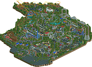
Finally I achieved to finish my second and also my last park.
I've got no idea for how long I've been building on this park. As I haven't been to the US or any Six flags parks I created the full park by looking at pictures of several rides and by the use of google maps.
You will notice that not every ride is popular under the guests, I tried different ways to get more peeps into the attractions but didn't succeed.
(Watch out the brakes at Mr. Freeze might fail after a while, Close and reopen the ride after it's been repaired.)
As it says realism it doesn't mean I worked out every detail but tried to make it as "RCT2" real as possible.
The park includes several custom rides:
Peepable: BungeeBall, TheJoker (swinging ship), Frisbee.
Not peepable: Giant Ferris wheel, Small kiddie ride, Turbo Bungee, SkyScreamer.
The park counts a list of 8 rollercoasters, 2 water attractions and one dark ride.
Six Flags Great North (North Carolina)
Surrounded by forest the park includes some Iconic classics as the Batman coaster and Mr. Freeze.
Wonder trough the park and shop along the small stands and watch the beautiful flower gardens.
Get a great view by taking a spin in the Giant Ferris wheel, for those who aren't scared for dazeling hights, swing above the park in SkyScreamer.
But most of all Enjoy Six Flags!
Hope you like it ! -
4 fans
 Fans of this park
-
 Full-Size Map
-
 Download Park
1,287
-
 Objects
1
-
 Tags
Tags


https://www.youtube.com/watch?v=RjS_lwmU7EI
while what is there is technically solid it's just so lifeless and sterile that I don't think this deserves spotlight, it's gold material for sure but it lacks any form of wow-factor, some fun, some life to be counted with the truely greatest parks of all time, if this gets spotlight I fear many more technical parks to follow suit and shy away from originality...
It's utter sterility and heartlessness was almost appealing in a strange way.
Apart from that, I honestly thought this was quite poor. Sorry.
its almost like he's exaggerating six flags so much that he's making it too over-the-top bad in terms of park layout etc
It's a gold. I do feel like in order to build (and to properly rate) a chain park, you should have went there.
We did have a Six Flags park over here!
Easy gold imo. Nothing more, nothing less.
Well, i'm happy it got Gold. At least we have a new accolade that didn't just get the wrong category.
Congrats on the gold, just a perfect score for this park! Fairly consistent voting besides the 2 insane high and low votes. Crazy Louis! and Poke.
This is obviously very good on a technical level. I wonder if perhaps this kind of realism is starting to feel formulaic? I'll have to think about this some more.
Louis likes this style. When I opened it I immediately thought of Pine Hills Orlando and he voted high on that one too.
Everyone likes different things, kind of like how I'm in love with parks like Westwinds and Starpointe which is realism but with tons of atmosphere. Some people like "ugliness by design" which is an impressive art form in itself, it's just not my thing. I can appreciate that about this park though, I just wish the other realistic details (like layouts) were there.
Still, congrats on gold!
This is an interesting discussion and there seems to be a WIDE range of opinions from perfect (Louis) to low silver (Coasterbill).
I mean of course every person has different criteria with which they judge a park, so it's not surprising, but I'm wondering just how much value do we put on atmosphere, technical details, and planning?
This park seems to have a very high level of detailing and overall quality of construction, but it suffers from lack of atmosphere, lack of planning, and lack of realism for a realistic park. So how much do we penalize those faults and how much do we praise the great work overall that's done?
Overall I really do think this park is very well constructed, but that's just because Gijssie is talented and produces very clean work: the amazing custom flats are a testament to his creativity and polish. Then again, the serious lack of planning and the issues that others have pointed out makes me think it was more a stream-of-consciousness building method than a drawn and plotted park. Which to me is fine if you're building semi-realism or fantasy, but IMO it does NOT work with a realistic park. Realism requires meticulous planning to make sure path layouts make sense, ride layouts are realistic and buildable, ride placement is extremely important, etc. Those seem ill considered here, where you have choke points, dead end paths, strange layout choices, and overall a very unrealistic park that's been rendered in a highly realistic style. Such a weird mix. That's a real bummer to see such quality work so clumsily laid out and tied together at the seams.
I give it a 69% for the sheer quality of the work, but I can't give it gold; all simply because the individual pieces are great but the overall composition and layout just isn't well done.
Oh fuck me I just realized it was the same builder... I'm truly the dippiest of dipshits.
This park was soooo frustrating. It's about 2 days worth of work from being REALLY good, and I voted trying to think about how it could have been. So many things just fall short about it, but come really close. I think 75 is a perfect score, but it really easily could have won spotlight with a few more hours of love.
I share Ling's opinion that this style is getting so damn formulaic. It hurt this, and it hurt Westwinds.
I've honestly never experienced a park in RCT like this, where it genuinely feels real. It feels like an actual plan/imagery for a park, rather than an RCT creation.
And a lot of that comes down to the organic park layout and pathing, it just feels so real. I loved it.
It's funny, because I felt the opposite. It doesn't feel real to me, it felt strange and awkward. But maybe that's because I haven't been to a park with messy pathing like this. I don't know.
First of all, so sad you're not gonna build anymore. You are a skilled player... So this park deserves a proper review. You have improved your scale a lot since Pinehills Orlando, where buildings and rides were too small. You've got the scale right in this park.
You're coaster layouts have improved too, though I miss one eyecatcher in the park. I think that should have been the hyper, but it does look kinda meh and somewhat even boring. The kiddiecoaster looks too short for its height. I feel there should be a helix or anyother element before the brakes. It gains too much speed to hit the brakes so soon. The Ninja has a succesfull coasterlayout. Though been to SF St Louis I know it's a painful machine In my memory to my trip to SF St Louis it was nice to see a Mr Freeze. Good coaster. Overall the coasters are OK, the park could have used one topcoaster imo.
I have mixed feelings. Pure technical, the park is very good. It shows you are a skilled player. But somehow... it lacks atmosphere. I don't know if you were trying to get this kind of atmosphere (if so, kudos and forget what I'm about to write) but it's really not my thing. The park lacks some (bright) colors I think. Some more flowers and better color choices would have helped a lot. In terms of atmosphere, the area around American Thunder was the most enjoyable part of the park. Also, the big white theater was kinda awkward, with the mini decor and all of the backstage visible from the stands...
It's also a shame that you've misused the curved fences. There's a reason I don't use them myself: I really dislike curved fences without the path being curved itself, so some small parts of grass, other path types, etc are being fenced. Call it nitpicking but I think you should have used normal fences or like G-Force showed in his video, used the proper curved paths. It made it look so much better.
Sorry if I sound harsh. It's not a bad park at all, you can be proud of it. I think 75% is a score I would rate it too.
I remember, in my stream, trying to justify and sort of defend this park and a lot of the tendencies that gijssie, as a builder, has. First of all, there's a TON of things, big and little, that are easily derived from parks in the past, others' styles, and screenshots. Some of these can easily fall in the box of being inspired, of how you take something you like, put yourself into it, and make something new in the process. However, as much as I wanted to look past it, there's in fact a lot of things that are simply too derivative to be seen as anything but copies. The penguin rapids ride is one of many examples. Of course, the ride is a six flags staple, but things down to the very detailing of both the station and the theming elements make it clear that this is a copy. However, a lot of the issues in this park come from the idea of building something intentionally bad. To me, this strikes a better chord with me than a lot of others. The park layout, the composition of things, the thought and detail put into the path, among other things, is brilliant. If the whole park was as good as say the plaza with the wooden buildings and the couple of birch trees, then this park would be spotlight easily. However, certain things are lost in your seemingly sole focus of making this feel as "six flags" as possible. A lot of the rides you made were either bad or do not translate well into rct.
The best thing about this park is that it opens a discussion for how we should perceive realism. Many people, I feel, critique realism normatively and based on their preconceived ideas of what a "perfect park" is. Often times, parks like BGA are able to hit this chord with a lot more people than a park that is intentionally bad and ugly as this. I would say it is spotlight worthy, if and only if you were able to add more originality into the mix rather than blatant copies of others work.
Its good, just I wish you did more with the DC licensing instead of building clones.