- Views 27,339
- Downloads 1,635
- Fans 26
- Comments 87
-

-
 85.00%(required: 80%)
 Spotlight

Cocoa 90% yes Liampie 90% yes Louis! 90% yes Sulakke 90% yes Jonny93 85% yes Stoksy 85% yes Austin55 80% yes inthemanual 80% yes ][ntamin22 80% yes geewhzz 75% no 85.00% 90.00% -
 Description
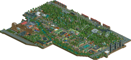
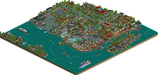
A Liseberg recreation.
-
26 fans
 Fans of this park
-
 Full-Size Map
-
 Download Park
1,635
-
 Objects
1
-
 Tags
Tags
@Fisch – Thank you for the kind words, Fisch. I’m very happy you liked it!
@Six Frags – You make some good points. The buildings are sometimes a bit blocky and unpolished. There is no arguing about that. However, I didn’t expect anyone to use the buildings on the map edge to prove their point. I thought it was obvious to most people these buildings were “closed down” due to the object limit. Maybe I should have been clearer about that in the readme. I do agree that it doesn’t look good, though.
As far as the object limit goes, 8 Cars says there are 3566 objects left to use, but the limit for this map seams to be at 3547. Which means there are 19 objects left to use. If there is a way to get around this issue, let me know. I honestly would love to know.
Anyhow, I fully respect your opinion. You don’t have be sorry for not “feeling it”. I obviously didn’t expect everyone to like it. I appreciate your honesty. My ambition is to improve my work, and I will take your critique into consideration. Hopefully you’ll like my next park better
@Jappy – Thank you for your review, Jappy. Glad you liked the coasters. I like terrain coasters too. Oh, you have plans for a terrain woody? That’s nice. Yes, why not, would love to give it a try.
You make a good point on the foliage; a different shade of green in the mix would probably make a big difference.
Thank you very much Jappy!
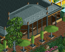
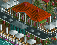
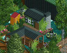
^You also read my previous post with things that I thought weren't as good? As you didn't respond to those points and they were on a higher negatives level than the plain walls, but here are some in-game ones that I think were too plain for the visitors;
About the objects, damn, you should've let me test it
I see a lot of easy opportunities to cut down the object amount while still have the same aesthetics.
For example on the hotel you have all 1/4 tile glass objects, however, I already have made a MT diagonal glass object a while ago, and if you used that you could've saved around 300 slots maybe?;
Also on the ferris wheel you could've saved a ton if you made those carts into an object;
Also, to be clear, as I said a couple times before in this topic, I really liked the park and thought it should be Spotlight (even though I'm starting to slightly doubt it when diving more deeply into it), and the positives far outweight the negatives and the points I raised were kinda picky.. I hope you take the criticism on board though, as it would only improve your work imo..
SF, I don't think the walls you've shown are big problems. At least in that first screen I think it would be weird to have windows... Look like logical places to have blind walls. Second screen is of course super ugly, but I imagine this is the same in the real Liseberg. In any case it looks like a deliberate choice and it is not unpolished. I think the third screen is actually excellent and any details on those would make it less good. The whole building complex reminds me a bit of a less excessive Raadhuis van Hilversum.
I'm not saying your argument is invalid, I'd just like to point out that blind walls in hidden and prominent places are common and they can be a deliberate creative decision. A well placed blank wall can be as interesting as a wall with details, for a famous example see the link above.
@Six Frags – I apologize Six Frags, I must have overlooked the comments on the Gold/Spotlight issue.
It’s kind of hard to comment on the layouts. They aren’t 100% accurate, but as accurate as I could make them within the limitations of RCT. Kanonen has probably the most inaccurate layout of them all. I agree the layouts are kind of awkward. Lisebergbanan doesn’t look as good and flowing as in real life unfortunately, and the log flume looks super boring. I guess it’s easy to forget about these things when you recreate a park. In some cases it’s important to be innovative and use your own ideas to make it look good and interesting in RCT. I will definitely take these things into consideration for next time. Thank you for pointing that out.
About the originality: you’re actually right about that it reminds a bit of Tivoli Gardens. I wasn’t aware of it.
The log flume merge does look bad - without a doubt. Wish there was a way around it. Tried different things such as creating track with objects, S-turns etc, but nothing really made it look better. But yes, I agree with you.
The Gothia Towers could also have been better. Little bit disappointed in myself I didn’t spend more time on them. I was in Gothenburg this weekend, and got to see the towers close up, and there is no doubt I missed an opportunity to make them more special.
The station of Helix and Atmosfear was a bit blocky and sticks out. Of course the shape itself sticks out, but the fact that it was a little bit blocky didn’t help. However I’m still happy how it turned out. My first attempts were terrible. You can see the evolution of this building here:
I also agree on the black tiles and the foliage. As you and Liampie pointed out it maybe would have been possible to free some object slots to black tile the area near the park.
I think this park went through too many stages. Whenever I built something I wanted to rebuild it and improve it. I figured out that I couldn’t go on like that forever. At some point I had to let go of this park and move on. Maybe it was released a bit too early and unpolished.
Most of the flaws you’ve pointed out are legitimate, and I’m very happy that you and others pointed them out. It’s sometimes easy to lose track of what look good and bad.
Anyhow, thank you for the helpful input, and I’m sorry I missed your previous comment!
Cheers!
Outstanding job lagom.
Been looking through this park for hours. Possibly one of the best layouts ever by Schwarzkopf, really really good recreating it and I must say, it transfers quite well into RCT.
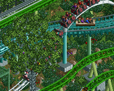
Helix was pretty good. I do like all of the interaction in that area. I understand the color of the coaster seems awkward, with all of the foilage surrounding it. But that's what you get when you re-create.
Kanonen and Balder were actually really nice to watch. Maybe a tad awkard, but really not that bad. Balder as this, might be my favorite woody ever. Great supporting there.
The logflume was a nice to watch, more as a sightseeing tour but imagine the buildup through all that coasters before the last 2 drops. The station was absolute stunningg.
Kallerado was nicely made, station was beautifull. Funny how I read through the comments about the rapids and I could only find the kiddi rapids. Then ~1 hour later I finally found the big one.
The custom attraction were good, but I would have loved to see the giant swing working. Its in such a perfect spot it would have been really cool to see it swing between that clusterfuck of things.
The overall quality of architecture was such high quality, but I think I could have done withouth the huge hotel outside the park. Could have saved up those objects to use for refining maybe the foilage. Not that the foilage is bad at all, its hard to argue against when its a recreation.
Overall a super fun park, wich I will visit a lot of times again, and again. And again.
Great job and congrats on the spotlight.
https://www.youtube.com/watch?v=qc--08YBCbY
CorriIIo Offline
Dude! Coming back here after visiting Liseberg at it's Halloween season. This is sooo accurate. I just wanted to say that this is the best thing I've ever seen