- Views 25,347
- Downloads 1,465
- Fans 25
- Comments 87
-

-
 85.00%(required: 80%)
 Spotlight

Cocoa 90% yes Liampie 90% yes Louis! 90% yes Sulakke 90% yes Jonny93 85% yes Stoksy 85% yes Austin55 80% yes inthemanual 80% yes ][ntamin22 80% yes geewhzz 75% no 85.00% 90.00% -
 Description
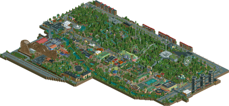
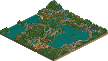
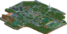
A Liseberg recreation.
-
25 fans
 Fans of this park
-
 Full-Size Map
-
 Download Park
1,465
-
 Objects
1
-
 Tags
Tags
Otsdarva Fan Offline
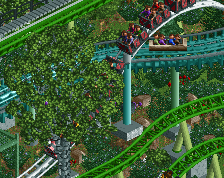
Excellent work and congratulations on the spotlight! My only complaint is Helix's color. The green you used blends in with the surrounding trees too much.
I guess I'll have to check this out!
What a cool guy you are Lagom. I've had another look at the map since I still don't have RCT2 access, and I can see the originality of this is probably what sold people. It's rather rare so many people vote "yes" on the spotlight question. It is a special and different park, and while maybe not the most shocking of spotlights, it's still brought something refreshing and new to the community today which people rewarded you for.
Congratulations with the spotlight dude! 85% and yes is what I would vote too for the park. Well deserved.
I visited Liseberg last summer and you did a great job recreating it. It felt like my visit was a day ago, very recognizable. The park is very atmospheric and the archy is great, fitting the park very well. That Werdshus Korf with the fountains, wow... The details in the park are amazing, like the planets at universum. Respect to do the outskirts so detailed, I couldn't do it but i sure makes the park more realistic, more believable and more recognizable.
The foliage could have been better but for me it wasn't that a problem. Layouts of Helix and Lisebergbanan kicks ass. Balder is OK but Kanonen is meh... But of course with recreations you can't do much about it. Seeing the first screens of Kanonen, you improved it a lot, so kudos for that. Also awesome that you included Helix' soundtrack ingame.
Congrats dude!
@Coasterbill – Thank you! Glad you like it. The planets on Universeum were actually not meant to be there from the beginning. They kind of happened by accident. The real facade looks different in real life, and there are no planets. But I’m happy about the way it turned out. Little bit lucky on my side.
@Liampie – I agree on the foliage, of course. I should probably have asked someone for help. I also agree on the colour of Helix. It isn’t very pleasant to look at. I changed the colour to black more than once during this project, and tried to convince myself that it was a better choice. Unfortunately, it didn’t look good with those light green supports - at least not in my opinion. I hope OpenRCT2 will make it possible in the future to choose any colour.
@inthemanual – Well, I do agree about the log flume. The layout itself is quite boring. However, I think the surroundings make up for that - at least in the real park. To ride Flumeride while Helix and Lisebergbanan operate right next to you is a pretty cool experience. When I think about it, I’m not sure I did a very good job to capture that “feeling”.
Yes, the merge looks awful. Wish there was a way around it. I tried to make my own track with objects, but it just made things worse.
Glad you liked the outskirts and the ferris wheel. As mentioned earlier I wasn’t sure people would like the outskirts very much.
@Louis! – Thank you so much for the kind words, Louis! It certainly makes me happy to know that this might be your favourite park since Thorpe. I didn’t expect to hear that. I would like to thank you for the advice I got, to keep building a little while longer, to redo some parts etc. I guess you made me realize that it would have been a waste of my own time to release the park “unfinished”.
@nin – Thank you, nin!
@Ling – Thank you, Ling. Glad you liked it. You are perfectly right about the foliage. I’ll try to improve that till next time.
@geewhzz – Thank you. I have a lot to learn from G Force. He made a wonderful job with Westwinds. In hindsight, I should have waited at least another week to release the park, and try to polish it a little bit more.
First impressions from the overview are very positive and I really look forward to checking this out in full over the weekend!
Congrats Lagom on your first release being a Spotlight! We all hope to achieve that someday and you've done it so quickly it is incredibly impressive.
@Battle boy - Thank you so much! I’m happy to receive 6 stars from you. I’m glad you liked it!
@G Force – It is true, as you say, the real park is really odd and messy. You’re also right about the lack of flow and organization. I guess you don’t really think about that when you visit the real park, but when you see it from above it’s so obvious. It’s kind of surprising the peeps don’t get more lost.
Is it anything in particular that you don’t like about the steep lift hill, or just the fact that it’s steep? Glad you liked the other coasters. Also nice to know that you liked the landscaping and the river!
I know what you mean; it’s quite unfortunate the towers are blocking the view of the entrance. I just felt I wanted to include them in the map. They are kind of iconic and important for the atmosphere. They are the last things you see before you enter the park, and the first things you see when you exit. I don’t know.
Anyhow, thank you so much! I’m looking forward to see a video review from you.
@Jonny93 – Thank you, Jonny93. Glad you liked it.
I agree with the things you’ve pointed out.
Thanks again.
@Austin55 – Thank you, Austin55. It is truly an honour for me.
@Bubbsy41- Thank you very much!
@Mintliqueur – First of all, thank you! Glad you liked it. I don’t know which one is harder, but to recreate a park can be a nightmare. I had to redo the park layout at least 3 times. Maybe that says more about me than anything else, I don’t know. The coaster layouts were tricky too of course. The hillside with the coasters, the log flume and everything else was in fact a nightmare.
Nice to know you think the park captures the atmosphere - very glad to hear that. Oh, the trips to Liseberg every summer. Yes, those were the days
Glad you liked the final version of the foliage. Oh god, you should have seen my first attempt - awful, just awful. I don’t even want to think about it. Also glad you liked the surroundings. I definitely agree that it’s sad there were no black tiles.
The steep lift hill on Balder was the only way out in my opinion. I guess it’s a little bit too steep. Something in between the normal lift and the steep would have been neat.
Thank you so much Mintliqueur for you review. Means a lot to me!
@alex – Thank you, alex!
@MCI & Version1 – Wow, you guys are hilarious. I had so much fun watching your review. 40 minutes of pure entertainment. You guys make such a great duo. I laughed so hard at 5:50-5:56. Please, never stop making videos! I’ve been a hardcore fan ever since I first discovered your channel.
Everything looked super slow in the video, the coasters looked like they would rollback even downhill, and I’ve never seen so many glitches before. The buildings with elevators in them looked terrible. But hey, it doesn’t matter. It was so much fun to watch, I couldn’t care less. Great job guys!
I would like to thank you so much for the review, but most importantly I would like thank you for leading me to New Element! I owe you a great debt of gratitude!
Very impressive work. Can't speak much on it being a rec since I know little about the real Liseberg Park, but when you build off pictures and real life is when RCT can look its best since you are building things people can relate to or may know.
Loved the cluster of track rides in the middle. Sure the flume is very long, but it's to scale and I liked the diagonals despite the lack of water. Amazing station area on the flume! Helix for coaster of the year! So its green, whatever. Great transfer area on it too.
The area for Hotel Gasten was great, very nice feel there and I also really liked the Sagoslottet ride buildings. Nice cutaway peek there, best way to go imo and more practical than a roof/roofless duel park version.
Awesome creative detail with the diagonal planets mural! That building and the Universeum lift might have been my favorite part of the park.
Really not that much I didn't like. The rapids layout (great station area tho and I am talking about the big one, not the cute little one which was very nice) was painfully boring with ruins and violet flowers, a few attempts at creative elements in there, but a miss for me. Balder was really good, just didn't do much for me, same with Kanonen. Some dummy Qs on the flats (see Lotte World from H2H7 for a good example) would have added more life to them as well as peeps in the ride car objects.
I saw my AP alert for this park, but forgot to follow up on it. My vote... 90/Yes. This is very NE Spotlight worthy imo. The quality is there, no doubt about that. You hitting the map data limit is almost worth a NE Spotlight on its own. Recently, I have been doing planning for my DR3 solo and it might be impossible to do without hitting the limit, but this park took some great steps to work around it with space saving objects (like Six Frags and Robbie did on their massive parks). I'll keep all these tricks in mind and have a few of my own to add. This is a very good example of how to build big.
I wish I had more time to post feedback on parks these days. I have been a little down to see Scientifica still on page 2, but I think upping my own feedback is best to help it... maybe some nagging PMs to a few guys too! lol. Glad to see you are getting lots of feedback.
So Lagom... what do you have planned for us next? Your style is like a mix of 5Dave, Faas and Pac, maybe with a little Walto. Really great work and I look forward to what you do with a non-rec park!
@dr dirt – Thank you. Yes, that’s true.
@Otsdarva – Thank you very much. Yes, the colour on Helix isn’t great. Maybe black would have been a better choice after all…
@Posix – Thank you, posix. I’m very happy and thankful for all the votes. It means a lot to me that many seemed to like the park. It is sometimes hard to know what people actually will think of the finished product. I had no idea what people would think of it, but I’m very excited about the reception it got. It’s very nice of you to say that this brought something refreshing and new. I appreciate it!
@FredD – It’s always interesting to hear from someone who has been to the park. It’s so great to hear that you think the park is recognizable, and I’m glad you liked the atmosphere. Thank you for the compliments on the archy, outskirts, and the details. Means a lot! Glad the outskirts “paid of”, they were not that fun to build. Building the interiors were probably the least fun I had during this project.w
I agree with you on the foliage and the layout of Kanonen. They could have been better. Glad you liked the soundtrack.
Thank you very much, FredD!
@AvanineCommuter – Thanks! I hope you enjoy the park!
@Kumba – Thank you very much for your review, Kumba. Means a lot! Excited that you like the station area of the flume and Helix and its transfer area. Glad you liked the Hotel Gasten area and the buildings of Sagoslottet.
Cool to know that you liked the Universum building/lift that much! It’s a very weird building, but weird in a good way I guess.
You do have a point about the river rapids. I could have tried to make it more exciting. I guess I wanted to make it look as good as possible, but forgot to make it fun or interesting. I’ll keep that in mind till next time. Thanks for pointing that out. You also make a good point about the flats. Some dummy Qs would have been great. I fully agree.
It obviously means a lot that you would have voted 90/Yes. The fact that you and others think of the park as Spotlight worthy is very flattering. Thank you so much. And btw, good luck with your upcoming project! I can’t wait to see what you do next.
Scientifica was great by the way! I’ll try to write a review some day.
My only issue is that it takes way too long for me to write in English. I have some difficulties to write in Swedish too. I’m not a good "writer", that's for sure. But I hope to do some reviews soon. I guess it could be a good way for me to practice English as well.
I do have a new project going, but I want to keep it a secret for a little while longer
Anyhow, thank you so much for the review, Kumba!
After looking at it:
How would anyone justify this not being a spotlight? The only reason some people might not want it to be is because they're stuck thinking that only American hyper realism can win spotlights nowadays. Interestingly enough, seeing as this appears to be a recreation, this is hyper realism as well. It's just a very different type of park as opposed to the Six Flags, Sea World and Busch Gardens parks.
The best thing is though:
It's DIFFERENT. Different from all the conformity we usually see with almost all the other releases. This is daring, this is new, this is highly detailed, and beautifully laid out.
It has landscaping, ride interaction, architecture, foliage, elevation changes: everything you'd look for!
Clear spotlight. I prefer this to any kind of Six Flags or Cedar Fair park that's been released.
The more I look at this the less I'm starting to like it, even to the point I'm agreeing with gee..
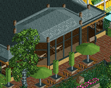
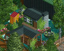
I mean there's so many blocky buildings and when you turn views there seem to be a lot of unfinished plain walls. The unpolishedness and almost chaotic way of building leave a lot to be desired unfortunately for me.. I too would've voted this beyond WW.. Sorry Lagom, you seem to be a nice guy and taking criticism well, while enjoyable it just fell short for me..
I wholeheartedly agree with Fisch.
Good thing we can all have an opinion then!
There are plenty of blank walls, but that's how buildings in real parks work...
@Ling, there's a difference imo between a good and bad plain wall;
Good;
Bad;
I thought that had to do with hitting the object limit.
^He has 3566 slots left, should be enough..
Also, if he really didn't have the slots he could make those rooms into a scenery object, like cena did in the Atlantis Resort h2h park..
& Liampie, not sure what you mean, I just posted a map edge of my favourite park?
Also, I DO like those other finished see-throughs VERY much, maybe that's why it sticks out like a sore thumb for me..
Lagom my friend, I promised a closer look, here it is...
Let's start with the beginning, I've never been at Liseberg before, so any comparison with the real park won't be made.
Coasters: all pretty nice! Helix lokks like an awesome ride irl, Blader was huge, which is a nice change from the small coaster trend that's been going on here lately. I like the fact that both Helix and and Lisebergbanan hugged the hills so closely and the interaction was great too. Terraincoasters are awesome, sadly I'm no good at them. Maybe I'll have to ask your help for the terrain woody in my project?
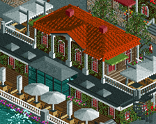
Architecture: from my point of view you've managed really well to make not a single building alike, yet still make them feel belong together in the same style. Some object choices and colour combinations are questionable, but if that's how it's like irl, then that's fine by me.
Foliage: not an expert myself, but you could've used a bit more colour variations in the trees. Most of them are the same colour, it would've done some good to give some a different shade of green. The pine trees helped a bit, but were not enough.
Overall, a brilliant park with some good rides and atmosphere. Definitely one to check out on multiple occasions 'cause you'll always find something that you haven't seen in some forgotten corner!