- Views 25,347
- Downloads 1,465
- Fans 25
- Comments 87
-

-
 85.00%(required: 80%)
 Spotlight

Cocoa 90% yes Liampie 90% yes Louis! 90% yes Sulakke 90% yes Jonny93 85% yes Stoksy 85% yes Austin55 80% yes inthemanual 80% yes ][ntamin22 80% yes geewhzz 75% no 85.00% 90.00% -
 Description
A Liseberg recreation.
-
25 fans
 Fans of this park
-
 Full-Size Map
-
 Download Park
1,465
-
 Objects
1
-
 Tags
Tags
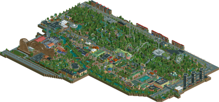
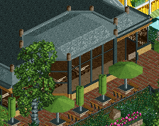
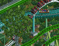
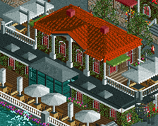
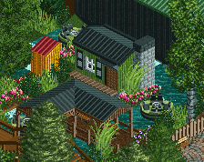
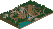
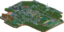
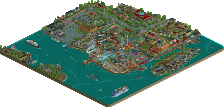
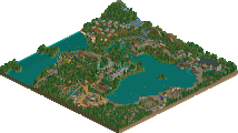
This is one really, really hot mess. Can't blame you though, I'm sure the park is like this in real life. I'll try to get a review done this week, definitely deserving of one.
Listen, I can't really vouch for accuracy considering I have absolutely no idea what the real Liseberg is like, but DAMN. This was ridiculously fun to look at. All of the coasters were really nice, Helix probably being my favorite based on how it interacts with what's around it. Balder looks a little weird, though; probably a bit too, uh... condensed for my taste..
Your scenery-built flat rides were probably one of my favorite parts, especially the Screamin' Swing. It also helped make what I think might be the best Ferris wheel I've seen in RCT2.
A major portion of the park being located on a hill is pretty interesting; reminds me a bit of Magic Mountain. Landscaping is nice, terrain is nice... sorry, I don't really know how to discuss these things. I think my main complaint should go here, though; you really could've used the black tiles to block out the unused parts of the map. It would've looked a lot cleaner if you had.
My other favorite parts? The stuff that wasn't even really part of the part. I'm talking about the Gothia Tower and arena. I'm a sucker for stadiums, arenas, and other concert venues, so I'm happy to finally see one incorporated into a park. It really does look like a medium-sized hockey arena, and the lights on stage were nice and colorful. As for the Gothia Tower... gotta love that futuristic Swedish architecture.
Overall, a wonderful recreation, even though I don't know how accurate it actually is. Doesn't change the fact that I give this a solid A/a 95% vote.
That garbage truck behind Kanonen is just so good
Everything else is also perfect, amazing job dude
OOOOOHHH, Yeah!!!! Gon check dis out som gewd!!!
I'll write a proper review later.
Probz spotlight. Phenomenal, if a little busy/overwhelming at times.
Holy crap this park is phenominal...
Where do I start? Firstly, that's probably the most fully realized, believable park outskirts I've ever seen. Beautiful gardens, apartments with interiors, parks, buildings with purpose and realism. And so lively and fun, it just sets the park perfectly.
You do a really amazing job recreating things that are probably incredibly difficult. Rides and buildings built on slopes and diagonals, made of giant curves, etc. And you did a fantastic job making it look good in rct and feel so real. This park probably has some of the best examples of 'modern' architecture I've ever seen in rct. so sleek, clean, and well-structured.
The layouts are all, as far as I can tell, amazing. They seem real and look good. You do an amazing job portraying the interacting, rides-on-top-of-rides feeling of the park that makes it so much fun, and you make it look good too.
I can't say much for the accuracy of the park, having unfortunately never been. But I can say that it looks like its been pulled out of a real park- every detail, piece of backstage or small path, each building or stall, etc is built with purpose and care and so much attention to detail. I spent a long time scanning through everything I could, peeking into the holes you made in some buildings or admiring the care you put into the slightest things. It really makes the park come together as one of the best, most well-put together and complete parks around. Its just brimming with fun, atmosphere, and care. It feels to me like you did a good job balancing your love/nostalgia for the real park with your own creative input to make a park that feels... loved? I guess thats the word for it...
And of course, some excellent architecture, great foliage, so much to see (I spent longer on this park in just one viewing than I have on a park in a looong time). It seems from the readme that you put a ton of effort and time into this park and it really was rewarded with a fantastic park.
If I had one gripe with the park, its that you didn't surround it with black tiles . Everything else, the business and chaos worked perfectly to bring it all to life IMO.
I'm very excited to see what you have next up your sleeves!
btw, you should post a topic or something on themeparkreview, I'm sure they'd be interested in a damn awesome recreation over there...
Holy shit, it´s here!
Dont have time to give this one a proper look right now, but I will do so later today. Fanboy review incomming...
This is a great looking park well thought out great layout.
Looking at this in-game now. I'll give you a full review in the coming days because you deserve one but I just wanted to say that this is innovative, mind-blowing and while I wasn't sure if it was Spotlight quality based on screenshots after seeing it in game if this doesn't win Spotlight I will positively lose my shit. Wow!!!
Also those fucking planets on Universum. Nice.
Yeah, that was my latest wow-moment before I closed the game just now. Amazing. The park is full of awkward weird things that no one would think of doing when creating a realistic park, you need an actual real world for those ideas. I think it sets this park apart from most other RCT2 creations for exactly that reason. In terms of realistic immersion, I think Liseberg is only rivaled by Geewhzz and RRP's very best stuff.
The park itself is flawed, like any RCT creation. The foliage obviously is this park's main weakness, it did drag the mountain area down a bit (not to say it was bad, just less good than all other aspects). And recreation or not, those layouts look ugly as fuck in places. Not a fan of the Helix green either.
I'd like to say more about this park, picking out highlights and stuff, but I'll save that for when this park gets its score. Whatever that may end up being, this park is special and you should be proud of it.
This park was very hard to vote on. It violates a lot of the typical "conventions" we see around here. There were some amazing things in this park, but also a lot of things that felt cluttered, busy, unrefined, or flat. The biggest weakness for me was the flume. It was too long and straight, and it dominates a big portion of the park without even being exciting. I also wholly understand that merging was the only way to get the shapes you wanted, but I think the merge from water to track is a bit ugly. The interactions between the flume, and the two coasters there was phenomenal, however. The outskirts were some of my favorites of any park, and I really loved the ferris wheel, flume station, many of the custom rides, and the creativity of it all.
Man, we REALLY should make a new category for parks like this and Westwinds. It's WAY better than any of the recent Golds (/H2H parks), but not quite Spotlight material yet.
I'll check the park out some more, but at first glance it really looks like a phenomenal park to introduce yourself with Lagom. Tons of atmosphere in there. The outside parts, espcially the hotel towers interiors, reminded me a bit of the h2h London Olympics park and Tivoli Gardens, but still unique. Great job!
I think it's spotlight, and our ideas of what a spotlight should be are skewed when we look at standout parks like BGA or Starpointe. we haven't had a sub-90 rct2 spotlight since zippos (and that was 89.5, mind you). Have we ever had one sub-85?
Either we do that, or create a new accolade altogether for parks that are obviously better than golds but dont reach our new ideals for spotlight.
^ I realize this isn't the correct place to post this, but this is definitely something worth considering. Bronze is 50-60, Silver is 60-70, why not make Gold 70-80/85, New Accolade (Platinum???) 80/85+. Seems strange Gold covers 70-100 right now. Anyway, that's my two cents worth.
For this park, I've only checked out the overview, but I'm downloading it as we speak and I'll give my review shortly. Stoked!!!
Platinum needs to be a thing.
Anything that had 80% and higher with at least two yes votes for spotlight should be Platinum. Although I'd prefer the name Blockbuster or something along those lines, rather than just another metal.