Park / Oakridge Acres
-
 11-April 16
-
 Oakridge Acres (finished)
- Views 7,456
- Downloads 924
- Fans 0
- Comments 22
-
 58.75%(required: 50%)
 Bronze

Chocotopian 65% nin 65% Poke 65% geewhzz 60% posix 60% Cocoa 55% inthemanual 55% Liampie 55% Stoksy 55% Louis! 50% 58.75% -
 Description
This is an openrct only park. We hope you enjoy.
-
 No fans of this park
-
 Full-Size Map
-
 Download Park
924
-
 Objects
1
-
 Tags
Tags
![park_2390 [H2H6] R2 - The Replacements - Tivoli Gardens](https://www.nedesigns.com/uploads/parks/2390/aerialt2133.png)
![park_3194 [MM2014 R2] Sorin Bridge](https://www.nedesigns.com/uploads/parks/3194/aerialt2805.png)
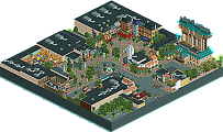
Thank you so much everyone for the kind words and criticism. I will definitely take it all into account when moving forward.
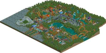
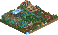
Certainly enjoyable to look at. There were some really attractive areas, particularly when a theme started emerging. The area surrounding Blue Lagoon was very pretty, I thought, with the fountain, the golden foliage and the barn-inspired station building.
The layout of the park was different from the norm, which is cool I'd say. As others have mentioned though, a couple of underground tunnels would've helped the peeps bridge the gap. The water source situation was a bit strange, and I think it's something that can get overlooked when water is specifically placed for aesthetics. There was perhaps an opportunity for you to begin it at the rapids, from the map edge, and have it flowed under Nightengale into the central lake (also giving you another element for the coaster to interact with). By tying the water together, it just gives a better sense of realism, I believe. But nonetheless the water looked great in most places, and I really liked the waterfall of Black Bear Run and the way it could be viewed from the balcony.
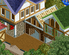
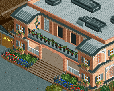
Architecture was decent for the most part, with good colours and textures, but there was a certain something that kept it from being better. I think they all shared a flatness or boxiness... it's really hard to put my finger on. They're by no means cuboids (well, some were), but they mostly seemed to display a chiselled look, with prominent angles. Sorry I can't describe this better, but it's definitely something I feel will change naturally as you continue to build and experiment, so I wouldn't worry.
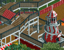
I liked the coasters - Comet was my favourite. Something about its triangular shape and the way you could see the entire layout from the first drop was appealing to me. Cornstalker was interesting to watch too. For the foliage, it was perhaps a bit heavy on the oak trees, but it's called Oakridge Acres so I guess I can't complain! However (and I think I mentioned it one of your screens), I think thinning it down a bit near paved areas would allow better lines of sight for the peeps, such as by the central lake.
Overall, I'd say I agree with Poke in that there's certainly heart and personality in this. A few areas that could use refinement, and aspects that will improve over time and through experimentation, but there's definitely a strong presence here. Congratulations on the bronze, and I hope to see more form you soon.
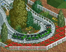
I really like The Comet. Something incredibly classic about it, even the white fence and red flowers along the midway. The main midway is something else I liked, although it felt a little short and I wish it had been more central to the park. As it stands the park is in a sort of deformed crescent which is playing havoc with the peeps. Many of the rides felt random and themes were just all over the place. You already had a rust/mine-themed area going, why not have the mine train over there instead of next to the vaguely Mediterranean haunted house ride?
I really like the train too, actually, although you let it limit the park layout. A bridge back in the area behind Nightengale (sp?) would have worked well I think.
Your coasters were consistently far too fast. To the point where I suspect Nightengale's stats are edited. Cornstalker is too fast everywhere except that last hill overlooking the river (before the second roll). I enjoyed the idea a lot but it's just so damn fast all the time. Aviator could also stand to have its first hill 10ft shorter and the subsequent loop 10ft higher.