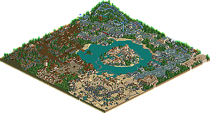
Park / Universal's Lost World
-
 09-September 04
- Views 17,454
- Downloads 769
- Fans 2
- Comments 55
-

-
 65.45%(required: none)
 Silver

Poke 80% Cocoa 75% Jaguar 70% Ling 70% bigshootergill 65% Liampie 65% nin 65% RWE 65% Scoop 65% 5dave 60% alex 60% csw 60% G Force 60% 65.45% -
2 fans
 Fans of this park
-
 Download Park
769
-
 Tags
Tags
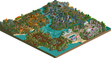
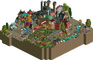
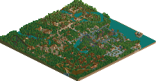
At least give a little constructive critisicm before you go and diss a park that you haven't seen the whole of. So you don't like the park. That doesn't mean that you should write 4 paragraphs on how bad you think it is and have only one positive comment the whole time.
And don't even try to bring West Virginia into this. Bringing down the intelligence of an entire state with only sereotypes to back you up doesn't make you look any better.
inVersed Offline
-----------------------------------------------
Anyways, going by the screens the LL parks look great. MI:LAS was great. It had great atmosphere and was a great overall park. Great Job Junya Boy!!
Junya's park is now tied with Euroscape for my second favorite RCT2 park ever, behind RoB. It pulled off the theme it was trying to convey at least as well as the latter park. All the extras were there such as the lighthouses, the sea monster, the boat dock etc. Frankly, I'm frightened to be going up against this guy in the RCTHQ contest.
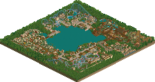
Mort, your park was beautifully done but we need more of it. The feeling I got was of a park built around water instead of a lake built within a park. I liked exploring each one of the sections very much, but they were a little small and narrow. If you expanded your work to encompass the entire map I'm sure it would be kickass.
Edited by laz0rz, 26 June 2006 - 02:42 PM.
Richie Offline
---
Junya, I have mixed feelings about the park. Ive looked through it about 5 or 6 times, at least half and hour each time. I loved the overall atmosphere and the layout was great. I loved each island, althought mystic island grabbed me the most. A big problem i felt with the park was that almost every ride was hacked. Dont get me wrong, i do like each of the hacks, but the large amount seemed to be there just to say, "Look, i can hack". The mine train jumping past the waterfall was a great touch, but a little too many jumps. The jump off the top was a cool start to the ride, and the first couple of jumps back and fourth. What i felt ruined it, was the large invisible turn at the bottom, and the 3rd jump back accross.
The architecture throughout was very pleasing to the eye. I hate overcrowded, over detailed architecture that has no purpose, and this is my favourite type.
My favourite coaster was eruption, i loved the way it lauched through the loop, and up out of the volcano, it was very nice indeed. After that it was the 4D (i forgot the name now, sorry), it was great, the best 4D ive seen in RCT, suppose the B&M track helped with that, the real 4D track is ugly. I liked how it reversed, back down.
The thing i didnt like about this park was the 4 shuttle type coaster (back fourth back fourth). It seemed to me like quick gap fillers, when maybe you could have just had 2 like this and another larger coaster. It also seemed they were just to show off more hacking.
Overall it was definately worth runner up, and on another day a spotlight. So congrats on that runner up worthy of spotlight.
inVersed Offline
Screen
Screen (unfinished)
So its fair im asking the other members to tell please us what y'all think, who's work is better??
Sorry once again for going off topic.
Richie Offline
Just shutthefuckup.
inVersed Offline
Corkscrewed Offline
MachChunk, my West Virginian friend, you really remind me of that kid they had on the WifeSwap commercial with the anger problems. He's like, "She's trying to make me control me temper. She is the STUPIDEST... MOTHER... EVER!!!"
Or maybe you ARE that kid... anyway, what amuses me is that you bring up West Virginia OUT OF NOWHERE. Talk about feeding the fire... the fact of the matter is that those screens are not even decent. Well, if you compare it to the population of the world, perhaps, but that's only because 5.99 billion people don't even play the game, so you'd be better than those by default.
It's not just your RCT work that irks me and others. It's your attitude in general. In a way, I can't really be too harsh on you, because you're only like 12, and despite what you think, you're just a kid and not too wise at all. It's okay... most people your age are like that. On the other hand, you've had a benefit in disguise in that your immaturity and absurdity have been exposed by those who do know better, at least better than you, and yet you don't really accept it. You act too conceited for your own good... someone (in this case, me) takes a crack at your parkmaking work and you take instant offense, drawing out an argument meant to assert that you're decent at the game. I'm sorry, but at this point, you're not. It's not to say that you're an abysmal failure... frankly, it took me two years to get decent at the game. "Decent" is like... an old D-Net spotlight... something that would be considered crap today but was pretty darn good and still has some redeeming qualities.
The fact of the matter is that I'd be a LOT less harsh on you if your attitude and your behavior here warranted it. However, you don't deserve that sort of liberty. Did I have to spend four paragraphs criticizing you while only pointing out two faults? Perhaps not, but firstly, your park really does need to improve in everything, and so it doesn't take too many words to convey this, and secondly, I would argue that I did have to spend that length of time because you just don't get it. You are immature and rash and laughable. And you have remained this way.
If you're tired of this sort of offensive treatment, change your act. When everyone on this board has a negative opinion of you, it's time to take a look within yourself and see what the heck you're doing that's pissing people off, not continue to stubbornly persist in your opinion and maintain your pompous attitude.
Frankly, maybe it'll just take some growing up. Maybe one day, you'll just figure it out. But until then, if you won't change, our attitude toward you won't change either, and you cannot blame others for your own actions.
All of this may have seemed like a giant flame, but in reality, it was just a critical assertment of the truth. I'm sure many will agree with me in my assessment of your tenure here at NE. Am I telling you to get out of here, or go to hell, or die or something else stupid? No. I'm just telling you to get your act together.
And don't mess with someone against whom you have no chance of winning in an argument.
With that, I wash my hands of this little case. I've said all that I can say without repeating myself, and maybe you'll just take this advice (yes, it was advice) to heart. If not, hell, I can't really do anything.
NOW, I return you to your regularly scheduled topic.
I was your websites biggest fan.
Since it's my first post, i'd like to thank everyone for the comments on my park, and enjoy reading them somewhat. I feel distanced from the community though, and as some of you might have noticed i won't be around as much. I'll play rct2, on a very small scale (on weekends, couple hours tops a week) So don't expect much from me in a while, though i am working on a "re-PT" sort of thing, on a thus small map so you might see that relatively soon. My next full project will have some tackiness filled in again too, but it's far from being finished, and might stay that way for a while.
MILAS: some of the rides were creatively designed, and there were a few ideas, but the composition and the park as a whole left a lot to be desired.