Park / Universal's Lost World
-
 09-September 04
- Views 15,559
- Downloads 663
- Fans 2
- Comments 55
-

-
 65.45%(required: none)
 Silver

Poke 80% Cocoa 75% Jaguar 70% Ling 70% bigshootergill 65% Liampie 65% nin 65% RWE 65% Scoop 65% 5dave 60% alex 60% csw 60% G Force 60% 65.45% -
2 fans
 Fans of this park
-
 Download Park
663
-
 Tags
Tags

Richie Offline
Dont worry, Iris hasent announced Spotlight(s) yet.
Anywho:
Mysterius Islands- Lost at Sea
Its huge and detailed while it remains harmonius. I really really like it. Somehow the style seems a bit outdated though (it's the round windows, they're killing it). I love the area with Eruption because it was not only a great coaster but it also kinda reminded me of some of my favorite LL creations (Tropico Cove and Universals Islands Xtreme) because the atmosphere is so similar. Somehow it feels "denser" so to speak in your park, not that that is a bad thing in any way shape or form. Some goes for the area surrounding Nirvana, just more "blue" than "yellow" in the coloring. Lovely. The area with the minetrain was also very much to my liking. I've been waiting for someone to do an area like that for god knows how long. Simply beautiful. Thee Sandbar also went over well with me since I loved Empyrean (best coaster in the park IMO) and the atmosphere created by the bright sand is just so infectious (in a good way). The other areas I didn't really like (The one with serpent b/c it looked like BGSS and Euroscape had merged with confused results and Ashbourne grove simply because it just didn't "click"). The park is also excellent in the details. The Boats cruesing about, the rail road, sea monster, plane rechage, ship wreck and lighthouses all add to the atmosphere and depth of the park tremendusly. I'm sure there are many more details to be explored since the park is so massive and so lovable. Other than minor problems with two areas I either like or love the whole park for something. Even the water seemed well-used, if that's possable. Excellent job.
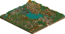
Universals Lost World
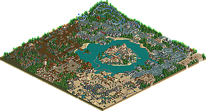
I really don't know what to take of this park. I used to dislike WME's work because it seemed sloppy and awkward but this goes the otherway and becomes to simple, in places. This has become my favorite WME park purely because only two of the area's were truely too boring from my favor; those being Jurrasic Park and Lost Continent. Even though both are very refined they don't apeal to me because they are too simple. The World Expo was the turning point for me, it and Marval Kingdom area just lovely with the colors, details and coasters. The centerpeice hotel is lovely as well, being the perfect mix of WME's old "in your face" parkmaking and the newer, calmer style. The enterence also impressed with the beautiful use of color and texture. Although I love three area plus the enterence I feel that two area's aren't carrying their weight here. As a whole the park seems like HIOA, IOAH and KAL (that recent posix park) got stuck in a blender and this came out. Not that that is a bad thing, I just wish there was less KAL to get in the way.
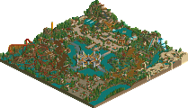
Portal of Heaven
I don't see why this isn't a spotlight. There isn't a single corner of the park that didn't recieve due attention and the improvement from Cypto is amazing. The Enterence feels like that (enterence) of DFK feels right after looking at DDI's. That's the best way to compair this enterence related to Cypto's. Excellent stuff though, just more understated. Brazil was up next, Great archetecture (which is throughout the park) with spectacular levels of ride detailing. An improvement on Mort's QFTB invert resides here too however I still feel that coasters are Morts weak point. Hawkhurst- The Wooden awnings work some real magic, pink flowers boost it to the sky and the music puts this in orbit. I could just stare and relax. Very refreasing, like listening to Wish You Were Here (the song) from Pink Floyd while you sleep (try it sometime). Japan Game Test Site- Cool, almost sick use of dark parkmaking and although I disliked the screens of this area it's pure fun in the game. Green, purple, and orange make a perfect combo. Heaven Hotel-Love the hotel itself, I just hate the glitch effect that the nearby peeps cause. A masterpeice by itself none the less. Elounda Market- Really funky landscaping that magically comes off well, matching colors for the flowers and coasters give an effect that I've been craving ever since RoB. Very nice. Best coaster in park IMO and the shipwreck is possably the best ever made. Istanbul- Intoxicating colors and textures, but very small, still very, very nice. Puero- Like Kumba done in LL, it can't get me going, it's really the only area I didn't instantly fall in love with though and many times I don't much care for 1/2 of spotlight maps. Do I sense a promotion at the NE Awards 2004? Indeed I may.
Excellent work you three. That was, without question the best round of runner-ups in a long ass time.
ride6
Corkscrewed Offline
Universal's Lost World by Evil WME - I can't say I liked this park as much as your other ones. I'm not a fan of the "bare" look. It's still not bad though. The entrance was my favorite part. The hotel was also vey good. The Marvel area also looked really good, it reminded me a lot of IOAH. The area with The Unicorn, however, I didn't like. It was too bare for me and the coaster looked like it was just stuck there to me. The rest of the areas were still nice, but they didn't appeal to me.
Portal of Heaven by Ablaze - This is definately one of my favorite parks. The whole thing was so detailed and was pulled off so well. The only thing I didn't like was the hotel. It just didn't look like it belonged there. The area with Vim was my favorite. The whole area was beatiful, as was the area with Vaporeon. The japanese area was ok, but I don't think it looked too much like Japan. The Istanbul area was very nice. Bison Run looked so nice among the rest of the area, and it fit in so well.
With these runner-ups, there had better be one hell of a spotlight.
Corkscrewed Offline
Not to mention, you don't have the goods to really back up what you're saying.
This thread is about parks that were nearly good enough to make Spotlight, not about parks that will be nearly good enough to make people look at them.
j.p.
Thank you.
I spent much time on it. Trust me the park was a drag, a serious drag. But i wasnt letting it go to waste, so i tried to complete it the best way that I can. There were times where I gave up on it, but I would come back to it after a while. It's funny cuz the park is half outdated, half new. The center island was made back in October/November while the "entrance" island was made last month. Though built at different times, I tried my best to make it all look like it was made continuously. But anywho, thanks again. I'm glad its off my shoulders.
Corkscrewed Offline
I looked at the screens, and damn! You HAVE improved!!!! Of course, when your original state involves architecture composed of paper thin walls (in scale) if you don't improve you might as well be the most retarted person to walk the planet. The screens still suck. The buildings are enormously blocky and undetailed. The use of flowers and landscaping is poor and nonexisting, respectively. Heck, (and yes I know this was just done to cover up the areas you didn't want people to see), your park is so bad it's even been infected by a plague of locust. Don't want people to see? Maybe you should have just covered up the whole screen. Might have looked better.
Do you realize that your own posts comprise like 90% of those threads? No one's replying because they have the common decency not to post crap when they don't have anything nice to say. Had that been here, your morale probably would have been launched into the Marianas Trench. In fact, the only screens from your "runner up" that looked remotely decent were this and this.
Point is: I said it's hilarious that you think you have a chance at the runner up. I looked at those screens. It's even MORE laughable that you think you might have won runner up. Frankly, my first RCT 1 parks were about as good as those... and I was absolutely abysmal at it (ask Iris about my "Alray Parks" series and he can tell you some stories).
I admit, I used to think they were pretty good, but then again, I'd never seen a Spotlight in my life. That was before I was in any online community, where I could see quality before my face. You, on the other hand, have been exposed to some of the best work on the planet yet seem convinced that your pudgy little self makes great parks. That's just conceit, and quite absurd conceit if I must say so.
If you had been more humble about your work, you wouldn't be getting this flame. Personally, I tend to operate under the rule that if I don't have anything nice to say, I don't say anything at all. Or I help out. But I'm nice to people who recognize they need help and accept it. You, on the other hand, seem to think your bile is the hand of God or something. At least be able to back it up. You're little better than that Coaster018 guy in that case, who claimed he could build better than SA.
Anyway, back to the Runners Up... Alec, that shipwreck really was cool. Kudos to you on that... I personally think it's better than anything you've made in LL!
I would like to know, WME, and this is not a bash, if your park was kinda made for the sake of being made. It seemed like you weren't into it as much, and so the detail and level wasn't as high as your usual stuff. Or maybe you really WERE trying out a different style? Just curious.