Park / Universal's Lost World
-
 09-September 04
- Views 15,559
- Downloads 670
- Fans 2
- Comments 55
-

-
 65.45%(required: none)
 Silver

Poke 80% Cocoa 75% Jaguar 70% Ling 70% bigshootergill 65% Liampie 65% nin 65% RWE 65% Scoop 65% 5dave 60% alex 60% csw 60% G Force 60% 65.45% -
2 fans
 Fans of this park
-
 Download Park
670
-
 Tags
Tags
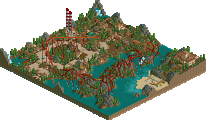
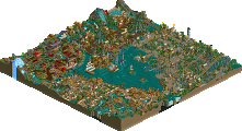
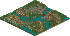


Mysterious Isles - Lost at Sea by Junya Boy
Portal of Heaven by Ablaze
Universal's Lost World by Evil WME
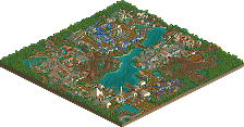
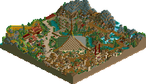
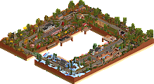
We have three great new runner-ups this round. Starting off with Junya Boy's RCT2 masterpiece "Mysterious Isles - Lost at Sea", the best park I've seen from him quite easily, and one of the most fun parks to explore I've ever seen. I can't help but to keep staring at this park for hours at a time for some reason, just a great pleasentness that Junya's parks always have, plus improved coasters and theming. Secondly, we have Ablaze aka Mortician aka Coasterct Nick aka the easter bunny's newest LL monster, Portal of Heaven. Ablaze has definitely cemented his place alongside mantis and Posix as one of the only people really holding LL down nowadays. But...just to have his back, Evil WME takes a step back to LL after his RCT2 exploration and unveils his newest park, Universal's Lost World. Congratulations all three of you, it was definitely one of our stronger rounds.
Oh, and P.S.: Six Frags...have fun submitting LXG to the RCTFusion spotlight
iris, on Sep 10 2004, 12:18 AM, said:
I've pretty much lost all respect for you in that sentence iris. You've passed judgement on rctf before you've even seen our parks. I thought you were better than that...deanosrs, on Sep 9 2004, 06:21 PM, said:
Oh no!What I said has nothing to do with RCTFusion. What I said has to do with Six Frags wanting to completely break away from New Element and start up their own spotlight at RCTFusion. You should know about that shouldn't you? So, if he wants to exclude NE then NE will do likewise to him. Feel free to join him if you really want to, but I know not everyone in your club is as adiment as you are.
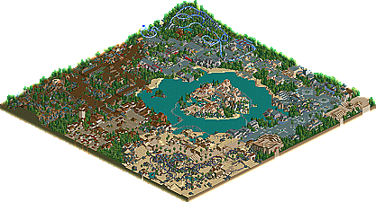
Universal's Lost World by Evil WME: The entrance was definitaly pleasent, and had a nice realistic touch to it. The foliage seemed to be right on target, along with the color scheme and architectual work. There was, however, mabey a bit too many paths types, for my preferece. Otherwise, the entrance was very cool. "Adventure trails" minetrain ride was good. The landscaping corolated with the ride rather nicely, and the semi-bare theming was put to good use. Now, let's talk about that flyer's sectioon. It had to be one of, if not my absolute favorite section, ever. I realize that it wasn't chalked full of detail and it was filled with an insane colorscheme but the overall section was so inviting. The design was great, and the landscaping was very nice. The choppy theming was absolutly incredible, though. It seemed to fit in so well with the section. Everything was 10/10 in that section. The Lost World, in general, was just spectacular. The realism in the section is just mind-blowing. The Unicorn section was a bit of a downer, though. The ride was way to compact, and the colorscheme kind of made me cringe. The bare theming arrangement was very nice, though. The architecture was good as well, in my opinion. The center island/hotel/resort looked very poised and pleasent. The color scheme definitally worked for me this time. Good job, EvilWME. I think the realistic style you used, in this park, really showed how good you really are.
Kevin Offline
Junya Boy, I've always loved your style. Although its very plain and simple, it really sets an incredible atmosphere when I look at everything all together instead of just looking at one building individually. I was most impressed by the coasters. Great layouts on all of them. Great job.
WME and Ablaze: again, I don't have LL on my computer right now...but the screens look incredible.
Great runner-up round indeed, iris.
Its also nice to see an LL dominated runner-up round. It shows that even with RCT3 on the horizon, NE parkmakers continue to finish award-worthy LL parks such as these. Nice job Ablaze and Evil, just wish I had LL to check these out.
Awesome runner-up round. The way you showcase RCT talent still amazes me, iris....
If that is true SF, thats quite a shame.....
EDIT: MI:LAS - Well, with a small file size, I was able to download this. I think the relaxing atmosphere throughout the entire park is what I was most impressed with, along with the incredible coaster designs. My favorite coasters were the mine train and woodie. That water jumper ride in the Roman-like arena was also amazing. The hacking, architecture and ride design in this park were all way above par. I can't wait to see what you have next on the project list Junya.
Wow. This has got to be one of the best RCT2 parks I've seen. It has that Euroscape feeling to it, and it seemed like a tough contender for Spotlight, because I think it definately could have been. Every building just flows so well together and it feels so elegant and relaxing. There was just an incredible atmosphere with this park. This was probably due to how there was no entrance, really (I think). Instead you build each section of the park on a different island.. and it made a weird effect.. a good weird. I absolutely loved the swampy section by the mine train ride. It reminded me of the Everglades and I just wanted to go there. It amazes me how you could master so many beautiful and well-executed hacks on your coasters, something I've yet to learn. I really liked the wooden coaster nestled in the back corner of the park. The foliage and landscaping around it was perfect, and I loved how you used every tree of the same color. The only minus I can see with this park is your repetitive style in your architecture. This was the reason that everyone loved then hated Euroscape. It had that RoB feel to it too in some parts, actually. If this park doesn't get upgraded to Spotlight at the next NE awards, I'm sure whatever your next park is will.
Mort/Ablaze- Correct me if I'm wrong, but this park really had no theme as a whole. It's the standard approach of a bunch of un-related themes put together on one map. Sorry, but I'm just bored of these kinds of parks. I would much rather see you put your undeniable skill towards a more original concept; a park with character, if you will. This showcased a whole lot of skill though, I might be the only one with a problem with the style of park.
WME- Sorry, I could'nt really get into this one either, perhaps for the same reasons as above. I felt there was no real character; nothing to set this apart from any of your other works. Personally I would rather see a more ambitious project from you.
I hate to sound so negative. Congrats you three, regardless.
Nevertheless, congrats to this round's winners!!!
iris, on Sep 9 2004, 04:18 PM, said:
Excuse me?Anyways, I have only looked at Evil WME's "Universal's Lost World," and there is a lot to like about it. I think it's largest, and essentially only downfall is that it was heavily inspired by Posix. I'm not a fan of Posix' work, but I'm not going to get into that. I think that you, WME, had a great, distinctive style going for you and it was only a matter of time before you created a seriously great park. I hope you can find your way back to your old ways in the future.
natelox, on Sep 9 2004, 04:47 PM, said:
Haha, yeah I know, I thought of you when I read that but I thought it was a pretty innocent overlookment.Much more importantly, I am also still very active
Corkscrewed Offline
And ROFLMAO at MachChunk thinking he had a chance at winning anything.
Anyway, you know my thoughts on the parks... I kinda wrote the intros. JB really impressed me with his very nice theming in addition to nice coasters. WME's park as nice, but it seemed like a filler park to be worked on whenever he got bored with other stuff. Mort's park was pretty damn nice... his best work IMO.
Overall, a fantastic round.
And did I mention the awesome MI:LAS logo?
iris, on Sep 10 2004, 12:24 AM, said:
RCTFusion has no plan to start up its own spotlight, that I do know.As long as you haven't passed judgement on our parks, that's fine. At the moment I have very little against NE, and I probably owe it a decent park given the amount of times I've left/come back, and failed to enter competitions, so I'm far from not submitting my parks to NE.
PBJ Offline
and that all aboute LXG!!! how can you do this to me and the rest of the world?
I think that SF must get a Runner up or spotlight! this is not fear!
-PBJ
PS. you 3 did a great job as i can see on the screens just getting my LL cd back and i can see all of the 3 parks!
2 SF:
man dit is echt balen! ik hoop dat je snel een oplossing weet te verzinnen om het park als nog online te zetten! ik vind dit echt k*t dat dit met je over komt! Oranje Boven!
As for MI:LAS, I was extremely impressed. The architecture and textures did get a little repetitive in places and I thought that hurt the park to some extent, but I still really liked what I saw here. The spacing of the islands was very well accomplished as this park could have easily felt too spread out. There are great details to explore in every section of the park and I'm sure I will spend much more time looking at things. I think what I liked most tho, was the fact that the hacking was done very seamlessly and just disappeared into the overall atmosphere rather than the more in your face approach some parkmakers take with their hacks. I prefer it this way. Great job Junya!
PBJ, on Sep 10 2004, 10:17 AM, said:
Some people truly are idiots and take this game / site way too seriously.and about the ll players... come to think of it, you can actually count us down to a frustrating little number.
Corkscrewed, on Sep 9 2004, 10:41 PM, said:
Next time try saving your comments before you even look at the park in-game.