Park / Palisade Gardens
-
 20-March 16
- Views 5,096
- Downloads 708
- Fans 3
- Comments 31
-
 53.75%(required: 50%)
 Bronze

geewhzz 60% posix 60% Austin55 55% Chocotopian 55% Louis! 55% nin 55% Cocoa 50% Jonny93 50% Liampie 50% Stoksy 45% 53.75% -
3 fans
 Fans of this park
-
 Full-Size Map
-
 Download Park
708
-
 Objects
1
-
 Tags
Tags
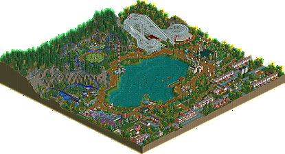
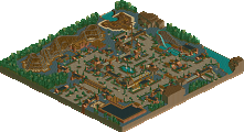
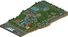
Cheers everyone. I'm really glad this simple style was received well. I was trying to build structures and gardens that seemed 'native' to rct, anything more complex would have been too jarring with the workbench/surroundings I think. At the same time I wanted to make a fairly believable park so I tried to give it a timeline - the classic woodie, midway, gardens, carousel and boats are the original 'old' park whilst the Schwartzkopf, wild mouse and the red brick structures were all built to regenerate the park in the 80's.
Its kind of hard to rate this park for me dude to the context of the bench. If it was just the content inside the park boarder I wouldn't consider this even close to accolade worthy. However, with the context the park comes together really, really well. A big testament to Ling, who made a wonderful landscape.
I guess its bronze worthy, the content there is unique and interesting, there just isn't much of it. Probably a 50-55% for me.
Some really nice touches in this park. The maze was elegantly done and I liked the additional roman structures placed round the carousel to complete the symmetry - simple, effective and not something I've seen done before, despite its obvious cleanness.
I think you've done a great job at maintaining the 'native' style, as you put it. It's got some real classic elements, yet successfully tries out new and creative things here and there, as your work always does
This is like an alternate universe where we still built in scenarios and cso and hacks never happened.
I love it.
This exactly.
I love the simplicity and approach you made, the elements you incorporated made for a really nostalgic feel - good job!
Congrats on the accolade!
Haha the stall connection problem never got fixed. For shame.
Great stuff alex; this was up there with ostdarva's entry for my favorite of the contest. The minimalist approach you took was unusual but worked really well with the scenario style I set up. The building in the back covered in foliage is one of my favorite bits of NCSO ever. And of course everything about Red Baron is just lovely.
I'm so glad to see all of the comments on the workbench and the Schwarzkopf. It's exactly what I was hoping for, and I'm happy people liked it. Congrats to alex on the Bronze!
PS: The workbench and all of the entries should be available here.
Vey very glad to see this get bronze.
Alex is going to beat me to an NE Yahtzee and this is completely unacceptable
https://www.youtube.com/watch?v=61sdceM3XIY
Thanks for the review Scoop!
Glad you picked up on the neighbourhood old-school amusement park vibes. The wooden coaster is based on Dragon Coaster at Rye Playland - https://en.wikipedia...aster_(Playland). The one Louis! made for Baker Lake is based on this coaster also I believe. The Schwarzkopf was actually made by Ling and is part of the bench, although the rules of the contest allowed parts of the coaster to be altered. I loved it the way it was though!