Park / Keverdal Kingdom
-
 05-February 16
-
 Keverdal Kingdom
- Views 5,667
- Downloads 668
- Fans 0
- Comments 22
-
 55.63%(required: 50%)
 Bronze

Chocotopian 65% Sulakke 60% alex 55% Austin55 55% Cocoa 55% csw 55% Jonny93 55% Louis! 55% nin 55% Stoksy 55% 55.63% -
 Description
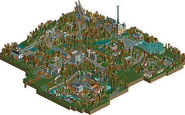
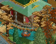
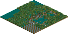
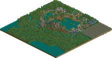
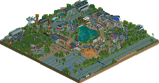
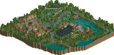
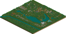
It's late October/early November... The trees are starting to turn brown, orange and yellow... Time for a hot chocolate in the small tavern in the forest, and to look at all the people coming by, tired from a walk in the woods, riding the rides, seeing the tropcial flowers in the greenhouses or exploring Miniature Europe...
That's the setting for this new project, which is basically a place to collect all my loose ideas that weren't big enough to warrant a park for themselves -
 No fans of this park
-
 Full-Size Map
-
 Download Park
668
-
 Objects
1
-
 Tags
Tags
![park_4178 [H2H8 Grand Finals] Heaven's End](https://www.nedesigns.com/uploads/parks/4178/aerialt3929.png)
I think this was pretty good.
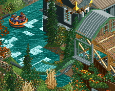
The rapids area was easily the best part in this park. The rapids itself was good although the first drop is kinda awkward. Its nice to see a wild mouse and I would be crapping my pants IRL riding it.
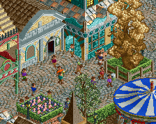
Architecture over the whole park was pretty nice. The bigger buildings in the plaza were a nice difference with the rest of the park. The castle with the launchtower is the thing I liked most. The placement at the river is nice too. The miniature area is cool and the back entrance forest path leading to the greenhouse has such a Chris Sawyer feeling.
Foilage was awesome, I tried it once but it did not turn out as good as you did.
Instead of the boomerang, I think a coaster like Tornado in Hellendoorn would have fitted this park really good and would be less boring.
Overall a nice park, would have loved to see it bigger.
Thanks! Glad you liked it!
I am actually very happy it wasn't bigger, in the end I got fed up building it and wanted to move on to my new project, Easkerton Towers and to the duo with Thirteen.
The reason for the boomerang is because it's a type of coaster I could imagine a small park like this would build. I didn't build a coaster like the one at Hellendoorn, because I already made one like that in my last release, La Fôret des Frissons
Fun little park. I liked your bigger buildings, like the castle and the mansion, try to use bigger buildings more. The fall trees were pretty cool, but I didn't like the colours of the trunks.
Entrance was a bit underwhelming, as was the hidden path to the river rapids area directly to the right of it.
https://www.youtube.com/watch?v=FjUfmMEAZmI
Quite a nice little park, some cool ideas and a little divergent from your normal style which is nice. Probably about a 60-65% from me.
Nice review! Thanks! I'm trying to get a mid silver with this, so hearing that you rate it about 65% makes me happy.
This is a great little park Jappy, shows some real growth with your archy, expanding into some new styles. The buildings are great for sure. It's rare to see an autumn setting, and I know you received mixed reviews on some of your screens. I guess it's tough to get it just right with such a small color palette, so all things considering the foliage coloring is decent, but still feels slightly off imo. Small park, small rides, looks like fun. I probably loved the rapids the most, especially the diagonal drop.
Areas I thought could be improved. For some reason, maybe on purpose, you have one set of entrance huts that are the default ones not covered with another building, which stood out like a sore thumb to me. It would have been nice to see a bigger coaster in here, maybe made this into a design rather than a small park.
I think this park shows your growth as a builder & some really nice work in the archy department, but the small size & lack of a real feature ride didn't put it into the silver category for me. 55% (but I'm not on the panel )
)
No matter, everyone is entitled to their own opinion. I'm happy to hear you think I'm making progress!
hey, nice little park. I think your architecture and detailing is actually quite good, I'd love to see it applied in a little more of a focused way. I do quite like the feel of the park but I'm struggling to like the foliage even though I like the atmosphere they provide. I think because you always colored the same type of tree the same way it looked a bit patchy and unrealistic. some good under-foliage and coloring diversity would have helped a lot I think. But there were a lot of nice details in the park, like the miniatures. I also enjoyed how the 'american' area didn't feel or look american at all, that totally seems like something a european park would do
Thnaks Cocoa, I can understand about the colour of the trees but I wanted a bit of consistency with them. Otherwise it would've looked a bit cartoony. What do you recommend for the underbrush? I would like to improve on foliage in the future.
Happy you hear you liked the rest!
There were some really pretty scenes in this park. It's clear what you mean when you say it's a collection of lose ideas, as I didn't get a strong sense of consistency or overarching narrative, but the individual areas were very pleasant.
First off, I though the autumnal trees worked well with their different shades and shapes. If anything, they were what brought everything together enough to create some regularity throughout the park, and prevented it from looking disjointed. The underbrush felt realistic and you included some nice open spaces too. One of my favourite moments was watching the tram as it made its way through the dense wooded area near the pirate boat, emerging into the open again and crossing the river on its narrow bridge. Incidentally, I thought your bridges were cool too. I've never really noticed the arch framing technique before (whether it's been done or not), but I thought the black arches you used added a particular elegance and impression of stability to the bridges.
I thought the model land was great too, with some lovely micro-detailing. I recognised most structures straight away, and those I didn't are just once I'm unfamiliar with IRL. It was quite refreshing to see a non-ride section, and to have this area of quietness in the park.
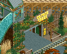
Coyote Canyon was an interesting section, and definitely felt the most manufactured in terms of how a park would theme its rides. The architecture was good, as were the rapids, and I liked the attempt at small back lot zones. A little cramped though, and thus something I'd like to see expanded in a larger park from you.
As some others mentioned, the entrance felt a bit underwhelming, almost as though it was a secondary entrance, with only one gate open and limited guest services. But I imagine this was merely a necessity rather than a fully realised part of the park.
In all, there were a lot of parts I liked, mainly because of the atmosphere. Some great architectural displays and a good eye for small details dotted throughout. I'd say it was the size that held my vote back, as I really would like to see some of these style and themes expanded. A pleasant park nonetheless.
Coyote Creek is boss. The first drop is entirely impractical but who cares? While I know it's a Boomerang, Experimental is very well done. The rest was very nice too though those were the things that stood out the most.
Nice work!
Very charming and nice little park. Personally i enjoyed the huge amount of creative content. The clear highlight for me was miniature land and the glass pavillion. Well done!
Thank you all for the nice comments and criticism, it helps and works motivating Now let's see what the accolade panel thinks of it...
Talk about consistent voting. Congratulations on the bronze.
Congrats!!!
Congrats on Bronze Jappy!
I think the architecture in this park is some of your best. It's particularly good to see some larger buildings mixed in, the belgian style terrace buildings as well as the castle building which housed the launch freefall were standouts here. What hurt the park a bit for me was some poor composition. The entrance area and mainstreet was quite awkward for example with lots of harsh right angles, narrow paths and I found it odd how the peeps direct route ahead lead to a backalley behind the terraced buildings. I wish you'd had these facing into the mainstreet so the beautiful facades were shown off more.
The Coyote creek area was bursting with charm and had some great moments but was a bit let down by being much too cramped compared to the open-ness of the rest of the park and it being somewhat boxed in by the rapids.
The rides were all well executed, especially the boomerang. I think the park was lacking 1 bigger custom coaster though.. even just a small woodie or an Arrow or Schwartzkopf.
Absolutely loved the miniature land, very good job here. It's always great to see unique non-ride attractions in parks. Everything was recognisable and full of charm (great to see The Florence Cathedral in here too, also to be found in Lake Chronus!).
Overall great work, very full of charm and fun details! If you're looking for how to improve then I'd definitely say focus on composition and using a more cohesive scale with your buildings (excluding the mini village of course )
)
I really enjoyed the texture clashing that is going on here... it's a unique style of architecture and pathing that I don't think I've seen before. That, along with the great color of fall foliage, really makes this park stand out as something different and original. Also, the little garden of miniature architecture is very cool and well executed! I really enjoyed that bit.
Overall, simple, plain in some parts but completely charming. Great work.
i think the main reason this came out bronze is the complete lack of landscape variation. it is crazy how much more mature this would look if it had more interest in that regard.