Park / Hunter/Wizard
-
 06-February 16
- Views 4,331
- Downloads 753
- Fans 4
- Comments 25
-
 64.38%(required: 65%)
 Design Submission

Cocoa 70% inthemanual 70% Jonny93 70% Louis! 70% ][ntamin22 70% alex 65% csw 65% posix 55% pierrot 50% Chocotopian 45% 64.38% -
 Description
did u miss me
-
4 fans
 Fans of this park
-
 Full-Size Map
-
 Download Park
753
-
 Tags
Tags

![park_4800 [NEFC] Ghost TowNE](https://www.nedesigns.com/uploads/parks/4800/aerialt5001.png)
![park_4821 [NEFC] Nile River Delta](https://www.nedesigns.com/uploads/parks/4821/aerialt5006.png)


![park_4820 [NEFC] Celladoria](https://www.nedesigns.com/uploads/parks/4820/aerialt5000.png)
![park_4806 [NEFC] We Overcome](https://www.nedesigns.com/uploads/parks/4806/aerialt4750.png)
Wow this is just awesome, this is the exactly the kind of LL that I would love to make, simple and beautiful. Great landscaping, foliage and layout interaction. Loved the little river and the way the path flowed around it. Really wish this could of been bigger, as everything in it I just loved.
Finally someone makes a couple intertwining coasters where one coaster isn't just a dummy/map filler
the happiest little brook
alright, review:
This Sam park is sort of a tricky one to pin a number to. Again.
Let me just copy over the relevant bits here:
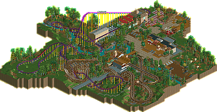
As with Classic Blast, I can easily see this getting some 50%s and some 80%s. The coasters are both solid layouts, and the way they work so naturally out from the big centerpiece interaction moment to do their own things and interface with the main path is just lovely, lovely stuff. The landscaping and foliage are understated and excellent; nothing seems out of place or overdone, and it all fits the sort of smaller-scale charm that family-oriented rides without massive inversions and showy flythroughs bring. Wizard's nod to Phantom's Revenge with the big second drop into a ravine through a wooden coaster is particularly nice. The stuff aside from the coasters sadly just ... isn't. The buildings and lone flat don't really offer any personality (I don't even know if that's a food court, souvenir store, something?) and although the path changes at the edge of the area indicate this is kind of sort of an area of the park, we don't really get a cohesive theme, even through something simple like the ride names. Something like The Dorney Park play on Hercules/Hydra could have been a nice way to amplify the ride interaction and give the area some character. Your PT prelim entry had more personality in the surroundings and that didn't even have a snack bar.
At least...
That's what I would say if this were aiming for critical success in the community, which I don't really feel like it is. I mean, it doesn't really fit the design/park format, you already know this kind of work gets mixed receptions, and there's a dicktrain. If you keep producing work like this just for the hell of it to scratch the RCT itch I'm not complaining - keep making awesome coasters with nice landscaping and keeping the entry barrier low with the #nohacks. Even if people don't really get into the parks ...
thanks guys. excellent review ][, glad you're always on hand to offer insight.
I feel pretty responsible for my teams problems last h2h so i haven't been playing. i've been pretty into film/tv (see spectre review i posted a while ago) and just wanted to build something with the simplicity i feel gets undervalued.
as a website we value detail and large things (because they are awesome) but we are neglecting a huge part of our art. we try and run before we can run. when we learn guitar we start with the achievable, with smoke on the water. we nail the strum and the grasp of simple rhythms. we don't start with frank zappa solos, and work backwards from there.
the problems that a lot of parks have is the failure to see their work as parts of a whole. you don't need hacks to do that. focus on "necessary" complexity is not helpful for the vast range of players who want to be better. i get bogged down by hacks. i can't remove that monorail without doing more hacks or i'll get a trapper. this merge took ages to do so i'll have to keep it despite the fact i need to move the coaster because i haven't left enough room for another aspect of the park. I've built too close to the bottom of the map and now i have get rid of some water even though it doesn't make sense because i've already done so much work. i was running before i had learnt to walk, and i was trying to work backwards from there.
so as i get older the more (my already substantial) love of minimalism grows. minimalism doesn't mean the removal of as much as possible, it means the elimination of the unnecessary so you're left with the necessary. It makes your ideas clearer and more focused. it allows you to zero in on why you're doing what you're doing. i desire it in art, i desire it in music, i desire it in film and i desire it in rct.
that being said, obviously don't stop having fun on my account. that's the opposite of what i want. just maybe have a think on what i say and keep on keeping on. love you all.
This is great, glad to see more work from you Sammy.
Edit: Wow, totally skipped over your post Sam but what you've just described is how I now look at this game.
The overabundance of detail and fluff is so unnecessary and has halted so much progress the last few years (in terms of completed work) and I too am tired of it. My most recent work has all been built from a "macro" perspective, that being the overall composition of the park/design/whatever rather than the individual pieces, and it's been a lot of fun and I can actually move along on projects now.
We spend hundreds of hours on these parks but in reality people only ever spend a few minutes glancing over them, so why bother pouring time into extraneous detail when it amounts to nothing on the overall picture? Honestly I could rant for days about this and have a bit of a post I'm working on, but that's for another time. It's just good to see another taking that sort of mentality in their approach to the game.
i guess its a return to the old point of "building for screens", where we only truly get the most of someones intended vision when they cut a square out of it to zero in on the detail
this is come classic sssammy sleek, minimalist, clean realism. amazing layouts (seriously) and awesome landscaping and interaction. I really enjoyed how you used the environment. I'm not sure how to vote on it but there seems to be an interesting discussion going on in this thread so maybe I'll have a read first. my main thoughts were that maybe the 'park' content was a bit lacklustre and empty feeling but it sort of works with the whole atmosphere so I'll have to think about it.
also I think this is a great quote that totally makes sense to me. I think you may really be on the verge of a new wave of rct... well we'll see I guess (has the nincso bench been released? I'd love a crack...)
Applause to the macro love, and I'm so happy to see this Sammy. Rather unexpected.
I liked it but didn't love it. Your style is always a joy to look at, but some of it felt a bit lacklustre and unrefined. I thought the layout of the land and rides wasn't the best, and I missed some more elegant design choices. I still find that one big building you made to be rooted in what was once a very technical RCT2 style. You need to truly change and move on to somewhere new.
Gawd, it's really good to see you keep building! Although I voted 50% on this, I'd like to see more of work from you.
Good to see you back sammy.
I'm afraid I couldn't get into this much and, judging from the comments, I feel like I'm missing something. For me, everything felt a bit confusing and random, and rather limited all round.
I understand that you've adopted a minimalistic approach, but to me this just came across as minimal - I felt like I was doing the work, filling in the blanks, and making the park as good as I could imagine it. The food court area for example, had the hints of an Asian restaurant, a wooden themed restaurant etc. which in itself was nice, but I felt somewhat cheated, as though you'd placed a pyramid and said "Ok, this is an Egyptian area now".
I wasn't too keen on the coasters either, I'm sorry to say. I think I preferred Hunter of the two, with the better pacing and flow, but Wizard felt quite clunky in places and lost its momentum. I'm not entirely sure of the link between the two either (tied in with the reptile ride). Is there a reference that I'm not getting? The interaction was a cool point though, with a well timed and placed introduction shot of the area by you.
There were some other neat details that I did appreciate, such as the sunken fruit trees and the hat stand as a control booth - both very tidily done - and the narrow stream was pleasant. I thought the landscaping was well done too, but I just couldn't grasp the mixture of wall textures. Odd stone walls next to brick next to bare land and back to stone again... the inconsistency really confused me.
Overall, I understand what you were going for, but I just couldn't rate it very highly. I personally don't see non-hacking as an achievement, and I feel that there are many players using vanilla NCSO rct2 who are also adopting this "walk before you run" style. I voted 45% for the content and because there is clearly thought and planning behind this, but ultimately I felt it was an experimental style that didn't come across too well.
thanks for the kind words boys
This was fantastic, such a delightful, simple and elegant design.
The foilage and landscaping was a wonderful composition. I am glad to see you back.
I'm sorry but this is a joke.
Wow, this didn't win? Quite surprised.
Aw man, SSSammy robbed again