Park / Valravn
-
 23-January 16
- Views 4,846
- Downloads 727
- Fans 2
- Comments 12
-
 65.00%(required: 65%)
 Design

Austin55 70% geewhzz 70% alex 65% Chocotopian 65% Cocoa 65% disneylandian192 65% Jonny93 65% Liampie 65% Louis! 60% nin 60% 65.00% -
 Description
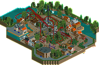
Soar on the wings of Death. Valravn takes you on a wild out of control tear through over and around the surrounding town, including many near misses and dramatic elements. Many have turned away in fear, do you have what it takes to conquer Valravn?
-
2 fans
 Fans of this park
-
 Full-Size Map
-
 Download Park
727
-
 Objects
1
-
 Tags
Tags

Cool little design here Maverix! Good mixture of archy, I think the colors you've used work very well together. The coaster has great interaction with the surroundings! Just the setting along the water (I guess a river), with the village, it's all really nice. Well done!
This layout was just fantastic, the interaction, queue placement and station were also really nice. Building placement possibly could have been a bit better though, it felt a little cramped, would of liked a little more breathing room on the map. Design worthy in my opinion, but probably not your best effort in this category.
The layout is very very good. I would have gone with it being Mack rather than Intamin, it feels much more like Mack's style of mega-coaster rather than Intamin's mega-lite. I know they are very similar, just the steepness of the lift/drop in this design makes it feel much more mack.
The architecture isn't that great and the surroundings seem a bit rushed in places. It's certainly not your best work.
For me, I wouldn't award this design, because it is literally just on the bored. If it was a little bit more polished then it would hit design, I just think the lack of a few details here and there, and the flat feeling it gives me, I think its just going to scrape by.
Nice to see more work from you though!
I enjoyed this.
I'm not sure if it was intentional or not but I liked how the blocking slowed but didn't stop the lift near the top of the hill as that's a very "Intamin" thing to do.
I don't love this NE, under-sized coaster style but the layout is very nice and interacts really well with the surrounding areas.
I wish there was a little more going on around the ride and I wish the drop tower was open but overall this is very nice. Great stuff!
yo this looks great
yeah, pretty decent work. I liked the layout and colors and it feels like a nice complete section of park. I think the archy is maybe a bit samey/stale and doesn't really achieve very much (buildings need more purpose I guess?) but overall it has a pleasant atmosphere. Not bad at all, although I would love for you to really push yourself out of your comfort zone and try new things. You're definitely talented enough to really do well, but I think you're being held back by being a bit... conservative I guess.
65% from me, I think it does deserve design. The layout makes it stand out enough.
I thought that the coaster had a very pleasing layout, with smooth drops, turns and transitions throughout. The way it glided over the lake, over paths and through the landscape was nicely done and I felt it added to the excitement of the area.
I have to agree with some earlier comments about the buildings though, in that they did feel a bit samey and purposeless. They were neatly done, and I did like the colour selection of the buildings near the boat, but for the most part I felt that they were unnecessary and perhaps a little too tall, which overcrowded the paved areas to a degree.
I thought the scenery was good and the overall setting was attractive, with the lake, canals, waterfall, foliage and rockwork all adding pleasantly to the area. The small orange-roofed building with the balcony overhanging the river was a part I found particularly lovely.
Upon looking at the design as a whole, I noticed it mostly breaks down into circles, with the coaster central, then the buildings around it, and the foliage mainly around that. As such, I found it easy to break my votes down as: Coaster-75%, Buildings-45%, Scenery-70%, averaging out at about 65% in total, and thus I thought it worthy of a design accolade. Ultimately, I think you had a great coaster in a beautiful location, but hindered it somewhat with the structures.
Holy shit, that's a close vote. Congrats on the design!
Congrats on the design, you just made it, and I think the park reflects that.
The layout was fun, and the maintenance trucks were a fun touch. The architecture and foliage/landscaping was sub-par though. There was nothing that really sticked with me. Theme was a bit vague, as was the purpose of a lot of the architecture, like some people already said.
Like most have already said. I'm really surprised that this won design. The layout is great and the setting idea is too, but you can definitely tell that it was either rushed or incomplete. Congrats on the design non the less.
Congrats! This was saved by the layout (as you probably already know!) I won't bore you with what I thought were the weak bits as they're the same as everyone else's. I really did enjoy the coaster though - looked beautiful and was fun to watch with some excellent interactions.