Park / Breakneck Bluff
-
 23-January 16
- Views 2,556
- Downloads 485
- Fans 0
- Comments 7
-
-
 58.13%(required: 65%)
 Design Submission

Kumba 70% Austin55 60% Cocoa 60% csw 60% posix 60% Stoksy 60% alex 55% Chocotopian 55% inthemanual 55% Louis! 50% 58.13% -
 Description
December 2015 Reddit Contest Entry
-
 No fans of this park
-
 Full-Size Map
-
 Download Park
485
-
 Objects
1
-
 Tags
Tags
![park_3787 [NEDC4 10/15] - Apollo](https://www.nedesigns.com/uploads/parks/3787/aerialt3441.png)
![park_4712 [NEDC5 - 05/10] Fireball](https://www.nedesigns.com/uploads/parks/4712/aerialt4594.png)


I can't really say that I'm a fan of this park.
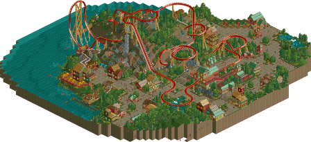
The coaster itself did little for me, it had some very weird spots such as the parts right before and right after the lifthill, especially considering how slow the train goes through those parts. For the rest the pacing was decent, if not a bit too fast through the inversions. Next time definitely ask yourself if certain elements are taken properly by the trains.
The architecture wasn't really exciting in my opinion, the fact that you always use full tiles and generally stay somewhere around 2×2 mean your buildings couldn't really create any excitement to them. The colour and texture choices weren't my favourite either, which made things kind of dull. I'd like to see you move a bit more out of your comfort zone by trying out new stuff and being a bit more daring.
The foliage definitely was nice though. Your foliage palette looks nice and the placement of your foliage is good too.
Landscaping was definitely a big plus here as well, the mountain you have going in the center actually makes this coaster quite exciting, even though it had it's weird parts (but other than that there wasn't a lot with it, I'm just being a bit nitpicky right now to give constructive criticism).
Overall a pretty nice design, but it sadly didn't really stand out for me. 55%
^ I know about the pre-lift/post-lift thing, Stoksy pointed it out to me. I guess I should have changed it before I submitted it to NE. I just made this park for fun, I wanted to support the reddit contest.
But regarding how elements are taken by the trains, I don't really get what anyone means by this. I get this criticism every time. I thought my pacing is improving, which I figured was the biggest key to elements. Kind of figuring out when elements should be placed (beginning, midway, end). Maybe if I frequented coasters I'd be more in the know, but I don't so.... c'est la vie!... not sure what else to do with that one.
Other than that, I may break out of my style in the near future. I don't have any desire to build realism, kind of bores me to bother trying, but maybe some different styles of architecture, we'll see. The key for me to play this game is to keep having fun, and I still enjoy this style. I'm in the middle of two bigger parks, we'll see what happens as I finish these off.
Thanks for the review/critiquing gdb.
this reminds me a lot of cp6's mountaineer, only with a more fucked up layout and confusing theme
I enjoyed it though, seems like a nice section of old-school parkmaking. Not a lot there to hold my attention but I appreciate the style in general. I reckon you can take this style that you clearly like working with and make it more adventurous and exciting.
bigshootergill, on 24 Jan 2016 - 12:46 AM, said:
It's mostly an aesthetical point aside from the odd pacing. Some of the elements you make in your coasters just don't look good with the rest of it, and feel out of place. Improving your layout skills will help you immensely.
I have to admit, I found this a tough design to judge. Technically, I felt that everything was there - impressive coaster, decent landscaping, pleasant buildings, foliage etc. - but something about the whole thing failed to hold my attention.
I think gdb summed up my thoughts on the architecture, in that everything felt a bit restrained and safe. Incidentally, my first thought upon seeing it was "this is exactly how I would build" (and I'm pretty sure I use exactly the same pieces too), but it was this fresh look at this style that made me realise a somewhat lacklustre quality to it. As said, it's visually pleasant and technically sound, but it just doesn't evoke much excitement.
The coaster was pretty cool in my opinion, but had some shortcomings. While I actually did like the meandering parts of the coaster, particularly the pre-lift bit, I felt it lacked pace. I also felt that some of the inversions and transitions, such as around the final corkscrew, were a bit jerky, and broke up an otherwise smooth ride. The interaction with the landscape was good though, and the top hat element over the water had a real grandeur to it. As for the music... I don't think it really fit the area much.
Following on from the idea of fitting the area, I got a mixed impression of the mood you were going for, again making this hard to vote on. The village was idyllic and peaceful, with almost a cutesy quality to it, yet the twist, tower and hover rides didn't compliment this. Their names too (including that of the coaster) seemed rather generic and independent of the theme, making me further question what the theme actually was. I guess I sensed a How To Train Your Dragon vibe, with a powerful feature descending over a small settlement, but if that was the case, I think it could've been developed much further and would've pushed the design vote higher.
Overall, a nicely crafted design that I think could've benefited from a stronger narrative. I liked it, but did not feel that it quite reached design quality.
^ Honestly I didn't have much of a theme in mind Chocotopian. The reddit contest was to build a coaster with a mountain in it, so that's what I did, not really with any particular style I was going for. I had to stick to the workbench provided for the contest, so I couldn't add in any extra objects. Thanks for the review. I wasn't expecting this to win design, though the verdict is still out from the jury, but I'm fairly happy with how it turned out nonetheless. It was a fun side project.
Definitely one of my builders to watch this year. Your productivity and dedication and really good to see and should bring great things to you in the future.