Park / Kestrel: Canyon Raptor
-
 29-December 15
- Views 2,910
- Downloads 644
- Fans 0
- Comments 14
-
 62.50%(required: 65%)
 Design Submission

geewhzz 75% nin 70% inthemanual 65% Jonny93 65% Poke 65% Chocotopian 60% csw 60% posix 60% alex 55% pierrot 50% 62.50% -
 Description
Nothing fancy, just a casual peep-friendly project. Kestrel is built like I build in scenarios, with no pretensions of needing to look outstanding. Started as an excuse to use a nemesis-inspired layout and a natural park theme.
-
 No fans of this park
-
 Full-Size Map
-
 Download Park
644
-
 Tags
Tags
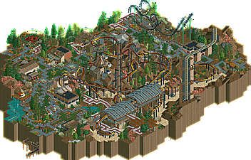
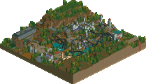
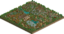
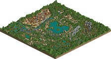
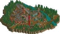
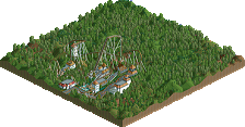
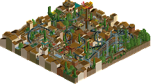
NICE.
edit: Is this meant to be a park or design? I figured design since the main draw of it is the invert, yet the tags say otherwise.
The theme and layout are wicked, but my main issue with the park lay in the fact that it utilizes single-wide paths. I get why you did it and that it brings a peep friendliness to the park, but it leaves it a bit messy and chaotic.
A nice little piece of work, always cool to see peeps in a LL park. Maybe a little too chaotic for my tastes though, especially in some of the architecture. I did like the layout though, probably one of the better LL inverts we have seen in a long time. Maybe a touch to sparse in some areas as well, not really a fan of the queue or really the edge of the map behind the invert, just got a little messy there. The entrance to the coaster was really nice though, excellent placement.
I still await something a little more serious from you, obviously you have the talent, its just a matter of putting all the pieces together on a bigger map.
From the overview. Will check out in-game later. Looks a bit messy. Possibly because of all the single-width paths. But all in all it certainly isn't bad. Layout was nice. 60% if it's going for design.
Nice little release this! Makes me want to have a go at a quick peep-friendly design.
+Simple but well themed and had a nice natural atmosphere
+Layout looks great. Strong Nemesis vibes but also very unique.
+Railway bridge also looks great.
-Coaster pacing was too slow through the first 3 inversions.
-Looked too messy. I didn't have any issue with the single wide paths at all (infact I thought the paths and flowers looked great) but I found the architecture quite chaotic. Too many awkward looking path railings and supports for my liking. A narrower pallet of textures and simpler forms would have looked better I think.
Is there any point in releasing LL stuff anymore? 16 downloads in a week? It's a joke.
I'll tell you what I think about this later but it looks great from the overview. Even if it's scenario based, it's definitely quality work.
I'll check this out once I have access to my LL disk next week.
To be fair, there are probably about 3 people outside of NE who actually play LL and download parks. It was also a holiday, there have been a bunch of other releases lately, and its not like this is a massively hyped up gigantic park. Most of the downloads on NE have always been non members, or it at least used to be that way 4-6 years ago. Considering how difficult it is to even get custom LL parks like this to run now a days its understandable there isn't a big community anymore.
I don't think quitting LL because few people DL the parks is the solution though.
I thought this was great. The peeps created a fun atmosphere and your use of flowers in this was really interesting. I thought the layout looked effective and its accompanying landscaping makes it exciting and your use of the martian texture added some nice colour. Unlike the others, I didn't really find it that messy, maybe in some parts but it's not necessarily a bad thing.
A little chaotic for me too, I'm afraid. However, it did have a pleasant atmosphere overall and there were parts that I really liked: the cycle monorail area was cool, with the twister ride underneath and the skinny trees for it to wind through. I thought the flowers worked well and the foliage, though mixed in terms of geographic locations, blended nicely.
Regarding the coaster, I thought it interacted well with the landscape, but this in itself felt very random and difficult to define. I really lost sense of height and depth while watching the coaster travel. Similarly, I believe the non-definition of the landscape is what caused the building structures to become a little lost as well, seeing as they were made primarily of landblocks too. I did like the loop round the lift hill though, and thought that was neatly done.
A random little detail that I did like was the irregular loop of wild mouse track around the top of the central roosting tower. From two of the angles, it looked like a circular disc that had gone askew, and it really looked like you'd built off the isometric grid! Not sure if this was intentional or not, but it was certainly interesting.
The single wide paths were enjoyable to see and added to the pleasant, almost nostalgic atmosphere, and the hints of other rides were fine, if a little limited.
Cool work overall with plenty of charm, but a bit too chaotic for my taste particularly with the landscaping, and that's what held the score down for me.
I think this was pretty nice. I really enjoyed the setting of the inverter. The interaction with the landscape was spot on. Also the tower in the middle was pretty good and fit in very well.
The path layout was a bit obscure. In some places it felt a bit chaotic and minimalistic but overall this is a solid design for me.
This thing was awesome, the layout really kicks and the setting just makes it perfect. I feel like it´s a bit to compact for a design, because you had to cover much of the map with the surroundings. Dont get me wrong, I really like this but as nin said it may have been better in an actual park than as a design.
The tower in the middle was awesome.
I just got a chance to check this out and I thought it was awesome. Definitely underrated, I would easily have given it design. Solid layout, landscaping, atmospheric themeing, etc. I just really enjoyed the whole vibe of it.