Park / Victoria Classic
-
 03-January 16
- Views 3,478
- Downloads 750
- Fans 0
- Comments 14
-
 63.13%(required: 60%)
 Silver

Chocotopian 85% geewhzz 70% Liampie 70% posix 70% nin 65% disneylandian192 60% Jonny93 60% alex 55% csw 55% Louis! 55% 63.13% -
 No fans of this park
-
 Full-Size Map
-
 Download Park
750
-
 Objects
1
-
 Tags
Tags
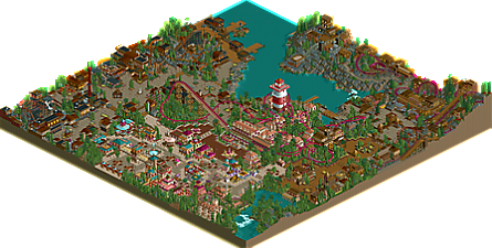
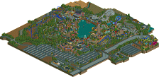
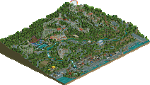
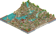
hashtag throwback.
Solid little park, reminds me a lot of Artist and Turtle circa 2005/2006. Could possibly have been something special if it was a larger size, almost like an Isole Calabria or Ports of Magica with more modern foliage and layouts.
Solid 65% from me.
Not bad. I prefer your LL
Had a quick look at this earlier, wanted to have a better look before rating/offering feedback though.
#throwback is certainly accurate.
Great park! I want to give you some feedback shortly Poke, I'm just being lazy (or working on my own park).
I really liked this.
It has everything I love about classic parks like this, a focus on colours and landscaping/interaction, rather than detailed architecture and realism and hacking, so that is awesome. And it had peeps! Something I always miss in the old parks.
I especially liked the car ride in the corner called the royal palace or something.
Well done! 70% for me.
Pretty nice park.
It felt very classy and like G Force said it has some Turtle and Artist vibes.
My favourite part was definetely the arrow looper and its theming, the color choices there were fantastic in my eyes, also the station and the lighthouse were pretty good.
Overall a smaller and very enjoyable park, good work!
Absolutely wonderful. This park encapsulates a style of building that I really like, yet can't necessarily pinpoint. It's charming, fun, clear, neither too complicated nor too simple, has a mix of rides, textures, landscapes and atmospheres. To be honest, this park embodies exactly how I try to build, and how I want a park to look, but I'm still far from
As a main point, I'd say your use of colour was very well done. I really appreciated the vibrancy of the entrance area, and the way in which the more subdued areas were not completely washed out with brown but featured lovely colour splashes, or at least a range of textures.
Some of my favourite parts of the park were the superb markets stalls, which really gave off the bazaar theme. Also, I liked the dock areas, particularly those narrow jetties with a couple of peeps walking on them, creating a lovely serene atmosphere against the waterside and standing in complete contrast from the otherwise bustling plazas and roaring coasters.
The coasters themselves were great. A little... unusual, particularly with the supports on Victoria, but I always like to see different things. I thought their interactions with peeps, scenery, buildings and landscaping was nicely done, and they had good pace for the most part.
Finally, I thought the non-accessible mine area at the back of the park was very cool. Rather a bold choice to isolate a relatively large area of a relatively medium-sized park like that, but I think it worked excellently. It was interesting to look at and provided a fascinating backdrop for peeps to view across the lake.
Overall, I loved this. I only wish there was more because, as I said, this style is really to my taste, and I think you recreated a classic vibe well. The size of the park and a few technical errors were what caused me to vote as I did, but should you produce something similar on a larger scale (with a touch of polish) again, I'm sure my vote would be floating around 90+.
I hope you produce more parks like this in the future!
I don't have an issue with the amount of absolute realism we see on this site, but it's definitely a pleasure to see work like this that harkens back to a previous era. I think in a perfect world we would see a blend of both realistic and pseudo-realism released fairly often. I think with the continued object limit struggle we'll be seeing an evolution of style though, with the knowledge of realistic details combined with more aesthetic decision making like done here. In other words, good job. We needed this.
Congrats on the accolade!

There's definitely some evidence of your LL roots in the creative use of objects (particularly in overhangs), and the landscaping being universally excellent. The areas all reminded me most of Slob, but also Artist and Turtle (both of whom took at least some inspiration from Slob's style).
My biggest peeve with the park was the coaster selection. While each of the five (four "adult" coasters) was quite good for it's type the types were still "early 80s" Arrow, Togo Standup, Mack Wild Mouse and a (probably Arrow) Mine Train. If that was a real park it sounds very much like one I would never go out of my way to visit. That being said the mine train especially was very, very good. That area was phenomenal in it's use of color and texture and I absolutely love the way it rises out of the water to form a backdrop for the rest of the park. Very inspirational.
wow I loved this park. Full of vibrancy and atmosphere, and each area felt like it was crafted uniquely and has its own special atmosphere. The entrance is lively and colorful and Victoria is an awesome centerpiece, especially with the giant lighthouse. Firewood village is maybe my favorite, just feels the most detailed and well rounded and I really love the dock area and the whole area around the wild mouse. The terracota area is probably the weakest but still a really nice old-school addition. The mine area is also awesome, I love the mine train and the whole docks area on the peninsula is really well done and very atmospheric. On the whole, great park. Felt fun, fresh, and fancy free
Really liked this park, some amazing moments in there.
Although I´d say it´s a bit too brown around the edges. But who am I to tell you
https://www.youtube.com/watch?v=N6Spn9wtulI
Review time.
Other than the truly iconic older spotlights built in this type of style, I'm not quite convinced that anything built in this style could get anything more than a low gold. Probably based on my own tastes, for which I can only apologise.
The entrance was lovely, some soft, pastel colours with accents of teal and maroon/pink was so pleasant to look at. Very easy on the eyes without suffering from problems of too much of the same style.
Terracotta vale was very...brown. Which is hard for me to critique because I myself am guilty of using a lot of brown but I still feel that the contrast between this and the entrance is perhaps too sudden. The architecture just started to look very similar very quickly, and there wasn't the colour changes that worked so well in the entrance to offset any clear similarities (again, one of the reasons that limited CSO is so difficult to make work well because architectural detailing is limited, colours/texture/form are even more important). I maybe would have avoided using any light brown on the buildings so it didn't blend quite so much with the path(?) Forms were very different, but it still looked the same.
The landscaping around the mine was a nice change (landscaping was a great feature of this park I think), but it would have been nice to have seen the area accessible/park themed (eg access up and around where the transport tracks are). The mine train has some awkward transitions unfortunately, also not convinced by the colours but it certainly added something to the area. The architecture worked a lot better in this area, shame it was so similar to terracotta vale because I felt the themes were relevantly different and therefore warranted more clearly different architecture.
The port was interesting, a little bland, but it was well situated in the context of the overall park. Also nice to see a rarely-used coaster-type. I quite like the industrial stuff (wild mouse included) but perhaps this area would have fitted better as an offshoot of the mining theme(?)
Might as well talk about Victoria as well. Probably design-quality on its own which is a great feature to have. Interweaved with the landscape, foliage, and architecture surroundings which was really great.
Perhaps slightly too much crazy paving in the park overall though. It's a texturally interesting path, but when it's used basically everywhere it kind of loses its appeal. Worked brilliantly in the entrance area, acceptable in the mining area, but quite strange in the industrial section. Moderation, especially in the industrial area, would have helped here I think.
Silver is probably accurate, 60-65 for me. Apologies that this review has taken so long, it was certainly a pleasant trip down RCT-memory lane.