- Views 24,330
- Downloads 1,589
- Fans 28
- Comments 99
-

-
 83.13%(required: 70%)
 Gold
Gold

geewhzz 100% yes nin 95% yes Pacificoaster 90% yes Kumba 85% no pierrot 85% yes Liampie 80% no Sulakke 80% no csw 75% yes Poke 75% no Louis! 70% no 83.13% 50.00% -
 Description
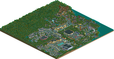
A Cedar Fair Entertainment Park
-
28 fans
 Fans of this park
-
 Full-Size Map
-
 Download Park
1,589
-
 Objects
530
-
 Tags
Tags
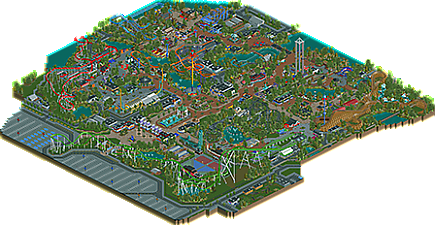
Tell that to all the recent spotlights, lel
It's basically forcing people to change their style to one they don't necessarily enjoy as much if they want a chance at a Spotlight. This is pretty unfortunate because ultimately it's likely to lead to less parks actually being completed and released as in order to finish a park like this it requires a ton of motivation. Many of us get that motivation from visiting real parks.
By the way, thanks for your explanation Sulakke. Those are all valid critiques... If everyone else had the same reasoning behind their votes I wouldn't have a problem with this score at all.
Not liking the style of park isn't a good reason for a low vote in my opinion when the style is based off of real life parks.
The people who gave this park anything below a 85% obviously don't have a good eye for things. Like anyways people. This park should have won spotlight and you all know it. It didn't get one because you're all waiting to give the spotlight to BGA. :/
Just because BGA is coming soon doesn't mean that plenty of people didn't find this spotlight-worthy. People in this topic give plenty of reasons why they think it deserves spotlight or doesn't, and other good parks nearing completion isn't one.
Personally, I think this park definitely warrants the old Blockbuster category. It's a well-executed park with mostly-great execution on the rides and realistic details but doesn't stand away enough from previous realistic releases in a stylistic sense. It's a higher quality than the majority of Gold releases, but I don't see it enough as a standalone (yes, innovative) park for a clear Spotlight. That being said, I wouldn't have minded if it got spotlight, if only to avoid these asinine arguments
EDIT: This reminds me a lot of Faceman's Paradise Island, where it was a high quality park that, while having a high level of execution, missed the Spotlight mark due to its stylistic similarities to previous parks. It wasn't a sense of "oh, this is a copy," but more of a "I feel like I've seen this before and done better." It just looks like history has repeated itself for a new NE generation hah.
Robbie is pulling a Rihanna.
Just love it, G Force.
Otsdarva Fan Offline
Excellent work. Congrats on winning gold. I'm sure you'll earn a spotlight on your next project. I'm amazed at how quickly you built this park.
this is a great park and i don't want to diminish that but i've also never seen a park's response be affected this much by nepotism
I've already given you my thoughts in private, but I'll reply here too, and they might be a bit more added in here and there.
First, congrats on being an NE Parkmaker, and congrats on the gold. Particularly one so close to spotlight. I think you have turned into a great member of the community and have really become a decent RCT player.
Looking back, I probably should have voted a little bit higher, but I still wouldn't have voted much more above 75/80. And I'm not the first, nor will I be the last, controversial low vote, but I'm not that far away from anyone else, like can happen a lot of the time, there are 2 75% votes, so I'm not the only person who has this supposed controversial vote.
I voted 70% for a variety of reasons. It's a very well built, high quality park, but for me, it had several flaws.
The park layout was very organised, planned and set out in a way that suggested the park was almost built as it was rather than a park that has grown outwards and changed throughout time. It felt too perfect and pretty for the amusement park it was meant to portray, and I think that it could have been done with being a little bit more gritty in certain areas, and more atmospheric in others, as the atmosphere was also a problem IMO.
The park felt very sterile and whilst this is a heavy realism park, and thus being sterile isn't a big deal, it just didn't have any charm, that say, Starpointe, or SFSF, or SFC had. And I don't think that this being a Cedar Fair park can be used as an excuse for these problems or for how similar it is to other realism parks. There needed to be something in there that made it spectacular, everything was solid but it felt like a sub-par Starpointe v2.0. It didn't have a lot of originality, not everything has to be original of course, particularly in realism, but I would have liked to see more of your own spin on things, something a bit more exciting to set it apart from the rest, something that would make me come back for a second or third look. Your style is similar to other peoples, and when you have a similar style and build a similar park, it becomes a bit boring.
The coaster layouts, in my opinion, weren't the best and they felt awkward in places, however the line up was a very good selection of coasters, what was with the main coasters all having lift hills the same way though?
The whole park was totally flat, which was odd, there was no elevation change at all, not even a tiny bit of slope. I think even just one change of level would make the park that much better, even if it was in the coaster layouts or on the outskirts of the park, and combine this with the repetitive foliage, it was just a bit standard, although the foliage choice was good.
It is a great park, better than any park I could create, I certainly don't dispute that. I hope you continue to develop your skills and create an even better park, you have the potential to be the best the site has seen. This is your first park, there is much to learn from it and take forward into the next, your debut park was never going to be as personal as you could be, not when there are so many people to be influenced by, which is a great thing to do at first, now you've learnt from that and can take it further. I do think you have quality work, and I don't think there is much more you can do to improve your skill level, I just think you need to identify how you can make your work better in other ways and how to make it different. Much like Robbie. I don't think his work has improved in any quality since SFSF, he has just identified how he can make his work better, without upping a skill level that cant be improved upon.
What you have achieved in such a short space of time is incredible, and don't let my vote, or other people's votes, high or low, impact you in the future. You've gone from nothing to a star in the space of a few months, I don't doubt for a moment that you will have more than one spotlight in the future. And if anyone can top Rob's recent score, it will most likely come from someone like you that is humble and has a desire to build bigger and better.
Thanks a bunch guys!
Thanks, but perhaps you could elaborate a bit more, I'm a little unsure of what you're referring to.
Thanks a lot Louis, like I said, I never had a problem with the way you voted. I was just a little curious on why you voted the way you did. Anyways, thanks a bunch for all the complements, it really means a lot coming from one of my favorite builders.
As for all the lifts going the same way, the real CGA does this as well, it was sort of an unintended consequence of trying to mimic aspects of that park layout. I think it has something to do with the sun, so its never in the eyes of people when they are on the lifts or something. It does look a little odd though, and by the time I noticed it was way to late to change sadly, however, I guess the reasoning could apply here as Florida is somewhat sunny, or at least I've heard.
Still, thanks a bunch, it really means a lot.
I realised I never commented on this.
I actually liked this park a lot, but obviously not as much as Gee. I thought there were a lot of cool ideas, and a bit of built up history that really helped it come to life a bit. Demon Drop and Wizzer were both pretty key to helping provide that aspect, and they're both ride styles we don't see enough of, so I appreciated you bringing them in.
Some parts of the park didn't really makes sense in that way though, and took me out of immersion a bit. The way fury cuts into the parking lot, with grass underneath, rather than old, defunct parking lot was one such thing. I could see that you might have intended that as part of the renovations that occurred when fury opened, but it doesn't feel too believable to me. I also didn't really feel like Fury flowed too well anyways.
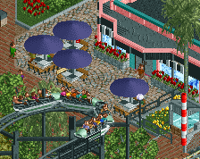
Another thing was that a lot of the buildings, while all very unique and well designed, didn't display much purpose. I found myself having to check what kind of stalls you'd placed inside, on several occasions, to see what a building was for.
I also found a lot of the park to feel a little generic and bland. I wanted a bit more variation from the norm, thematically, interactively, creatively, whatever. A couple areas where I thought you did this well were around the log flume, and around the woodie and rapids. I loved how the flume towered over the car ride, and i could imagine it having a pretty stellar, unique view of the park. The woodie interacting with the rapids (or was it vice versa?) was also very well done, and served to be a highlight of the park for me. I also quite enjoyed the woodie's layout. The rapids themselves could have used a bit more love in the hacking and layout/elevation departments, but I liked the theming you'd done on them, which made them enjoyable regardless.
this park absolutely did what it set out to do, but unfortunately, that's not exciting to everyone. Regardless, it's an amazing park, and really highlights the improvement in technical skill you've developed since H2H.
If I'd had the time to vote, I'd have been 85%, but a no on spotlight, because while it showed technical skill at a spotlight level, and I enjoyed the park very much, it didn't really have that extra spark to push it to the next level that I think spotlight needs.
They're also on a kick of building "front gate coasters" and modernizing the main entrance and parking entrance area in the process. Leaving parking lines intact is something Six Flags would do, Cedar Fair would never do that because they actually give a shit..
What was done here is exactly what would have been (and what was) done in real life.
We did it again. Amazing park G Force!
I distant myself from everything V1 said in the first few minutes.
https://www.youtube.com/watch?v=OJdTKBWRkBM
With the exception of Kumba, this a classic example of European and non-European preferences in voting that most people don't seem very willing to admit. Not saying it's bad, but it's definitely there every time a park is released that's strongly geared towards classic American realism, in my opinion at least.
But enough about that. I guess there's two different schools of thought on this park and I'm in the one that loves it so. I love the layouts and the pacing. I love the feel, the Cedar Fair vibe, all of it. Keep it up G-Force!
Fucking hilarious comment btw Bill.
Okay then, let's do a review for this...finally haha
First of all, I think this was borderline spotlight. Originally I said that this was Starpointe but bigger and with more iconic coaster layouts, however, upon additional viewings (and this also came up after looking at BGA), I can certainly see the reasoning behind not giving this spotlight and I think I fall into that category now.
It would have been nice to see some cars in that huge entrance carpark, however, I know that the object limit was a problem for you so that's not too big a problem. The initial bridge over Fury was a little weak, possibly because of the textures or the monorail walls but it just didn't 'fit' with the rest of the park in my opinion. Shame, because it was a really interesting thematic element. The entrance gates also seemed a little dated, these were some of the first things that you built(?) and I'm not sure how much you re-did them, seem underdetailed/unimposing for an entrance. Maybe some towers/greater height differential/just strictly bigger/wider gates would have helped.
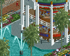
Main street seemed to be lacking some architecture on either side. Beautiful central pathway with the custom sign, carousel, leading to the theatre. Followed by a lovely, snug, kiddy area; adore that. The power towers added a nice touch of colour, as did the Chaos ride.
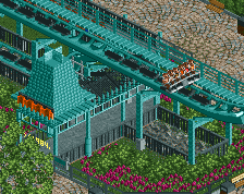
Great interaction between the rapids and Prowler. However, it would have been nice to see some more features surrounding rapids. Maybe I'm just spoiled by rob's in BGA, but it would be really nice to see rapids that have more thematic features than just foliage and rockwork. I did like the realistic backlot with the boat crane(?) lovely touch there. I would have liked to see you do a bit more with Prowler's station though, also might have been worth changing the queue path so it didn't blend in quite so much with the standard path.
Fury was quality, really appreciated the custom sign you used. The stadium was really well done, interestingly positioned, I'm not sure if I necessarily like it. I can appreciate Fury being built around it, but having Demon Drop so close just throws off the 'feel' for me. It's a relatively big stadium/outdoor theatre but the path leading to it seems cramped in comparison to the size.
On the other side of the park now; the dodgems were 10/10. Maybe a little too centralised on the actual path (only awkward from one angle though) but style/form are probably some of the best dodgems I can remember. Something about curves just sits really well with me.
Great awnings on the Shrimp Co I did feel that more could have been done with the flume theming. Seemed overly empty despite the surrounding foliage and interaction with the car ride for some reason. Maybe the height of the foliage? This was one of the things that held this park back overall I think. Foliage went from underbrush/flowers/rockwork straight to tall trees in all areas. I think that this made it all seem a little monotonous. There was no real in-between where there could have been, eg low bushes by the low sections of the flume. It certainly worked around Wizzer, but not necessarily in other areas.
It was great overall...really great. But it just didn't feel like a spotlight I don't think. Quite easily quantity, quality was borderline probably pushing it (the architecture didn't really lend itself to details that could be appreciated size-wise - hardly any buildings have more than one level which means overall scale is a tad off I think), but for some reason it all didn't come together in a way that spotlights just 'do.' I don't like that I can't point to features that can clearly be improved to justify why this is 85 and 'maybe' for me but that's just how I view this. Larger architecture, and varying foliage height is probably the best I can do.