Park / Cocopa Bay
-
 18-December 15
-
 Cocopa Bay
- Views 5,064
- Downloads 901
- Fans 1
- Comments 15
-

-
 63.13%(required: 60%)
 Silver

Kumba 80% Cocoa 70% Poke 70% inthemanual 65% Sulakke 65% Jonny93 60% pierrot 60% Stoksy 60% alex 55% csw 40% 63.13% -
 Description
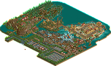
Almost took a decade, but there it is. Levis' old park, first ruined then saved by Liampie. A mix of chaotic fantasy and mild realism.
Not compatible with OpenRCT. -
1 fan
 Fans of this park
-
 Download Park
901
-
 Objects
1
-
 Tags
Tags
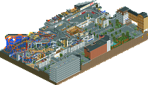
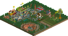
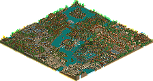
Always great to see more Levis work even if his style was never quite my favourite.
I remember commenting on the screens about how it'd be interesting to see how everything fit together and I wasn't really convinced in the final product. Perhaps because of the strange mix between fantasy and realism, this didn't really come together as well as it could. Nonetheless, kudos for finishing this off Liam!
Totally knew this was a Levis park. Will take a look shortly.
I'm right in thinking this was the one that originated from RCTAvenged?
The Clockworks contest?
Louis, the read-me holds all answers. Including why you're wrong.
Thanks for actually finishing this . I will try to look at it ingame soon(ish).
The park is pretty cool and good looking in some places, and useless and forgettable in other places. But it is good to see Liam working on an RCT2 park .
.
this was definitely an interesting park.
Things I liked:
+ the car park looked good and the way it's framed with the foliage is really nice. Although the moving cars never really works well for me cause they're so slow.
+ The themes were good. Very original and creative.
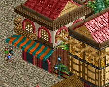
+ I adored the entrance area cause it's so colourful and atmospheric.
+ I liked all the textures used in this park. Some are awkward and maybe not the most aesthetically pleasing but I think it adds a charm to the park.
+ The foliage was good in the entrance and camelot area. Again, I liked the fact you used so many underused and awkward trees.
+ Layouts were fun and wacky.
Things I didn't really like:
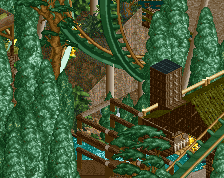
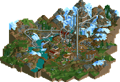
- That really green area was really claustrophobic and wasn't a good viewing experience for me.
- Like stoksy said, definitely not the most flowing park and there was some awkward connections between areas.
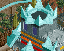
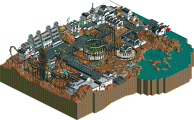
- I think that massive crystal city didn't really work in this park at all. It's also quite confusing to look at cause of perception issues but meh.
- I have mixed opinions on the monorail. Sometimes it looked good but then sometimes it didn't really suit some areas of the park.
I think overall I would give this high silver low gold maybe?
I kind of wish you would have went back and added to the Levis built areas, the transition between the entrance area and the sand island was quite jarring due to the detail and density changes. It is interesting to see this release though, there is just a charm with the older Levis built areas even if they dont quite stand up to today's standards.
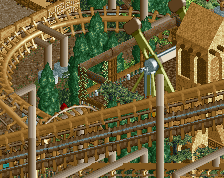
I really like the entrance and even the.. fantasy? area around the crystals. Some really nice stuff Liam as always. The stuff around the wooden Coaster was definitely 100% Paul inspired, which I didn't care for that much. The hacks in the parking lot were also nice touch, wish we would see stuff like that more.
Overall, nothing to amazing, but a quality release that I'm glad got to finally see the light of day. Wouldn't mind to see more unfinished park by older members be taken up and finished. Maybe this will inspire some to do this in the future.
Sorry, I wasn't really a fan of this at all. Some of the color choices are pretty awful and the park didn't flow too well. The only area I liked a lot was the entrance, some nice buildings there.
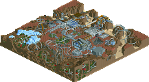
I actually really enjoyed it. The object choices were horrible but in an endearing sort of way that pulled me into the vibe of the park. The entrance area was stunning IMO, as well as the sci-fi area; I loved the tent city surrounding the ridiculous flash-gordon-esque palace. The medieval area was also surprisingly likeable, felt like a renaissance fair which makes me a bit nostalgic. And I actually liked the layout, reminded me of the Boss at SFStL (which is defs due for an RMC retrack imo). The mining area was also quite pretty although the layout was terrible (and the colors worse- green on green?? same for the sand area- tan on tan??). But I liked the overall feeling and layers of the buildings and infrastructure. The african area was perhaps forgettable and the coaster also pretty shit. I almost liked the persian area, although it was a bit too open for me, it didn't quite grab me like the areas on the left side of the park did. I also liked the busy parking lot and the old-school vibes. So good work you two, really enjoyed this, we could all learn a lot from trying out new styles and objects like this.
How is it possible that Westwinds gets an accolade within 24 hours, yet it is taking almost a week for this park to get... seven votes?
It's not showing the accolade vote thing for me... even though it has 15 community votes and I have a notification telling me it's up for an accolade decision.
I'm trying to write a short review at the moment but I'm really struggling to know what to make of this haha. It's like an energetic child; uninhibited and ballsy but chaotic and incoherent.
Thanks for the votes guys and the accolade . I think some people voted it a bit to high
  personally I would say it should be below 60%. But I don't complain
  .
.
It made my game crash. 10/10