Park / Thunder Road
-
 12-December 15
- Views 3,273
- Downloads 774
- Fans 1
- Comments 9
-
 46.25%(required: 65%)
 Design Submission

Cocoa 60% Austin55 55% alex 50% Chocotopian 50% Jonny93 50% Stoksy 45% Liampie 40% nin 40% Poke 40% csw 35% 46.25% -
 Description
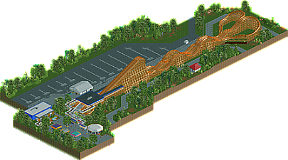
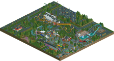
I imagined Carowinds' Thunder Road being retracked by RMC instead of being torn down for the 2016 season. Hope you enjoy it!
-
1 fan
 Fans of this park
-
 Download Park
774
-
 Objects
1
-
 Tags
Tags
![park_3324 [H2H7 R1] Circus Circus & Adventuredome Atlantic City](https://www.nedesigns.com/uploads/parks/3324/aerialt2970.png)
This is actually pretty awesome.
I was just at Carowinds a few times over the summer so I can say you recreated the area decently well (albeit sparingly), and while the architecture and surroundings aren't the greatest in terms of form, detail and the like, the overall idea of this is really great.
I do wish you'd have pushed it further, with maybe a more thematic station to really show that this is a "new" ride, and maybe coloring each side of track differently like Six Flags has done with their Twisted Colossus. You could have really pushed the whole North Carolina/South Carolina side thing with that. I'm a bit unfamiliar with TC so I don't know if the two sides are entirely different from each other, but maybe you could have gotten more creative with the layout, making them duel or interchange sides or something instead of just mirroring the two. Regardless, the coasters are fun to watch.
In short, better execution and thoughts into the surroundings and ride are needed, but the idea here is great. Not design-worthy great, but still really good.
I agree with Nin, we're pretty big Carowinds fans and you pulled off the general feel of that area of the park pretty well. It's not Design-worthy yet but not too far off and a ton of fun to watch. I was impressed with the quality of this. RIP Thunder Road.
Although the mirrored layout was a little dull, you executed it well. I liked how the zero-g rolls were embedded into the supports of the bigger hill for instance. They fitted really well and I'm glad they were the only inversions you used - on a small ride like this anything else would have felt forced. Opting for the cool interacting bits of banked track instead seemed like a more realistic 'upgrade' to the rides. Good job. Rest of the map was a bit bland and I don't know the source material enough to say much about it. Just needed more fun stuff going on and another level of detail.
Thanks a lot for your replies! I was thinking about more to this design, maybe a part of the waterpark. I decided to keep the racing style of the original coaster, maybe I could have added some more interaction on the way back. However I'm proud of finishing something and it keeps me motivated to build more stuff!
I thought this was pretty good. Not a lot of content other than the coaster but it was done reasonably well and with some good realism. Probably not enough for a design, but if you add a bit more content and liveliness into your next park you'll get it next time for sure.
Agreed with most of what's been said above, in that you've created good content but not much of it. I definitely got a realism vibe from this and can see it fitting in seamlessly within a larger park, but for a lone design, I don't think it contains enough substance.
In detail, I liked the foliage as I felt it helped frame the scene without drawing attention - which in my opinion is what foliage of this nature should do. The custom dodgems were neatly done too, and the steel/wood combo for the coaster track and supports worked well.
Really promising work, and I congratulate you for its completion. I hope it does indeed motivate you further, and that in future designs you really experiment with interaction and theming, as it's clear you've got a strong footing here.
I think the execution was pretty nice, a bit simple but somehow elegant. The foilage was also really good. What hold it back for me was the huge car park. It made the map sterile and dead.
Take care for a better atmosphere next time and try to add more live into your work, i think you have the skill to build a design.
I voted this quite low. I thought it was quite stale and boring. There was not much content and it wasn't particularly exciting. However, you've completed a project and that's something to be proud of. You've got great potential and you just need to inject some colour and life, through more interesting textures and structures, into your work.
I hope this gets a score soon.
Thanks again, little disappointed it didn't get a single 65% vote. However I had a lot of fun building this!