Park / Dan's Enchanted Realm of Thrill
-
 12-December 15
- Views 4,663
- Downloads 887
- Fans 2
- Comments 14
-

-
 66.88%(required: 60%)
 Silver

Chocotopian 80% disneylandian192 80% nin 75% csw 70% Poke 65% Stoksy 65% Jonny93 60% Liampie 60% posix 60% pierrot 50% 66.88% -
 Description
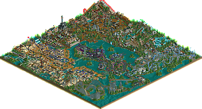
I finally finished my biggest project. It took me a long time to build it as my style changed often during the process. I had to rebuild whole areas because I didn’t like them anymore but it helped me to grow as a builder.
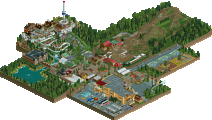
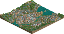
The park contains 11 coasters that disperse over 7 areas. Savage and Sky rush are the main attractions of the park. -
2 fans
 Fans of this park
-
 Full-Size Map
-
 Download Park
887
-
 Objects
1
-
 Tags
Tags

This park is really good, definitely shows a ton of improvement. I probably won't be able to do a video review on this but I'll definitely do some sort of review in the next few days. Nice work!
Wow. Impressive park. To me, your NCSO style is original and refreshing. I really enjoyed some of your layouts. The park had an old-school mid 2000s vibe to it.
Nice park here. Seems to be a cross between the german style and Kidron park.
Favorite parts were the mine train and the little green virginia reel umbrellas. Didn't care for the egyptian area as much. Also, fix the peep jams!
I'm voting 70% because of this right here:
I'm going to get more in-depth later, but something that struck me as odd is the wooden coaster. I get that you have the weird lift- you don't want the supports to hit the water. But then you entirely invalidate that by having supports hit the water on the very first drop.
Consistency is key.
BigB Offline
I'm giving you a 75%.
I enjoyed this a lot. The coasters were fun throughout the whole park. Especially "The Last Journey" "Coal Miner" and "Gold Mike" took my attention for quite a while. I liked the use of terrain to create interaction.
Architecture and theming was more than solid, but what was the theme of Skyrush and Fury? Sometimes the architecture got a little bit repetitive and basic but this is acceptable if you compare the Skyrush area or this sweet Alpine village, even though this could have been a bit more rocky and mountain-like with less foliage on the mountains.
Great to see those skills pop out of nowhere. Were you active on a other RCT2-site before?
Greetings B'B
This park was stopped by blockbrakes.
Also the peepjams could have been fixed beforehand, that and the fact that you didn´t bother to fix any bbs in the park kind of held an awesome park back a bit.
I love the style of everything, very old school but mixed with other, newer ideas. The little to no use of the 8cars trainer held it back at some places while really bringing creative solutions in other areas. I like that!
I cant really point out a favorite area, because every single one of them had great buildings or moments in them, as well as some not so.... good ones. I just didn´t care much for the entrance area, felt to cramped :/ Less buildings and more open space there would have made it better, I think.
I´ll just give you some thing I liked (theming wise)
-All the monorailstations
-The bridges around the globe theatre
-Furys station
-Daniel (haven´t seen that in ages )
)
-The globe theatre itself
-Tower of Doom
-The woody lifthill
-The area csw pointed out.
-The virginia reel umbrellas
Videoreview will come at some point, just dont know when.
For me this is a gold worthy park, but not by much. Keep improving (and playing most importantly!) and I´m sure you can do great things here.
Gruß
MCI
Holy cow, I usually just lurk but I had to come out of the woodwork just to say how much I loved this. Just a huge amount of fun and impressive detail for a ncso park imo.
Very well done. I was a little letdown after seeing your screens, but it was still a good park. 70% from me
Big thanks to everyone for the nice comments. Especially to savoytruffle98 and ottersalad for the kind words.
To be honest i really wasn't focused on that. Fot the supports of the wooden coaster I was inspired by Goliath.
http://rack.2.mshcdn...er_edited-1.jpg.
@MCI: Yes thats true some areas are better than others. I would say the reason is that I build the park over such long period of time that the areas that I build first dont look as good as the newer ones.
I thought this park was excellent. With NCSO, there tends to be a need to go more macro, and I think you certainly did that here, without missing out on some more close-up details too.
One of the things I was most impressed with was the landscaping and the way the rides interacted with it. The Mountain Climber cars really did scale the mountain and the scenery kept it interesting along the way, and the whole Adventure Canyon/Chairlift area looked great too with both rides popping in and out of the cliff faces. There was a good use of bridges and tunnels throughout the whole park, for both the rides and the peeps, and often just the route that the queue and exit lines took was quite interesting.
Your coasters were bold and well done, and it was great to see so many of them in a wide array of types. Each had its own uniqueness and character, and sometimes this was quite subtle. The Last Journey was a cool design, suggesting a runaway mine cart without resorting to a mine train, and there was something about Serpentine that I really liked – I think it was the unusual route it took round and through the mountain, and the fact that I would never think to build like this. The larger coasters speak for themselves, with great support work, interactions, theming, pace and course.
I appreciated the scenery overall and think you did a good job of keeping it varied and attractive, with a good use of shapes, colour, textures and patterns for the architecture, and foliage that was appropriate and pleasant throughout. I would say that the castle area at the park entrance was the least coherent though, looking rather cluttered and a bit samey, but everywhere else felt like a definite improvement from that.
It was a shame about some of the technical errors; the peep jam for instance and the block braking, both of which have been mentioned, and could’ve be fixed with a little work. A couple of unnamed rides, simulator closed etc. – all minor points that niggled away, but nothing massive that distracted from the overall quality of this park.
On the whole, I really enjoyed this. It was well themed, attractive, daring in places, dotted with cool designs and unusual features, and felt like a well completed park. Very nice work.
As far as pure NCSO goes, this is probably one of the best examples there is. The park was of a good size, had consistent quality and style while also presenting a variety of themes and approaches.
Notably, the area around the dive machine seemed like something out of Spellbrook Shore, the way the path and buildings were placed around the coaster was great and the layout had solid pacing. Overall each coaster was memorable and unique, nothing really felt cookie cutter or boring in that department, which is good to see and allowed the park to have a certain unique personality.
The Alpine Meadows, while only a transition area really, had great ride placement and architecture. The use of terrain when it comes to these things was good, although it felt a little isolated from the rest of the park, making it almost seem claustrophobic. Perhaps I would rather have seen a little less dependency on terrain here or maybe different placement of the area altogether.
I quite liked the Sunset Boulevard area, probably the best coaster in the park, Skyrush, was wonderfully placed and had a very neat and unique layout. I loved the inversions, pacing and even the supports I though were very well done for NCSO, which often is something I dislike in these kinds of parks. The scale and height of the ride was really well handled as well, didn't really feel awkward which can often be the case in larger looping rides. I wasn't the biggest fan of the wooden coaster, the layout was decent but it just felt kind of boring compared to the other coasters. Might have been a combination of the layout and placement, or the presence of Skyrush in the same area. However, once again, the architecture here felt fresh and really unique, which for NCSO can be really tough. Definitely something you can build on for your next project whatever that turns out to be.
Moving onto the Mystic Industries Island, which provided a great change of pace and tone from the brighter Sunset Boulevard area and Egyptian area as well. The layout of Fury once again was very good, paced well and seemed natural. The terrain and especially the mass of buildings around the lift was really well done and handled in a way that didn't make the architecture seem out of place or distracting from the ride itself. The only thing I wasn't a fan of when it came to this ride was the placement of the exit path, it kind of created both peep jams and just from a parkmaking standpoint seemed really poorly planned. Also in this area I really enjoyed the Globe theater and presence of the observation tower here. Not only did this provide a good balance of rides for the center of the park but attractions that fit really well in their locations.
Next, the massive Old Kingdom area, which is another really strong showing of both NCSO style architecture, but also has some of hte better planning and parkmaking of the whole map. The Invert and Hyper were both really solid, while the layouts weren't super realistic, they did their job and were believable enough to not distract from themselves. This is an important balance and part of the reason why some older parks have very forgettable rides in my opinion (notably Jkay and some latter LL spotlights). The use of terrain was also fantastic here, it added to the theming in some cases but also helped keep our interest on the map in others as the park stretched often times to the very edge of the grid. The density of the architecture and placement of some of the smaller attractions here was really strong, rides like "The last Journey" really showcased this. Each coaster also had a nice queue and entrance plaza in this area, the sign use was also really strong and you did a good job of integrating them into the park and not look ugly or out of place as they often do. The Oasis coaster provied a good chance of pace and color here, the gardens and fountains were a great addition and fit really well. Again, definitely a style that could be used in your next project and could be used as a great base for something really special.
Finally the entrance, which was probably my least favorite area. The architecture while good just wasn't my style, it also felt a little to claustrophobic for my liking. Although I did enjoy the working drop tower, great job on making that work as it provided a great entrance area attraction.
Overall some more polish could have really made this park special, adjusting the wait/departure times on coasters to keep them from stopping on the lifts and blocks as well as improving capacity could of really helped the park. Maybe naming staff could have also added a little more personality to some of the areas of the park, but this is a minor issue compared to the coaster wait times. There were also a ton of peep jams in the park, which was a little frustrating and could have probably been fixed quite easily with some hidden and under ground paths.
For me this is right in the 70-75 range, could have been even higher if it weren't for the entrance and block section issues on the coasters. Some great potential was shown, I'm definitely looking forward to more work from you in the future.
Hey. This was an interesting park. Some parts were good quality, refined and detailed whilst some parts were just not just refined at all and not aesthetically pleasing at all. It's weird.
The entrance area was nice. The tower of doom was really nice as the architecture was cool. Its position was not that well thought out seeing as it's just stuffed to the side. I thought it would be cool to walk into the park and see it looming in the distance. Composition is definitely a major flaw in this park. The rest of the area was fine; just thought the black was maybe used too much.
The Egyptian area was great quality but then there was some stuff that was just not good. The Oasis coaster was really odd, you've got this desert and then it's just placed in this big grassy area. The architecture was nice, interesting and unique - a great strength in this area. A thing I really disliked was the last journey, sorry but this just did not need to exist, it looked ugly, forced - why??? Composition was lacking, the freefall and enterprise was on top of this massive staircase which was just strange positioning.
I liked the industrial area. The bridges were executed really well. The theming and architecture was quality and your use of track blended in well. There was a massive peep jam by the cinema which could have been sorted out - this brings back the whole compositional problem as the flat rides are all hidden away when they should really be brought forward to the main pathing.
Your landscaping throughout the park is really quite unrefined, it needs to be smoothed out properly or it just looks ugly.
The rest of the areas harness the same problem as the rest of the park. Moments of good quality architecture, aesthetics especially in the skyrush area which was really good. But then it's just brought down by unrefinement, composition errors and unaesthetic layouts. It's a shame because you have definite skill but you need to think about how everything looks cause some parts were honestly just plain ugly.
But for a first release, this is quite special to be honest. Keep building.
Do you know what an Oasis is? Haha
nice work! I think I'll review area by area.
entrance: a bit forgettable and cramped. I think it was meant to be medieval but it didn't really work for me- it needed more space and form to make it clear what each building was meant to be, how it was an entrance and not just a collection of buildings.
western: mostly pretty good. I liked all the rides on top of each other and the height variation in paths and landscaping. The architecture was very monotonous and colorless though, and didn't really feel western-y other than the fact that you used the western object set to build it.
swiss: almost worked for me. A bit sloppy but getting the right idea in terms of landscaping/vibrancy.
modern area (?): pretty good ncso here, good buildings, sexy layouts, and some solid landscaping. Enjoyed this area. Also, the giant woodie was pretty epic.
purple area in the middle: I actually liked this a lot, loved the coaster with the landscaping. Nice work.
egypt: probably the best/most consistent area. nice archy, very alive and full of stuff going on, pretty colors, etc. Fun layouts all around if not so realistic.
Overall solid park, definitely a good silver although there's no need for my vote now!