Park / Spessart Park
-
 16-November 15
- Views 6,395
- Downloads 799
- Fans 6
- Comments 24
-

-
 66.88%(required: 60%)
 Silver

Kumba 85% Chocotopian 75% Cocoa 75% inthemanual 70% Sulakke 70% Austin55 65% Liampie 65% nin 60% geewhzz 55% Stoksy 55% 66.88% -
 Description
The Spessart Park is supposed to be a small german theme park with some local influences. A huge thanks goes to MCI who helped me with the B&M dive machine.
-
6 fans
 Fans of this park
-
 Full-Size Map
-
 Download Park
799
-
 Objects
1
-
 Tags
Tags
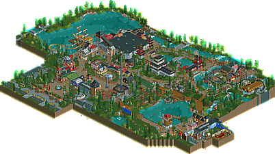
![park_2859 [PT4 R7] Medieval Climate Optimum](https://www.nedesigns.com/uploads/parks/2859/aerialt2509.png)

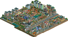
enjoy your silver
This could have made a pretty cool H2H park, definitely has that vibe to it with the cutaways. Good to see new work from a builder with your talent, definitely want to do a full video on this.
This felt like such a nothing park to be honest.
Your architectural skills are on-point Jonny, but park layout and ride selection leave a lot to be desired. I get that it's supposed to be a small park (and it's probably just my own personal tastes that lead me not to like it as much) but a small-scaled diver and water coaster ripped straight from Efteling? If it's really a "local" park would they really be able to afford a B&M, let alone a heavily themed water coaster?
Furthermore, you've enclosed the entire park but hint at future expansion. Instead of providing context for the actual park with surroundings it's been cut by black tiles, making it even more difficult to imagine how those expansions would fit with the rest of the park. Was it a case of lacking inspiration that you finished it like this? Because I'm struggling to imagine how they would work given how closed off the park felt to me.
Maybe it'll grow on me, but I wasn't a big fan unfortunately.
What a lovely little park- I wish it was bigger! Lots of fun little details to look at, like the ferris wheel raft lift, fantastic dark ride interior, foliage, architecture, etc. Did a good job at being a little european park I think, and with one of the better de fleigande hollander-inspired rides I've seen. not really big enough to break out of a silver (a shame) but really good work nonetheless.
Fun park.
Starting at the actual entrance plaza, I found that area to be a little dead. Just not much going on.
Main street itself was nice, decent archy throughout and fun atmoshepere. The drop tower's exit path was really neat, love teh levels there.
DFH felt familiar and a bit to inspired for my taste, but still well done. The boat was pretty good to.
Asia was fun. Really like the seating area to the side of DFH. Hemji wasn't all that well done I thought, a bit to blocky, Waka-Sa however was fantastic, the ride itself and it's surrounding's were great and I love the details like the gong and bigger elements like the bridge and landscaping. It felt very Zippo's, which is a great thing.
The whole area around the dive machine and rapids was'nt to impressive to me. Pleasant but a bit dll and the interaction of the two rides never really came together for me. I think better foliage here would have helped, as it was lacking throughout the park.
The last little corner was a bit confusing as a theme to me. I do like the tree drop ride a lot, very fun. I thought the windmill over the lake was a bit big and blocky. The grills in the picnic area were a pleasant detail.
My favorite bit of the whole park is the dark ride interiors. So good! Not really sure what the story is (wished the entertainers had names or something), but the themes are very well done using scenery.
So overall, like I said very fun park. Hope to see more in the future, definatly do more stuff like you did with the dark ride, main street, drop tower, and Waka-Sa.
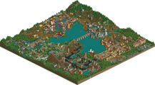
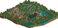
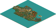
First of all i want to tell you a bit of the building history of the park. I started with this project directly after H2H6 back in 2012. The first map was much bigger than the actual one and i thought that the park should be more like the Heide Park with a nice entrance area themed with local influences. Some time later i was not really satisfied with the stuff i build, so i decided to make a complete restart of the project. At this time i visited often the Holiday Park and Tripsdrill. They became quick my main inspiration. Still the map was big and i wanted to include a hotel area and some resort stuff. Unfortunetely exactly the same happened like with the 1st version, i became unsatisfied with my own work, since i am very critical with myself. I made another reboot. The next version is more supposed to be a park like Tripsdrill. I loved the original attractions there, like the Donnerbalken, so i decided to use them for the park.
In 2014 i visited with MCI and Version1 Efteling and Toverland. There was so much input and i wanted to include some of the influences in my park but the my actual park was not ready for such a huge change so i decided to remove everything except the entrance area. I built a dutch area with my own version of the flying dutchmen and originally i wanted an ancient area with GCI woodie at the lake, since i enjoyed Troy so much. Lately i had nearly no time and motivation for RCT. On our England tour is said to MCI that i would never play again. Then i broke my arm some weeks ago, so i had a lot of time. I thought fuck, why not to finish the park. I started to skip some stuff i planed, like the ancient area because i knew i would never be able to do it. Also i skipped some of the surrounding areas, i just wanted to finish the park.
Here is a graphic of the versions:
So, now you know a bit more of my battle with the park. I am very proud that i was able to finish this park and i had a lot of fun building on it, especially the road to finish was fantastic. At this point i want to say a huge thanks MCI for the little help with the Dive Machine and his feedback during the building process, also a big thanks to Version1 for his feedback.
Great to see this submitted eben though if it´s just a fraction of what you originaly planned.
I really like the entrance. Maybe the only good looking thing in the whole of HolidayPark and you captured it really well. The square behind the entrance has a very cool Trippsdrill vibe to it and demonstrates your ability to capture the atmosphere of a theme park and transfer it into rct. You did that with the Fränkisches Abenteuerland and now with this park.
Speaking of great atmosphere, the "Der fliegende Holländer". I love the original ride at Efteling and I think you did a great job here. That ship <3
The Asian area was not that strong to be honest. Waka-Sa is brilliant, but overall the area is just to small I think. Himeji's Castle is to big in my opinion, a smaller building would have served you better I believe.
I really like the rapids in the scandinavian area. The use of the ferrs wheel is awesome although I think it would have been better if there was something going on around it. It just stands there in the middle of nowhere and looks weird :/
Wirtshaus im Spessart may be one of the best darkrides I´ve seen in rct. I think I already told you around a thousand times, but it is truly brilliant.
I was not sure about Donnerbalken, when you first built it. I dont like the ride in Tripsdrill and I did not think yours looked that good.
But I have to admit, it grew on me and I do actually like it now. yay
As you know I liked the idea of the Weinkübelfahrt so much I built my own version in LBaTP shortly after seing yours.
Overall I really like the park. Silver quantity, gold quality (sorry Stoksy, I couldn´t resist)
Gruß
MCI
It looks like you had to cut out a ton of content from V3 to final... what happened to that stuff?
@G Force: I would be glad to see the park in one of your videos
@Stoksy: I disagree with you on the ride selection, just look at the Holiday Park. When GeForce was opened, there was only Superwirbel in the Park, so i don't see there a problem that a small park is able to make some big investments. Like i said in my previous post i just wanted to finish the park, since my time is really bordered. Therefore i had to cut away some stuff.
@Cocoa: Thanks for your nice comment. After V3 i went back to the scenario editor again, since i changed a lot of the park concept. I still have all the saves.
@Austin: Thanks for your detailed comment. The Dark Ride is inspired by a local tale called "Das Wirthaus im Spessart". Here is a link from the german wiki:
https://de.wikipedia...aus_im_Spessart
@MCI: Thanks for your opinion. I am glad you liked the park
What a beaut! Fun little park. Small rides, small size, you left me wanting more!... but it's better to have it finished than never to see the light of day! I thought your architecture was well done, touches of variety. Good use of the green glass roofs, reminded me of World Fair. The Asian section was nice, but the Himeji's Castle building could have used some more work. It's great that you had a good amount of rides in the park. It could be tempting to have only 4 or 5 rides, but you made it into an exciting theme park despite it's size. I enjoyed Der Fliegende Holländer, how it went up and over the ship. As some said, foliage could be thicker in spots. I would say this is in the 60-65% range, and I doubt the size would drop that to bronze. Really nice work. Sadly if your time is tight, we may not see more production from you, but I hope you find some "rct time"!
Jonny and I already agreed that I would finish it, if he didn't. I'm very happy Jonny got motivated again and finished it.
Jonny, I think you know how much I love this park and all of your work. I'm to lazy to type right know, but if you want I can give you my critique at the next RCT2germany Tour
How popular is rct in Germany to have a "Tour"? It doesn't seem like there are that many Germans on NE. Get the German hoards to join NE to build up the active members!
Hehe. We just call it "RCT2germany Tour". The last one was Jonny, MCI and I through England.
We tried, you scared them away.
Edit:
Damnit, less then one percent short of actually beating you on an accolade score for once. Congrats on the silver mate!
Apparently I am rct2germany now too.
Can't see this ingame at the moment but it looks like a really fun park from the overview. I love the look of the Japanese pond area with the overhead cycle ride.
Congratulations on the silver! Really enjoyed the landscaping and the Tripsdrill-inspired parts of the Park. The asian theming is really well done as well, but it felt a little off between the other areas (nordic, german, dutch). It's a shame you had to cut away a lot of stuff but it came out as a nice little theme park.
Very well done on the silver. I really enjoyed this park and all the little details throughout. Its main setback was that there wasn't more!
What stood out most to me was the charming way in which you used the rides/ merge of rides. The little Virginia Reel coaster was great as a slow-ride, with the little mechanical part to maintain the pace, and I really liked the spinning mouse as it went through the different scenes - they were all pretty cool and very well decorated for being so small. Other notable parts for me were the water coaster ducking and diving before scurrying back into a cellar tunnel, and the canons by the rapids complete with splashes. I also liked the way Scream's queue formed a bridge/archway into the next area.
There were however some parts that I wasn't as keen on: the foliage felt a bit messy to me, though I can't really say why. I think the wild overgrown look would work better in moderation, or nearer the edges of the park, but it was present all through and gave me the impression that the park designers hadn't done anything with it. I also didn't warm towards the entrance area. It felt generic but with a style that I couldn't really place (although this might just be due to my ignorance of German parks), with a mix of textures and styles that I felt didn't really work together. Everything there was well done, but as a whole I just wasn't keen on it.
Overall though, a great little park that I wish would be expanded further (here's waiting for 2093!). Again, well done.
@bigshootergrill: Thanks for these words, maybe i will be able to finish my Walibi Belgium NCSO park, i already asked MCI for some help
@Version1: Thanks, yeah i glad too that i was able to finish this piece
@Alex: You are welcome
@CHE: It's right that i was not the best solution to cut out a lot, but its better to release a smaller version instead of no release
@Chocotopian: Thanks for your feedback, if the will try to improve the points you made, if there will be another park from me
any chance for a download of the in progess versions?