Park / ThrillZone Amusement Park
-
 04-June 04
- Views 18,861
- Downloads 695
- Fans 1
- Comments 66
-

-
 57.27%(required: none)
 Silver

G Force 65% 5dave 60% alex 60% bigshootergill 60% csw 60% Liampie 60% RWE 60% Jaguar 55% Ling 55% posix 55% Scoop 55% Cocoa 50% Xeccah 50% 57.27% -
1 fan
 Fans of this park
-
 Download Park
695
-
 Objects
467
-
 Tags
Tags
-------------------------------------------------------------------------------
I have yet to d/l the two other parks here, but must say that from the screens of aero's park, it does look spotlight worthy. Bchiller's park looks seemingly familiar to his last runner-up, but with a new colorful twist. I'll post more about these parks once I've been able to d/l them.
That's happened to me sometimes.
sorry, i'm just really bored today. i never noticed the acronym for the park.
Aero's park was nice and realistic, but I hated the thatch-style roofs and some of the theming was a bit boring in some parts, but I liked the Terminator and the Matrix area, among other things.
Overall, I think it's a great park with some nice rides that I surely will look at again.
That pinkish park was pretty boring, I thought... It looked as if some buildings was exact clones of other buildings in the park, and the rides was pretty dull as well. I'm not sure if I'll even keep this park, I have to save the precious little space I have left on my computer.
Jkay's park, I found to be very inconsistent. I really like the dolphin show, but the rest, with a few exceptions, looked really un-refined and almost a tad rushed. I didn't see much thought put into anything, most buildings seemed thrown together a bit randomly, the colours, though nice at places, was total misses for me in some parts etc.
The coasters was really uninteresting and didn't look very good, but I liked the theming for the green woodie.
Good job everyone on getting runner-up, I can imagine it being pretty cool to get a whole page for the park with a little review and such, plus the obvious honour.
I wonder why I write more and more for each park I comment on.
Aero's W-BRA (should we start calling it the Wonder Bra park?...OK, lame I know) was interesting in parts, but I'm not sure how "Real" it was. Each section seemed to not flow into the next, but rather stand on it's own, kind of like a bunch of "mini parks" were puzzled together to form one big one. The matrix coaster was cool...first time I've actually liked the look of an RCT dive loop.
See everyone elses comments for the pink park. Just not enough there to hold my interest.
Congrats on the awards guys.
Superman was a great idea. Fantastic work!
I would ask someone to send it too me, but I could care less.
Two Shades of Pink was great. I thought it was a great idea and had more than just "2x2" buildings. I thought it was nice, but the only thing it lacked was some rides. I think it had about 6 or 7.
And JKay, your park was just as fantastic, dude. Looking forward to your next park, you quick sonofabitch.
First, I would like to thank everyone for the comments and reactions so far. I was not reall sure if this park wou;d ever see the light of day (finished at least) it almost became one of the "Merry Christmas here is an unfinished park" files last December. I must say that I never really thought this park would be Spotlight material, it just doesn't have that polish on it like Wormwood had, but i am honored with the runner up nod. There are a few things I must address. First, Jokers Fun Fall was built before I knew you could hack a Free Fall (like Phatage's) so that is why it is static. The Superman ride was the first ride built in the park, mainly due to inspiration from TTD opening at Cedar Point. You will notice that one of the sceanery elements in that ride are movie screens, an idea I had had while building Wormwood and it has made it's way into Disneyland Utopia as well. The best thing in the Gothum area IMO is the Batman coaster, I finally built a realistic version that i feel is as close to exact as possible. Moveing to the Matrix area. The One coaster went through many changes, one of which was the removal of the main frame building that was going to house the midcourse brake run. I thought it would be fun to have the brake run be enclosed and themed like the "doorway hallway" from reload. It was unintentional that the Matrix and Terminator area became so visually close, but it seemed to work out well. The Terminator area, i agree with Iris, is one of those areas that grows on you. The T-X coaster was first and foremost a play on the name (there have often been rumors that S&S will eventually combine the technologys from the X coaster at MM and thier Thrust Air coaster to make the worlds first Thrust-X coaster..ie T-X) It just so happened that the female terminator in the movie shared that name. It must have taken me a full month to build that coaster, and almost another to time the seat rotations. This almost drove me insane, and i decided I will never do a X coaster again in RCT2.
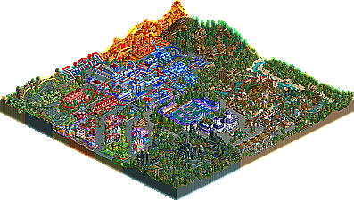
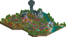
Right down the center of the park you will notice a very "Americana" theme, I really don't know where i came up with the idea for this, it mainly just grew off of the steel looper coaster's colors. The middle of the park was the last completed and has the most "rushed" feel to it. It was at this time that I began Utopia, and almost left the park for dead. That is until i built Vamp, I just couldn't see that area go to waste and the "Creepy" section grew out of it. Fallen, has to be one of my favorite rides in the park, the name is perfect and fits the theme in that area extremely well. Twister, i could have left out, but it has a nice "well what else are we going to do" feel to it. The last area I feel i must explain is the Toon Kiddie area. It started as a "port" hence the water and buildings on the edges of water, oh and don't forget the Sealion show. But it slowly turned into a small city type area with the addition of Sylvester's Mouse House, which I feel would make an awsome attraction at any Six Flags park.
Again thanks to everyone for the comments, hope everyone gets to see the park in due time. Just know this, Utopia makes this park look like a "Noob" made it.
Thrill Zone Amusement Park took me a while to look at, which is a good thing. There was so much to look at and take in. Some colors were pretty intense but it still seemed to go together with everything else. There were a lot of original ideas and plenty of creativity. It did look cluttered in places. Certain theming areas were just confusing and hard to really understand what you were going for. The coaster were somewhat lacking, but you seem to be getting better at those and everything else. Everyone should remember that this is JKay's very first park. If you all remember your first park and how quickly you improved with each successive park, you would realize that JKay has an extreme amount of potential. He also shows through his work how much he enjoys this game. His fun transfers over to the person viewing the park also, which is a talent in and of itself.
Warner Brothers Reel Adventures is an interesting park. Depending on how you look at the park, you could think it is just an average park or a really good park. When I first looked at it, I thought it was just an average park and actually wondered why it was a runner-up. The reason I thought this was because the architecture was mostly boring and sometimes even blocky. The sections are very different and as aero said himself, it just doesn't have the polish on it. I also did not like the wooden coaster nor did I like the giga. I still don't like the wooden or giga, but I do have a different opinion about the park as a whole. After looking at it a second time, and really understanding what aero was going for, a realistic theme park, I saw a really good park. For one, everything made sense more. The somewhat boring/blocky architecture actually made sense for the particular area and fit into the theme. The very different sections made sense because in most real parks, the theme changes are somewhat abrupt. After clearing up those two things, I really could get into the park. Aero did a great job of creating a park that you could really imagine walking around. I think that better architecture would be an upgrade but other than that it is a great park.
I actually loved all three. There must be something wrong with me...
Reel Adventures was the best realistic park I've seen in a long time. This park did it for me like Wormwood never did. I wouldn't mind seeing this as a Spotlight.
Thrillzone is exactly the style of parkmaking I have never liked, but the difference here is, I did like it. Loved it, in fact. I am starting to think JKay might have been a better choice for a replacement than myself.
2 Shades of Pink reminds me a lot of my own recent style (but in a good way, for a change).
Great round. What spotlight were these for again?
Put it up, please.
Will someone please send me Warner Bros. Reel Adventures?
Thank you.
Aero, I did like yours as a park, but I feel that you could've gone way further into the WB movieworld aspect of it, which I'll hopefully get a chance to elaborate on later.
Only the best ones, regardless of if it comes with one or not.