Park / Six Flags Idaho
-
 08-November 15
-
 Six Flags Idaho (Finished)
- Views 5,380
- Downloads 810
- Fans 1
- Comments 16
-

-
 42.50%(required: 50%)
 Spotlight Submission

disneylandian192 55% geewhzz 45% inthemanual 45% Jonny93 45% nin 45% Austin55 40% Cocoa 40% csw 40% Liampie 40% Stoksy 35% 42.50% -
 Description
Just read both text-documents before opening the park
-
1 fan
 Fans of this park
-
 Full-Size Map
-
 Download Park
810
-
 Objects
2
-
 Tags
Tags
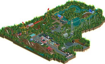

![park_2387 [H2H6] R2 - Reservoir Dogs - Pixar Animation Studios](https://www.nedesigns.com/uploads/parks/2387/aerialt2130.png)
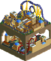
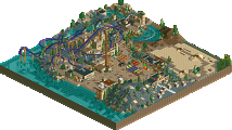
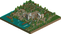
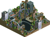
edit: FIXED!
Man, I can't recall the park being so big. Must have sleep-build on this.
Well, there it is. My first completed CSO submission. Am I happy about it? Not really. It all started out as a lame attempt to copy the Fahrenheit layout. Then I had this crazy idea to build a design without dense or even interesting theming. Transforming this into a park was a mess, and I think there was a better park in the narrative. Maybe even I could have made the park better, if I was more patient. But alas, I decided not to, as I have a problem with actually finishing something. I tend to start a lot and then hit the first bumps and then abandoning projects, savegames, you name it. I didn't finish this to win an accolade, get praise or even get a high community score. I finished it to have a finished park in my profile, something that noone can take away from me. Don't know yet how long it will take for me to start another project, as a ton of concepts of RCT Parkmaking still are unclear to me, but I will try my best to become a productive member of this community.
All in all it's a nice submission though, and I can see it grabbing bronze.
Really big congrats on finishing it. You should be proud, really.
Finishing something is vital to improving. It's tough to do, regardless of how big something is.
So yeah, well done. Definitely looks Bronze worthy at the very least, I hope you get an accolade with this
Let's get this out of the way... nothing about this looks like a Six Flags park. It actually has a European feel with the lack off fences and wide open spaces and while it's very nice, the name doesn't fit at all. The woodie has a Cedar Fair name, I don't see them building a Fahrenheit style ride and the park is actually too pretty in most cases to be a Six Flags. Also if Six Flags ever removed a Carousel there's no chance in hell they would replace it.
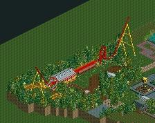
That being said though... who the hell cares? Taking the name out of it this is actually really nice. Besides the one awkward corkscrew I love Green Lantern and really kind of wonder why it took this long for someone to make a ride like that. The flume and car ride have great atmosphere also and I like the little touches like the arrows on the shuttle loop.
I do think that this park could have benefited from a little more content and I don't really get the abandoned area even though I know you were going for a Six Flags park so that's probably the reason for it.
Again though I love this style. You've improved a lot and I think a scale like this works for you because it might allow you to finish some things. You're really hard on yourself but you're improving really fast and I'll be chocked if this doesn't get you an accolade. It absolutely deserves bronze.
Great work!!!! 55% from me.
I am glad that you were able to finish this. I think this park is easily your best rct2 work. In my eyes is this much better than your NCSO stuff.
Like Coasterbill said, the name Six Flags doesn't fit well to the park, but its just a name so.
The biggest problem i had with this park was the fact, that i had often the feeling that its still a bit unfinished, some places were just really bare.
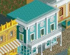
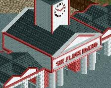
The best area was definetely the main street. I think the architecture was really solid.
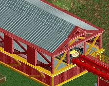
Yea, to echo what Bill said, this feels nothing like a SF park. Which I guess is understandable as it was only under SF ownership for a few years. My favorite area was definitely the midway mainstreet, the buildings were nice and well made. The carousel was also well made, but could of use a little more color and detail. The coasters were just ok, I like how the wooden coaster was hidden in the trees, really made it feel old. However the Fahrenheit was kind of meh, its just not a layout that translates well to RCT, it felt super awkward, but considering all that it was servicable.
The rest the park was kind of not so great, while nothing was terrible or bad, it just was super boring and well, there wasn't much there. To much open space and lots of opportunity for architecture and more rides and expansion. You did a good job of justifying this in the readme, however the park still felt pretty lackluster outside of the main street. Not super realistic or pretty by any means, but for a quick first try at a CSO park, it wasn't all that bad. You definitely showed improvement in the park and could definitely make something much better than this in the future if you tried.
Overall, a tough decision on voting for me between a 40 and 45, probably will end up going with a 45. Just lots of missed opportunity to fill the map with more interesting things than open grass, more detail and effort into your rides would also have helped a lot especially around the log flume.
I really liked the main street, solid architecture. Other than that, there wasn't much else. the park definitely peters out into unfinished (?) territory with a lot of open ground and not much going on other than a couple random layouts and 1 or 2 buildings. It doesn't seem like a real park (and definitely not a real six flags park). I also didn't like the abandoned area, it seems like you threw that together in 30 minutes because you wanted the map to look fuller- same with a lot of the stuff outside of main street IMO. The layouts were alright but still insubstantial. Not sure if it should get a bronze, feels like you had an unfinished park and wanted to pretend it was finished.
This is a classic example of what separates honorable mentions and bronze-level work from silver+ work. In sub-60% work, you have this awkward flow and this feeling of that the builder is not confident in him/herself in his/her abilities. Rather, the viewer is made, or at least nudged to make, to see this park as parts of a whole that are haphazardly placed together. This,stylistic inconsistencies and lack of spatial and compositional reasoning (e.g. enterprise, queue line for both coasters, etc) is what keeps this work below silver. The skill in this park can easily warrant a silver, but it's these shortcomings that are keeping you as a builder from doing better.
Congrats on the completed park, and breaking out into a new style. I have a feeling this isn't the last we'll see from you, you're showing skill and improvement! If you spent another 10 in game years on this park it would have seen a panelist vote and an accolade. Others have already said what I think, areas of strength and those needing improvement. Keep on building V1!
I guess it's time to answer all the comments:
Liampie:
How dare you calling the Enterprise boring! But seriously, I paid as much attention to the Enterprise as most parks I've been to, which means very minimal attention. I decided not to use the same two rides for the coaster, because honestly there was no way I would reach the maximum and I couldn't be bothered to do it just so it's easier to re-color. I think the green is fine, and I really wanted to give the coaster a Green Lantern "theme".
Louis!:
Thanks for the kind words. I'm not really proud of that park. I am proud, that I finished, but I think it would have been better if I decided on the contents earlier. If I didn't want to do a forest park and just brought it all closer together the park could have been better. But at the end of the day, I didn't think it was worth my time to rebuild this entire thing, when the coaster itself wasn't really good.
Coasterbill:
Honestly, this whole project started with the Fahrenheit Layout. I just wanted to see if I could do it and I think it was decent enough. Additionally, I just really like DC at the moment and wanted to do something with that in mind, so Six Flag was the only real option. That being said: I've been to one Six Flags Park and that was 3 years ago. As you may have noticed in the mainstreet, I'm not really good at developing a theme by myself. I think the buildings I ripped of Mainstreet USA are far superior to the buildings I built myself.
Jonny93:
Thanks for the compliment, although saying that this was better then my NCSO stuff doesn't say much, as my NCSO stuff was garbage. I totally get what you're saying, but I think I told you that a few times already: I'm not really creative and really not good in coming up with decoration.
G Force:
Honestly, the open grass areas were something I always miss when I look at RCT2 parks. I love how Alton Towers or Tripsdrill feature wide plain grass areas, but I now get, that I have to atleast do them better to let them work in RCT2. At the end of the day, I just wasn't really motivated in reworking the entire park, which would have been necessary to really switch up the theme. As I said further above, I really grew to dislike the layout of Green Lantern and I thought that it would be easier to just finish the park and move on than to rework the entire thing.
Cocoa:
Just to assure you: This park is by all means finished. I thought about doing the abandoned area better, but I couldn't really come up with how to do a construction area properly, so I just decided to build a few houses and explain in the readme, what this area means. I know that there were too few buildings in this park, but again, I'm not really good at developing a theme and building in it, so I was happy with what I ripped off of other builders (I think it's pretty obvious where the station for Penguin came from). At the end of the day, the high amount of nature is really just a failed experiment on my part.
Shotguns?:
I didn't really have confidence in my abilities when I built that park, and I don't really have any now. I don't really like the buildings I awkwardly ripped off of Mainstreet USA and honestly, the only part of the whole park I'm really happy with is the car ride. At the end of the day, I noticed that, although I have tremendous expirience in visiting theme parks, I'm maybe just not good in translating that into the game. When I try to think of a themed area, I just draw a blank and stare at the screen for minutes. That's why this park has the most simplistic path layout in the world. I literally have no idea how to place a queue, exit path or attraction. That's something that I somehow have to learn before starting something new I suppose.
bigshootergill:
Thanks for the comment. You will se more of me, as soon as I finally manage to build a decent layout for my new project. I kinda now what I'm going for, but at the end of the day, the idea doesn't matter. I'm both happy and sad about this park. Happy, because I finished something that isn't compelte crap and sad, because I know I should be able to do better.
Very well done on finishing a park. I echo what Louis! said in that completing something can be hard, but in doing so you can see your overall product and improve from there.
As for the park itself, I can't say I really connected with it much. Having read the story beforehand, I kind of anticipated a mix-match of themes, rides and general structure, and I think that's what there was. As you've partly hinted at, it felt like the story was made to cover up inconsistencies in the park, and while it was a pleasant read, it didn't really justify anything (e.g. why would the family build a massive island in the middle of the lake, especially as the flume doesn't interact with it much?).
There were some good bits of architecture, particularly in the main street area where the facades and colours were nice, but I felt that everything else was a bit thin. The shape and layouts of the path and queues felt quite random to me, and the bare patches of land looked unfinished rather than there by choice. I, as much as anyone, appreciate open space areas, but the locations of these in the park clashed rather than complimented.
Coaster layouts were solid (except perhaps for the transitions into the corkscrews), and the park-wide surrounding forest was neatly done. With some tidying up and reworking, I could definitely see this park flourishing - almost in the way of restoring the RCT Rotting Heights scenario
Overall, I can see that you yourself aren't too happy with this, but there is certainly a lot of potential, given a bit of refinement and forward planning. Once again, congratulations of finishing a park, and I hope you can use this as a stepping stone to greater releases.
then dont
you're approaching the game wrong and if recreating theme parks aint you thing then dont force yourself to it
it's not mine rofl
The main street was nice, but it looked like you just lost interest and gave up after that. Next time try to stick with it long enough to at least have everything at the same level of quality.