Park / Manta Lake Theme Park
-
 03-November 15
-
 Manta Lake
- Views 5,588
- Downloads 915
- Fans 1
- Comments 17
-
 65.00%(required: 60%)
 Silver

Poke 80% Kumba 75% Chocotopian 70% Cocoa 65% Liampie 65% nin 65% Stoksy 65% Austin55 60% Jonny93 55% pierrot 50% 65.00% -
 Description
A large-sized theme park with 8 themed sections. My biggest NCSO project to date!
Formerly known as project _underscore. -
1 fan
 Fans of this park
-
 Full-Size Map
-
 Download Park
915
-
 Objects
1
-
 Tags
Tags
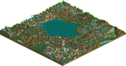
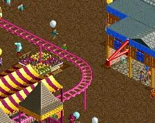
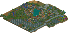
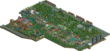
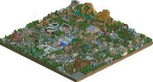
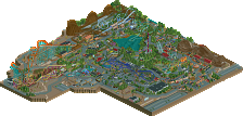
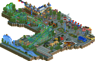
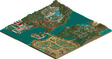
What a pleasant overview. Being able to clearly see the curves on that grey path...awesome.
EDIT: It's a shame that you had about 3 areas of ridiculously repetitive architecture because this is a gold-quality overview.
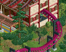
I felt the entrance, western, and area around Exodus were just the same building over and over again. I just didn't enjoy looking at those places close-up as much as I'd hoped. Rome was quite interesting, although I'm not entirely convinced that you pulled off the roman architecture perfectly (I understood the use of wooden coaster track but not convinced by it on first viewing), it was one of the better areas I thought.
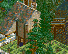
Layouts generally solid, nothing spectacular, Caesar's Fury was weak but I enjoyed Banana Blaster and Osiris. There were also some interesting details like the barn (awesome job there) and using track for picnic tables (possible the best way to something appropriately scaled in NCSO).
Odd landscape choices (eg alpine area, exodus surroundings) and repetitive architecture contrasted with a gorgeous macro layout I'm probably sitting at 60-65% for this.
Hope to see more from you
I was really surprised by the size of this park, definitely going to do a full video review for this.
This is a contender for the "best overviews" topic. Classy work, csw. We should work together sometime.
what a nice park! I really enjoyed it. Simple, clean, effective. Nice work all around. I especially liked the egyptian area and the one next to it with weird colors (not that I knew what it was, apparently). There seems to be a lot of content and its very good looking in the macro. I'd say more but I'm about to fall asleep! soz
btw I first tried opening it in LL coz I saw 'csw'
Very simple but good. I give it a 65% on the basis that it's very large and has lots of unique ideas (vultures, picnic tables, the silo, the banana, etc) which really impressed me. Architecture is pretty bland and you seem to love leaving lots of patches of land with nothing really going on there. At times, it's an effective strategy, but you left prime real estate barren. I'm guessing that was because you wanted to just be done with this park and move on, so you couldn't spend hours on some areas?
I am very unsure about this park. I spend a long time with it during the map job. On one said there was so much creativity in the park like the vultures or the giant banana. Also the charming character of the park and the old school feeling that reminded my heavily to older spotlights.
On the other side it felt really bare and to simple in some areas. I had sometimes the feeling that you converted LL architecture to RCT2.
My favourite part was definetely the roman area. I think especially the arena is a fantastic example for good NCSO architecture.
Lots of fun for sure. Had that old school feel about. Very good on the macro level ofcourse, a trend that seems to be strong lately.
Fun coasters, fun theming, etc.
The roman area was really strong IMO, the best use of a lot of creative objects.
The wild west area got a bit repetive to me, however I really liked the barn and the coaster was a nice twist on the boring loopscrew, really liked that.
Pirate area was nice, I'm always a sucker for using mazes as "filler" and it works well here.
Egypt was nice, glad to see a custom SLC as those are somewhat more rare. The Asterix influence was interesting here. Architecture and other theming was really good to, I think this area was my second favorite.
The exodus area, meh. Probably my least favorite, it did hold my attention for a long time though with the little detials, and the vultures are probably the biggest "wow!" moment of the park.
Asia was solid, the invert was probably my 2nd favorite coaster and I really enjoyed it. Pretty standard Asian ncso look to everytging.
Banana area was fun, but huge and got repetitive. The colors of everything were great and the abnana was a fun detail.
Really great parts throughout the entire park. I especially liked the colour schemes in the entrance section and the Japan area. There were fantastic little details and creative designs all over the place: special mentions for the banana, the sideshows, the coloured gate pieces in the Japan area (a wonderful way to stylise an otherwise brown fence) and again, another shoutout for the gorgeous barn.
The Persian area felt the weakest to me, but mainly because of the repetition. Similar for the western section, which had some great ideas and designs but felt a bit stale. To be fair though, there's only so much in the way of wild-west design before it becomes to diverse, and you did indeed have a large area of it. Actually, all of the areas were a decent size, which I appreciated.
I thought that the foliage through was solid. Great selection, placement, colours... all of it. I felt it was believable, really added to the themes and looked pleasant.
Finally, I want to mention the excellent use of water in this park. I thought you used and crafted it expertly. The canoes and rapids looked beautiful, and the little ponds, lakes and streams in all places (particularly the Roman area) were idyllic too. It's just a shame that more wasn't made of the main central lake, even it it was the odd dock/jetty/boardwalk jutting more into it, or a coaster swooping over it, or even a grand centrepiece. Either way though, I was very impressed with this aspect.
Overall, a very pleasant and engaging park. A bit too much repetition in places, but what was there was well done.
Loved the park, nice to see some more casual but still high quality NCSO, especially in such a large map.
https://www.youtube.com/watch?v=r9cJ3RIWSjo
Thanks for the comments, they mean a lot.
The map is 160x160. I built the areas in this order: entrance, japan, rome, western, persia, alpine, egypt and carnival. I started it about last October, so I guess that's a bout a year of build time. I completely built the entrance and japan areas first, before I started anything else. This was a result of me reading a comment made by Kumba on some old park of his where he said he liked to work by completing a whole area before moving on to the next. So I tried it, but I ended up going back to my usual method after the first two areas.
I would say this park has the most original content of anything I've built in this game so far. The brown mountains in the entrance area were inspired mostly by Loopy's landscaping in Silver Valley but that's about the only direct influence I can think of in this park. With the entrance area, I distinctly tried to build an LL style in RCT2. I sort of lost that with the rest of the areas, but I guess that objective was still in the whole park to some extent.
Anyways, thanks for checking out my park. It'll probably be a while til the next one. I have a total of zero projects to work on right now, and starting a new one is usually the hardest part.
Holy shit, this is great! I love the old school style. It's timeless and I'm thrilled that someone decided to build a park like this. It seems like it would be a ton of fun to build.
Some of my favorite things were the Banana Blaster which had a beautiful layout, color scheme and sign / entrance area. This was easily my favorite thing in the park and it absolutely oozed with nostalgia. 65% from me but I was tempted to give it a 70%.
The Gold Rush flume was great also. If Clearfield Woods taught is anything it's that you're really, really good at building log flumes and this one didn't disappoint. It's an easy ride to overlook but the queue, station area, drop and first part are all great (wait... I just described the entire thing didn't I? lol)
Osiris was very nice too, and I appreciate the fact that it seems to be a Vekoma version of the similarly named and themed Oziris. The first drop and loop look great over the boat ride.
Overall this is great. If I had to find something to bitch about I guess it would be Caesar's Fury's location because I have no clue why this is in the water park but that's really the only thing I didn't like.
Overall, awesome work. I can't wait to see how this scores.
Banana Area
Looks like you originally wanted to make this park a four corners park, because this area is HUGE. It's definitely too big. The half with the splash boats and the fabulous Banana Blaster is great, possibly my favourite bit in the park. Very beautiful, well designed and atmospheric, although the architecture is not quite varied enough. Plantation is cool too. But the other half of the area is just a lot of nothing. It didn't add ANYTHING to the well done half of the area, literally. you should've inserted a new area there, which would also have resulted in more consistent area sizes...
Japan
I'm not a huge fan of this area, I just don't like the archy much. Wooden coaster roofs almost always look quite bad to me, and combined with a random colour scheme and bad looking timber frame walls the area just doesn't work. The coaster's colours are atrocious in my opinion. When I changed them and tried to block the wooden coaster roofs, I found that the area was well designed though. Wherever there weren't any shitty roofs, the atmosphere was very Turtle-esque. Please do something with a 2005-06 bench! I'm sure you can perform some miracles if you want to.
Persia
This is the least Persian looking area in the history of Persian areas. When I ignore this, I quite like the area. Very unique with the flower roofs. Coaster looks great, but could've used more visibility and interaction. I like the foliage and the central picknick area.
Egypt
I like the architecture a lot here for the most part, just not the buildings made entirely of stacked ruins (like in the middle of the canoe ride) because it's texturally plain. Should've mixed the two styles more in my opinion! Osiris is short but sweet. And blue is guaranteed to work in themes like this.
Austria
One of the strongest areas. Cool coaster, cool architecture with just enough variation and individual identity this time. Foliage is good. Composition is good. Mountain is bald, more on that later. Lastly, I like the pond next to the coaster station. Very nice touch. Ponds are underrated.
Western
Another strong area. Architecture is even more varied here, although it all sort of blends together. Exploring this area requires a different attitude than for example the Banana area. Looking close up, some buildings and things do stand out. The Rattlesnake exit path is great, the dodgems building is amazing, stuff like that. The area with the wild mouse felt a bit unnecessary but it's nice I guess. The barn was good, but felt like it was from another park. Picknick tables were good.
Kiddie area
Probably my least favourite area. It wasn't bad, just very generic and therefore out of place. The only thing that catches my attention was the yellow grid under the paths. That was a nice touch.
Rome
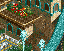
This area was very good again. A shame the architecture was either very interesting or very plain. The all brick buildings don't really work in my opinion. But overall, it works. Nice gardens, nice colosseum, nice slides. Lots of nice stuff.
Overall
You have a very unique style of landscaping. You have thick foliage everywhere, interrupted by bare mountains and rocks. Nothing inbetween. Sometimes this works, but sometimes it doesn't. It looks fucking weird under the log flume, it looked unfinished in Austria and Persia, it claimed the screen in the Banana area, and so on. You've gotten good with jagged rocks but I think you shouldn't do this all the time as filler. Anyway, overall, the park was very very cool. I've said it a few times already somewhere, the park reminded me of Bijou Magique: the oldschool style, with some quirks, and disproportionate areas. Manta Lake is like the smaller brother of Bijou Magique. Not quite as good, but still good. Flawed, but still tons of fun. Well deserving of Silver. Congratulations!
Grats on the silver!
I thought this park was special. Very beautiful and professional in its execution. You just need to push the boundary a bit more - we've seen these themes a thousand times before. The 'persian' area is a step in the right direction. I would say if you do stick with the base themes make them more interesting and personal; add some character so they become less generic. Otherwise, I immensely enjoyed this park for what it is.
This is one of my favorite parks as of late. Good job, csw. Stuff like this inspires me to build more.
Better late then never. Congrats on the Silver!
https://www.youtube.com/watch?v=Lu8CfFeYUlg