Park / Hallardrin's Keep
-
 03-November 15
- Views 5,264
- Downloads 758
- Fans 4
- Comments 21
-

-
 71.25%(required: 65%)
 Design

csw 80% alex 75% Jonny93 75% posix 75% Austin55 70% Cocoa 70% Liampie 70% Stoksy 70% disneylandian192 65% pierrot 65% 71.25% -
 Description
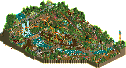
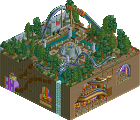
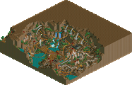
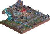
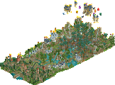
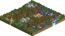
This mind-blowing coaster is located deep in the heart of Nimressea, a rich, lush valley fed by the breathtaking Sela Aiqua Falls, also home to the Eyfsera Elves. Check out the readme for the history behind this design and please enjoy looking around.
~ bsg ~ -
4 fans
 Fans of this park
-
 Full-Size Map
-
 Download Park
758
-
 Objects
1
-
 Tags
Tags
![park_4178 [H2H8 Grand Finals] Heaven's End](https://www.nedesigns.com/uploads/parks/4178/aerialt3929.png)
Wow.
I am blown away. Where did this come from?!
I absolutely love the atmosphere you've created. The architecture and foliage is great and it's a very charming / unique style that I really enjoy. The area around the lift in particular is just awesome. This is just oozing with atmosphere.
I actually think the layout itself is the weakest part of this but it's not bad by any means as the environment you've put it in and the surrounding areas really make it work.
This is flat out exceptional and absolutely deserves a design. Keep building, you have a very unique, fun style that's really a breath of fresh air.
I feel so divided on this...
First of all, great to see this true post-H2H bsg park. Agree with Tim that it's clear you have a unique style of relatively high quality, which is so rare nowadays.
The atmosphere is awesome, but unfortunately I can only enjoy that macro atmosphere from one, maybe two, angles. It's great close-up, which I guess should be the main aim, but I'd maybe consider thinking a little more macro with your next release. It's something that I myself have only recently begun to take note of and appreciate (damn you Kyle) but it actually adds a lot to overall "feel" that you get when viewing a park/design.
I am nonetheless glad that you utilised such sharp elevation changes. It's an easy way to improve a park that not a lot of people take into consideration. My one gripe was access to those areas; you've got these 1/4tile pathways and tiny ladders that look so out-of-place on sheer cliff faces like this. It would have been better to see access among houses on the cliffs via "normal" pathways with say grander staircases up to those areas for peeps.
The readme talks about how the houses on top of the cliff are for the wealthy, yet I found myself liking the architecture closer to the river. It was less of a showing of "grandeur" and more just larger versions of the poor houses (which I felt were incredibly small). Archy by the crazy paving was awesome, I think you should have done more of that in the lower parts and have fewer, but much larger, buildings for the rich areas. Why would the rich have their houses secluded in a forest with access (seemingly) only by rickety, wooden stairs?
The river itself was great, not sure I agree with three bridges with such different styles; two would have been plenty.
Unfortunately, the coaster was the weakest part of the design. Which is a shame, because ultimately it should be the focus (regardless of how much additional content you add, I'd know ). There were a lot of forced elements (eg the first drop, the two barrel rolls by the waterfall), and I think you missed a trick by leaving those underground portions completely bare except for the coaster and some supports. There's nothing wrong with a coaster that has to conform to its landscape, but it's not as pleasant to look at when it also has to conform to surrounding architecture, landscape features, and pathing. I'd maybe suggest building a layout first, or just have the landscaping done, before adding those park features. Hopefully it will help you in making a coaster that flows with the landscape rather than against it.
There's enough content here for a design, but I think some refinement could help a lot with future releases.
70%
That's a truly fantastic design. I was pretty overwhelmed by the amazing atmosphere and all those details. The concept is so original and unique.
The biggest weakpoint for me was my the heavy use of the animated objects. My game went really slow and it was hard to follow the pacing of the coaster. Also it would be nice to see here and there some more empty spots like grasland to relax your eyes a bit from the tons of details.
All in all it was the most enjoyable design in the last time for me.
brilliant
wow, this was so much fun! I love the atmosphere... it felt new and exciting. You did a really good job creating the village, it all definitely came alive for me. I also reckon all the green gave it a really good vibe. Out of nowhere but very awesome!
Interesting design here!
Starting with the coaster. Obviously very nontraditional,took me back to things like Mayra. I think it maybe took some parts a bit fast, and the bits hidden within the mountain were pretty bad, but fun overall. Ofcourse the highlight of this layout is the interaction. The partially enclosed loop is the best part of the whole design imo, really amazing element.
Landscaping is great, the river is well done and interesting, foliage throughout was good. To me good foliage is like a good defensman in sports, the best ones are the ones that just do there job without you ever really noticing. I really liked the paths up the mountain, would have been neat to see them be functional.
Architecture was...kinda varied some of it was good, some of it now. The thing is there is a lot of it, so it's easier to overlook the bad. I think the colors struggled a bit, there was to much green imo, and then not enough of other colors. Scale also seemed to be an issue, but I guess that is explained in the readme (thanks for including one btw)
Some nice little details throughout, good use of barrels and boats and whatnot.
Overall, unique and I think worthy of a win.
Yeah. If there were any doubts you are amongst the top talents among the new RCT2 players, they are now destroyed.
Great park, absolutely worthy of an accolade.
Thanks for the comments so far guys. I should note that coasterbill had a few looks at this design while it was in the development stages and helped me tweak the coaster to at least be decently design worthy. So thanks to him for the advice, as well as a few others that peeked at it before I released it.
@stoksy - I had to re-read your comments a few times to get what you're saying. I'm sure in time I'll give more thought to the parks I put together, coming from the micro and macro angles. Thanks for the advice and your vote of confidence for this design.
@therestofyou - Glad you guys are enjoying it. Some have a knack for this game, for others it's a slow growing process. I'm the latter, especially with coaster designs. Ugh. While I'm still a newer member, I've been very busy this year building parks, working to improve and enjoying it along the way. Liam's captaincy in H2H (and picking me 2nd to last in the draft) was a great learning curve, along with the rest of Heaven's Atlas. I'm glad to have reached this level of building, hopefully it'll keep getting better.
Wow, looks great. Should install RCT2 again to see it in-game.
I think my vote just gave you a design win. Congrats. Well deserved effort.
It's a bit too wild and semi-realistic for me to fully love it. I also find it a bit unnecessarily busy. But it shows you put a lot of effort into this, and it's nice to see this dedication to the game. Will be interesting to see what you do next.
Gorgeous stuff!
Congrats!!!!!!
Looks awesome. Will definitely hook up my RCT laptop for this and tell you what I think in more detail.
Great design, really enjoyed finding all the little details and stuff in the park.
https://www.youtube.com/watch?v=DyWS01WMOAo
It's great to see the response to this park, thanks guys. And it's nice to have a design under the belt, especially to see that it was a unanimous decision too. It seems like it's always tough to get the higher vote from a few on the panel! And I appreciate the great comments from the community and the video review from G-Force.
For upcoming projects, I still have my Forces of Nature park, plus a new project that is taking a step back in time, should have some picture posted in the nearish future.
Wow, so much great stuff coming out recently. I wish I could give all of this more attention.
This design is so cool bigshootergill, I love everything about it. The layout is weird, the architecture is quirky and fun, the foliage is great, and the landscaping is varied in just the right way in just the right places.
Like I promised. This was an awesome design for sure. I liked the caves and the layout was pretty neat. Architecture was pretty much top notch. I didn't care for the story because I don't like elves and fantasy stuff like that.