Park / Extinction
-
 10-October 15
-
 B&M Invert - Extinction
- Views 7,628
- Downloads 893
- Fans 9
- Comments 18
-
 81.25%(required: 65%)
 Design

disneylandian192 85% FredD 85% Pacificoaster 85% Steve 85% Cocoa 80% Jonny93 80% MCI 80% Sulakke 80% 5dave 75% Liampie 70% 81.25% -
 Description
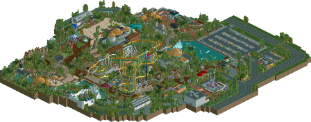
B&M invert design with a jurassic park/prehistoric theme.
-
9 fans
 Fans of this park
-
 Full-Size Map
-
 Download Park
893
-
 Objects
467
-
 Tags
Tags
![park_4203 [H2H8/8] Beachcomber Cove](https://www.nedesigns.com/uploads/parks/4203/aerialt3963.png)
Ok, whats the deal behind the 58% rating? I will review this park later, its completely amazing.
Congrats on finally finishing this! You know some of my thoughts but I'll give you a review later as well.
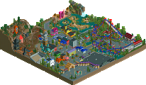
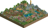
Can't wait to see this in-game tomorrow; the overview map looks absolutely wonderful.
Really good work mate, loved the foliage and the rapids especially - that turned drop with the monorail was great.
Shame about the ratings of the coaster but other than that a great design that brings backs memories of US Singapore.
I voted 95%
85% based on the full map. I'll check it out ingame later and rerate it.
This is a great map, here. So many things to look at and all done at such a high level of quality. Overall I enjoyed most of this, so I will start with things I liked versus the things I didn't (however, there wasn't much I disliked!).
Macro-wise, great first impression from the overview. With the parking lot, backstage areas, large warehouse buildings in some spots, it makes this thing look real. Great job with the park setting. At the end of the day this park comes across as very believable, minus a few bits I noticed (but more on that later).
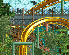
The coaster itself is pretty solid. Bummer about the ratings, but I can usually look past those if the ride design is well done. Really liked the elements on the ride and how they were a different color from the main track. The trains hit them a little fast on a couple of them but overall the pacing was fine to me. Probably one of the better inverts we've seen lately (nothing is sticking out from H2H, really). Nice job!
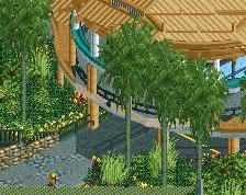
Architecture throughout is wonderful. Great colors and forms. You really like monorail track don't you? It works for the large thatch roofs due to basic necessity and I guess that was the only real instance of them minus other theming, so hey whatever. Really liked the coaster's station as well as the rapids' station (thank you for making it open-air, it is SO much better), and even the monorail stations. You make good realistic ride stations, keep it up!
Foliage was spot on I think. Good balance of forced/planted trees and wild shrubbery. I applaud anyone who uses the Lombardy poplars in neat rows. Custom trees were great too -- very lush. Overall landscaping was solid, also!
Supporting rides were good, but the rapids was excellent. Might be my favorite part of this. The diagonal steps leading down to the open pavilion with the waterfalls and monorail and rocks and trees and the ride station...just a great atmosphere. The rapids itself was very good. Real nice layout and themed wonderfully. The custom flat rides were nice and done well. I also really liked the carousel in the little hut in the entrance too for some reason.
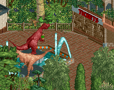
For the things I didn't enjoy so much, it's mostly incredibly nit-picky. This park screams realism to me and there were some continuity issues for me (there's a tickets building but no gates to pass through? Anyone could just walk right in, for example). The large visitor center also didn't seem believable to me, as well as the jeep ride station. Maelstrom was oddly named. You made an awesome mountain facade but the only real sightline to peeps would be for the zip line station and I feel like a park wouldn't do this but it's still cool so whatever I guess, ha. Again, this is trivial stuff. Honestly, it's really hard to not like everything on this map. So, great job. I'm looking forward to seeing what you have coming up next!
I turned it on, heard star wars music, and got really confused for a minute. Then I remembered to copy in the new music...
anyway, amazing park. I'm really happy you chose to submit it for design and come away with a really memorable one.
architecture:
it gets a bit jumbled around stylistically but I think you somehow pull it together into a tropical sort of thing that works. there's a couple odd buildings but overall very skilled and some pretty incredible buildings in places.
layout:
spot on. I love its interaction, size, everything about it. one of the best design layouts I've seen in a while.
rides:
I love the jeep ride that you would miss if you weren't looking hard enough. That would be a fucking fun ride in real life. Also, the rapids ride is incredible, I love the building with the monorail through it (although I'm less sure on the cliff walls you've made with the stony fence object... maybe it works in its own weird way though). there's some good custom rides here too, something I definitely don't excel at.
atmosphere: heaps here. the foliage is lush and exciting too.
realism: yeah you're good at this part, although the park layout and size is a bit strange for such an otherwise quite realistic park (understandable given the direction this ride took)
overall amazing work. I'd give it 75 or 80 probably.
edit: last vote, you're welcome
Thanks guys, I'll take that sweet sweet green name hahaha.
@Steve: Thanks so much! With respect to your entrance gate critique, I imagined that the ticket building would be purely for ride tickets. So, from a possibly incorrect memory when I went to Santa Cruz, there were booths at the entrance where you can purchase ride tickets (seemingly) instead of paying an actual entrance price. Given the size of the "park" and there only being one coaster I'd justify what I've done by the fact that anyone would be essentially "free" to enter because it's not really a park per se, but would need to pay for rides etc. Practically though, it was just based on positioning more than anything.
@TheViking: I tried doing something about the rating with SoB trainer but that aside, ultimately the park was too far along to really go back and try to change the layout for better ratings. The pacing was already borderline by the ending so didn't want to sacrifice the early elements for even worse pacing later on. Thanks though.
@Sephiroth: Very true haha, this started a lot smaller than it ended up. There were loose plans to make this an actual park with another coaster where the brown LOTR rocks are but I ended up just going with what I had. Possibly larger than it needed to be, but I'm just happy that I was able to finish it.
@Cocoa: Retrospectively I do regret some of the overuse of that rock wall object, I still like the texture I think but the amount could have been broken up a lot better. I also think that the large mountain with the zipline could have been made to look more natural instead of the at times quite sharp cliff faces. Thanks again for the pre-review and this one
Really glad to get this released, probably the best thing I've ever built and it's great to get such positive feedback from it. Unfortunately I haven't played RCT in about a month, but do have a park in the early stages of building/planning. Might be a while until you see a screen of it though.
One of the better releases last time (outside of H2H). The atmosphere is unique and dope. Archy is great and fitting the theme very well. I could imagine myself walking around in it.
I really like the coaster lay-out, that first drop goes ham! It flows really well and it rides with a good steady speed. Love those ribcages, great idea. The blockbrakes were an eyesore. That midbrake wasn't really needed if you didn't build a working blockbrake in it. I get why you didn't want to do that but now it's kinda useless. Train is really waiting long on the lift. I think it would run smoother with a train less and more fitting waiting times.
The rapid was awesome, as well as the death ride. One other thing I did mind: a building to sell tickets but no gates to enter the park?! Guests can walk in as free as they wish. Seems stupid to nag about that, but since you made backlot areas and a parking lot (stuff I don't find that important to see ingame) a ticket gate would be welcome too.
Conclusion: great design from a great builder.
Congrats on the on the score Stoksy and becoming a Parkmaker, very well deserved.
In my opinion this is probably my favorite Invert design of all time, its size and scale are just immense, the layout is very good, the theming is great, everything is just top notch. I love the foliage in the park, its probably some of the best foliage ever, maybe not as revolutionary as RRP but its almost more pleasing and fitting to me. Your mastery of foliage really brought this up a level, jungle parks are often quite difficult due to the foliage necessary, but you did it perfectly here.
The architecture is also top notch, the Jungle Safari and Rainforest cafe buildings are some of my most favorite ever, perfect use of trackitecture in the safari and the Rainforest was just such a good mix of foliage and architectural forms. Your parkmaking abilities are off the charts here, you are able to mix curves and diagonals almost perfectly to break the grid like few have ever been able to do in RCT history, its just immaculate. The layout of the park isn't perfect, but I like how I almost get lost in it. It feels like a real park that grew and evolved over time, constantly expanding and re purposing old areas, rather than being built all at once and organized.
I just love everything about this, its almost impossible for me to have any complaints. Only other things I could have asked for were some frozen staff moments to add a little more atmosphere and depth. Some of the buildings also seemed a little purposefulness, but I cant really complain as they were all architecturally interesting and unique.
Congrats Stoks, this was truly a treat to see. I hope to give this a video review next week because I wont have a change to review it this week. Rating: 90-95%
Hope that you keep building, your style is amongst my favorite for any active builder, its a perfect mix of Robbie, Airtime, BG and others. A full sized park from you would probably be amongst my most favorites ever.
https://www.youtube.com/watch?v=1eZyAm2_fRI
https://www.youtube.com/watch?v=omTljd2jFGQ
I finally got to check this out in game and holy shit, awesome design!
I really loved the atmosphere here. It was a mess but in a good, deliberate way and it really created an awesome jungle style atmosphere. There were awesome little rides and details everywhere that I really enjoyed and I get the feeling that you could keep looking at this for hours and still miss things.
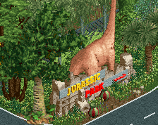
Some of my favorite things were the rapids ride, the zipline and area around the entrance to the zipline, the jeep ride station (and basically the entire jeep ride) and the awesome blue dinosaur up front.
The rapids and the jeeps were great between the great theming and awesome interaction and they made an already great park even better... excellent job on these.
If I had to critique anything it would be the invert itself. The second half was excellent and the area between the mid course and the barrel roll flow beautifully but the area between the first drop and the mid course seems oddly spread out between elements and the first element seems a little too far into the layout and a bit fast. B&M would generally hit you with more rapid fire elements off the lift than this coaster has. The order of the elements was fine but the spacing between them got me a little. Also, I'd vary the dispatches so it doesn't keep block stopping on top of the lift.
My only other critique is that while the Carousel looks awesome where it is that whole area makes no sense to me. At first I thought the Jurrasic park gate was the main gate but then I realized there really isn't a main gate despite the fact that there's a ticket booth because the Carousel is outside the gate as is another path that lets you access the rest of the park. Then I decided to ignore that and assume there was no gate and it was a pay per ride park which would have been cool except for the fact that even if the Jurrasic park gate was just the start of a themed land there wouldn't be dinosaurs outside of it like there are in this park.
As I said though my complaints are minor. The atmosphere here is breathtaking, the interaction between rides and paths is great and the architecture is truly top notch. This park was incredibly fun to look at and I absolutely loved the little details everywhere.
You showed a ridiculous amount of skill throughout this map. Awesome, awesome work and congrats on the design. I can't wait to see what you do next.
Incredible park. For a design submission the amount of content here is crazy.
Layout was really cool. I don't know a huge amount about real coasters but it seemed like quite a unique invert in that it didn't feature any larger loops or cobra rolls. The tight inversions, aggressive pace and landscape interactions gave it a Nemesis feel. Albeit with a colossal first drop! Only criticism is the colours - I wish you'd stuck with all yellow/green supports.
Great architecture, the thatched rooves were really well executed, particularly given the texture/curved object limitations. The beam structures underneath some of them were fantastic. I thought the rapids station and surrounding area was particularly stunning. Just a great use of depth and open space in this area - The diagonal stairs, the sunken building, the monorail and the open structures. It all felt so atmospheric and real and you know it would look equally good if not better from a peeps viewpoint.
Initially I wasn't a fan of the foliage. I found it too dense, even for the theme. But the longer I spent looking at the park the more I liked it. Although some of the details get obscured it just adds to the immersion and atmosphere when you see things like a monorail car or a jeep emerging through the trees. It was impressive to see more ornamental areas of foliage mixed in there too without looking out of place.
I'm trying to find things to criticise in the interest of a balanced review but honestly I'm struggling. I just want to see more of it - please make a big park of this quality!
Hey G Force I think it's awesome that you do these reviews, because it gives me a chance to check out parks when I'm not on my RCT laptop. But just a tip, not to hate, could you maybe press the enter key a bit less while doing the reviews? It makes me a bit dizzy when the screen keeps spinning, and just doesn't give me enough time to check some things out. Like I said, just an advice.
Stoksy this park is awesome. I love the zipline ride!
Thanks for the additional responses.
@Fred: Yeah, the train stopping at the lift was something I tried to combat with the longer wait times but apparently even 45 seconds wasn't enough unfortunately. The layout was long enough to warrant a MCBR in my opinion, slowing the train down through an actual block brake might have helped with the train timing but would have killed the pacing so I thought it was best just to imply that it worked.
@G Force: Amazing review from you, really appreciated the pre-feedback as well! So great to see this in video form, easier to see what you're referring to. I attribute the poor placing of the visitor centre to failed planning, I had the layout down quite early but working out how to set out the surroundings led to it probably being bigger than it needed to be and some oddly placed architecture/rides.
@Bill: Glad that you liked it so much! I had received quite a lot of feedback about shrinking the transitions between inversions and I'll just say that it's better than it was. I can see what you mean though and should take that into account next time. The architecture in the pre-Jurassic park area was originally a mish-mash of randomness (you can see in the screen that I posted of it) so I tried to incorporate features of the actual themed area into that section. It was more a means of 'implying' the main theme. I was really happy with how the rapids and safari turned out as well
@alex: Pacing killed me on this haha, I did try to replace that first inversion with a larger one but it just didn't fit in the area. Had to go with the smaller ones and try to keep the pace throughout the layout with a large initial drop. The differently coloured inversions on the ride was cause for much debate haha, but it was the one thing that I really wanted to keep regardless of critique. Most of the other things I did end up changing from memory. Glad that you ended up liking the foliage, it took quite a while to get it dense enough to sell the theme but also offering enough space to view/appreciate the rest of the park features.
@Faas: Thanks! The zipline was strongly encouraged by Tim so I was basically obligated to include it haha. Glad I was able to find a space for it that didn't look too forced.
I'll just burn through a few quick thoughts on this amazing design:
(1) I really like how this park doesn't feel like it was built on a grid. First off, your buildings are beautifully constructed, making valuable use of many 1/4 tile objects. The monorail track mixed in with the thatched roof to make circular roofs, covers, buildings etc was brilliant!
(2) Coaster design was awesome, so well thought out to bring in some great interaction with the peeps. Personally I liked the white elements in contrast to the rest of the track. Usually I'm not as big of a fan when coaster track is used in odd scenery settings, but to create the rib cage as part of the coaster was great. Lovin' the batwing too!
(3) Ride integration throughout was incredible! From the monorail that gives peeps a full park tour, to the Jurassic Safari meandering below the coaster, to the breathtaking and amazingly designed Hadasoarus Cove (just amazing!), to the perfectly located Pterodactyl Flight zipline, and so much more. It's almost hard to find everything in one viewing!
(4) Scenery was stellar. Foliage takes so much effort and patience to get it right, I can't imagine what it took you to complete this is such a perfect way. You used quite a wide variety of trees, shrubs, grasses, but none of it looked out of place. Just to note, since this is a dinosaur park, you took potentially tacky dinosaurs and made it feel as realistic as you possibly could in rct.
What else? There are some minor nitpicky things others have brought up, but they pale in comparison to the high quality of this design, earning you a rightful parkmaker status! Congrats Stoksy!