Park / Lake Chronus
-
 04-October 15
-
 Lake Chronus
- Views 7,226
- Downloads 925
- Fans 7
- Comments 30
-
-
 80.63%(required: 70%)
 Gold
Gold

chorkiel 90% yes inthemanual 90% no 5dave 85% no ][ntamin22 85% yes csw 80% no Liampie 80% no Cocoa 75% no Jonny93 75% no MCI 75% no geewhzz 65% no 80.63% 20.00% -
 Description
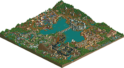
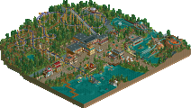
Lake Chronus is a full sized LL park with 5 themed areas: Knossos, Trondheim, Florentia, The Black Country and Arcadia
-
7 fans
 Fans of this park
-
 Full-Size Map
-
 Download Park
925
-
 Tags
Tags
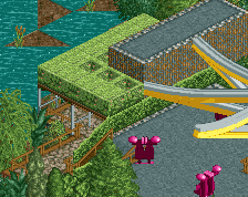
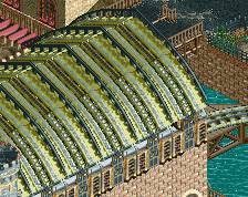
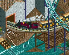
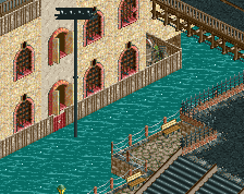
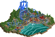
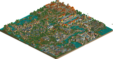
Can't see this in game atm but when I can, expect a full review like the one in Fabritius Delta.
Im commenting only off of the overview here (no ll)
Normally ll just doesn't do it for me, its a very different style, just not really my thing. but I liked parts of this park
Favorite part is easily the modern section with the purple flyer. So clean, bright colours, just everything was spot on in that area. The hacked ride and water slide in that area looked really cool as well.
Another highlight for me was the hotel, that was really well done, especially for ll.
Entrance area was good, First fountain was really creative, as well as the crazy circle shit going on by the actual entrance. Good colours and a solid atmosphere all around.
Woody supports looked good, but that turnaround looks really awkward to me, however it could be the angle of the overview
Industrial area? the black path part didnt do much for me, didnt like the vibes from there.
The B&M area is a little too busy for me.
Overall I really liked it
Review coming later.
Got back from a holiday and my park's released, nice one! cheers
Dear god that's a lot of cool and pretty stuff. Gave this a 90% because I absolutely loved this. There were so many cool ideas and the themes felt very new.
Haven't decided yet which area is my favorite. Florentia, black country and arcadia are the best in my opinion. With Knossos being my least favorite area. I didn't like how the coaster contrasted with everything else. It stood out more as an eye-sore than a blessing. Although it interacted quite nicely with the surroundings.
You're easily one of the best LL parkmakers of the moment and it's really cool to see you create something this good in your short time on the site.
two full size LL parks in a row?? amazing
I'll go area by area.
entrance:
a truly fantastic area. the clockwork stuff is brilliant, and it all feels alive and welcoming. such good architecture and park layout here. probably the best venice theme I've ever seen in LL, with some really awesome details.
viking:
the castle is outstanding, especially the flying buttresses. the rest of the area is, however, a little dull. the architecture is a bit empty feeling and I wasn't such a huge fan of the reverser coaster- it could have used some more intricate theming IMO.
crete:
a solid middle-ground area. some really nice bits around but overall lacking the polish, charm, and brightness of the rest. I like how you made the temple bits but there's not much to this area, it feels like, other than the big purple coaster.
futureyarea:
not really sure how I feel about this, I think because it seems quite inconsistent. there's some amazing bits, like the bubbles over the water ride and some of the flyers interactions. if the whole area had been as thoughtfully placed and integrated with the landscape it would have worked well- but IMO it got a bit sloppy and repetetive
industrial:
another fantastic area, probably 2nd best to the entrance. There's a lot going on, a great woodie, and some cool park design. Could have used a bit more colors and life without losing the industrial vibe IMO but overall solid work.
once again, a difficult contender for spotlight. there's some outstanding work but its not consistent throughout. I'll have to mull it over. for now, I'm voting it 80 or 85
also, that boat is amazing. the view from the entrance with that and the epic castle bridge would be sick.
oh my god...
That bridge
The wooden coaster section
The dueling reverser coasters
The layering!!!
I'm in love.
The only weak spot I saw was the Invertigo. But every time I go back to this park I find something new.
I apologize for no video review, but since I reviewed the park when it was like 95% finished I felt it would have been redundant.
Overall, a very strong park. Super impressive for a first solo release, especially being LL in this day and age. I'm glad you went back and finished/touched up some areas and added some more detail and polish. Individually each of the areas were really nice, especially the entrance. Lots of good architecture and interesting forms. The windows were a nice tough especially some of the open ones, really like touches like that.
The layouts were relatively weak I though compared to the rest of the park, however in the style your going for layouts probably weren't much of a focus so its not a big deal. The GCI was probably the best coaster in my opinion, the supports were super impressive and must of taken ages to build. The B&M, Flyer, and Looper were serviceable and did what they were supposed to, not really a fan of the dive coaster or the reverse-dueler. Although the dueler was impressive simply on a timing standpoint, however the aesthetics of those coasters never appeal to me.
My main issue with the park was the inclusion of the future area (flyer) and the location of the Viking/Medieval area. I wish you would have replaced the Futuristic area with something more fitting with the other zones, maybe something more medieval or a roman/Greek area maybe. I also wish the castle would have been more of a centerpiece or in the back/middle of the park. Would have made everything more appealing from a macro pov as well as providing a good point of reference in the park. Seeing as it was the largest structure in the park, it would have been nice for it to be more of a focus rather than simply something off to the side.
Overall, super nice park. Not exactly super if I'd consider it spotlight quality though, the future area kind of ruined that for me. Probably would still give this a 75% like I said in the review I did. Although I do like this more than Archipelago, its hard for me to give it a higher score simply because of the unrealized potential left in the park. Really looking forward to what you make in the future, you have huge potential in LL and I hope you stick with it.
Cheers for the review G Force!
I think the futuristic area is probably the most divisive - some people will (hopefully!) really like it and others will hate it. It's difficult to make a future theme cohesive with 4 other themes which are all from the past. But the concept was to have each theme spread out in a fairly even chronology (a greek/roman theme would've been too close to Knossos) and it seemed more exciting to use a future theme than a present day one.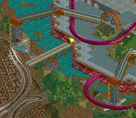
There were a few routes I considered: Dystopia was a possibility but would have probably shared too many aesthetics with the industrial area. At one point I started to make a walking city:
But this turned out to be way too ambitious and jarred too much with the rest of the park. In the end I'm happy with the Eco/utopia route I took as it meant I could avoid making obnoxious skyscrapers and make gardens that were still cohesive with the rest of the park.
This looks fantastic!
Cant look at it ingame right now, but I will as soon as I´m able.
Ahh I don' have LL so I can only speak from the overview. I have spent a good 25 minutes looking at it though, this is really an impressive park!
Florentia has a nice vibe, and I really enjoyed the entrance plaza. Grapevine is my favorite small coaster in the park. Overall a solid area.
Trondheim was interesting, with such a mix of ideas. Plunderer and the castle are well done, but the boomerang feels out of place. Geri and Freki looked really cool! Great little area, I wish I could see the coasters reversing in action.
Knossos is probably my second favorite area. While it feels a little chaotic, the interaction is awesome. Minotaur has an excellent layout! The Mythology Amphitheater was also a highlight! Daedulus felt a little like it was thrown in as an afterthought though.
Arcadia is my favorite part of this park! Just an incredibly beautiful area. I love the minimalism, it looks very real. Photosynthesis fits perfectly with the area, and obviously Windsong is excellent. Another coaster with a creative but believable layout. I enjoy the look of Glissando but the water slide choice seems strange. Overall, an interesting theme choice executed well. I really enjoyed it.
The Black Country had both parts I liked and didn't. Steam Hammer looked great, but Copperhead Coilery felt too close by. I would have enjoyed it more in a different location I think. The white coaster (Flying Shuttle?) also felt a little out of place. The theme is a pretty bold one, and in places it works well! Some of the details like the bridges and mine carts give a nice feel. But some of the architecture also feels a little bland. Hard to avoid with the theme, I suppose.
Overall, a great accomplishment, and I really enjoyed looking at the park! Definitely an LL park I will come back to, and my favorite of the recent ones to be released. Based on the overview, I'd be borderline spotlight for this. If this doesn't get it, your next park will!! That new screen you posted is quite amazing.
With LL releases, we always have to wait for one or two LL panelists who only check the site every 2-3 weeks, like posix or RMM or Milo. Nothing out of the ordinary.
Plus I haven't voted yet.
My park was released before his and I don't have a score yet. Patience young padiwan!
you're a parkmaker now. Congrats! Sorry, you're review might come in a few weeks or so.
This is probably my favorite LL park ever. Really, really nice work!