Park / Paramount's Movie World
-
 08-November 15
-
 Paramount's Movie World
- Views 10,125
- Downloads 1,234
- Fans 1
- Comments 29
-
-
 72.50%(required: 70%)
 Gold
Gold

Chocotopian 85% Poke 85% Cocoa 75% inthemanual 75% Sulakke 75% alex 70% Stoksy 70% Austin55 65% csw 65% nin 60% 72.50% -
 Description
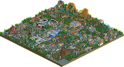
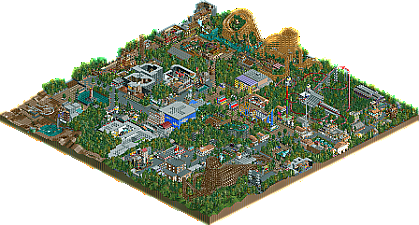
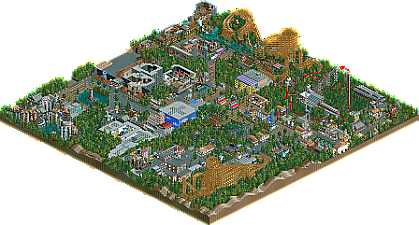
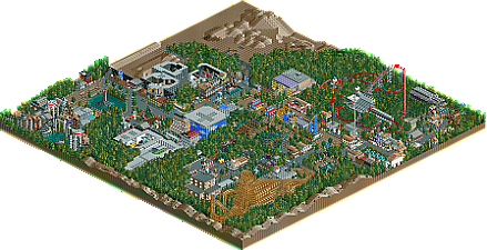
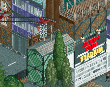
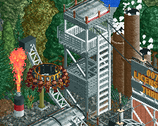
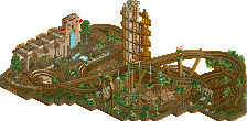
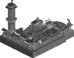
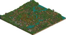
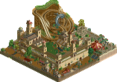
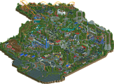
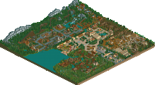
This is my first ever take on a Paramount Park. Here is some background history on the park. In 1994, Paramount wanted to open there first park. They started building the park in West Virginia in 1996 and finished in 1998. The park opened with four themed areas. The first area was Hanna Barbera Land, an area that you'll find attractions for the little ones themed to Hanna Barbera characters. The second area was Action Zone, this area holds the more intense and challenging rides that are themed to Paramount's action films. The third area was Wayne's World, an area that is themed around the Wayne's World universe. This area opened with the most heart pounding wooden coaster in the world at the time, Hurler! The final area was Planet X, an area that is themed to another planet that has the most Xtreme attractions in the whole universe. The rides in this area are themed to Paramount's sci-fi films. Over the years the park has had many changes and surprises! Today, the park is the most visited family destination in the South!
Thank you everyone that has followed this park, it was super fun to make! Now the 2015 file is the file that is truly finished. The 1998, 2001, and 2005 files are somewhat finished, but really not due to me heading off to college and not having a lot of time to finish everything in those three files. The unfinish parts are really the foilage and air vents tbh. Also the two audio files used in this park are actual audio Paramount Parks used inside there parks. I know this from growing up with a Paramount Park. The audio track in Top Guns queue is a song called Danger Zone, this song is off the Top Gun movie soundtrack and it would play in every single queue line in Action Zone at PKI. The audio file playing from The Outer Limits queue is actually the audio from both of the real Outer Limits queue line pre-shows. Anyway, thank you again everyone who has followed and supported this park!! -
1 fan
 Fans of this park
-
 Full-Size Map 1
-
 Download Park
1,234
-
 Objects
1
-
 Tags
Tags
I though I submitted this as a accolade. I guess I forgot to or something idk.
51mb, fuck dude.
I didn't know about this. Thank you for the heads up!
Amazing park. So much to see and a lot of creative ideas.
One of the best parks of the year for sure.
Definitely fun, old school feeling to this.
Invalid Data
Did you click the airplane in Gasworks queue? If, so then yea. Just don't try deleting it and you should be fine. Like you can scroll over it, just don't try to delete it or it will frick up.
No, he cant open any of the four saves
Oh, I don't know then.
Just download the AE-DMBGY dat manually. That's what I did.
Nice park here, I can tell a lot of work went into it. That being said, I don't think I'm a huge fan of your style. Every building was covered in fences and windows galore...there was no breathing room. As a result it felt somewhat messy and very crowded. You've got great ideas and creativity, now just balance them out with better area composition and you've got a >80% park.
Absolutely loved this. So full of life, creativity and fun. Glad you chose to submit the previous years as it was very interesting seeing all the changes, big and small, and the narrative it created. The parks composition was a bit confusing at times and aesthetically it was sometimes jarring but I didn't mind too much because the style is so unique and your own.
I agree with csw. I have very mixed feelings about this park. Your object selection was a bit strange. Your style looks very NCSOesque, mixed with some objects that don't fit very well with the game graphic and some other standard CSO.
Like csw said, the park is a bit crammed, i think there was nearly no open space in the park. Some areas were fully covered with trees, every tile is used.
On the other side, your oozes a lot of fun. There was so much creative input, all those indoor areas.
I think the area around the B&M Dive Machine was the best. It's more open than the other ones.
I am glad you shared this interesting piece of RCT with us.
Something like this on a giant map would be absolutely brilliant. Tons of rides, peeps, life, this would be epic. It's still great here, but like others have said everything is built atop each other and it's all very crammed.
Looking at actual park layouts and seeing how the elements are composed is something I challenge you to do with your next park. The skill is there to create good things, but it comes off as amateur because you simply pack as many rides and details into the park as possible. Every tile has something on it, there's no grass!
I know I'm repeating myself, but more space could have brought this to the next level. It's still great to see you finally finish this. King Kong is still my favorite thing in the park, and I love that there's finally another Paramount park on the board.
Also, would you want that logo to be fixed/made transparent? I can get rid of the white square around it if you want.
Thank you for all the comments, they seriously makes me happy!
I do want to comment on the reason why the park is so tight though. It is mainly due to the fact I didn't know this park map was "small" until I finished King Kong. So, I tried making use out of every single tile as possible. Also, I did want at least ten or more coasters built in this park. I do understand why people are commenting about there being no grass, but I like parks with a lot of tree's so that just my opinion. Although next time I will take note on having bigger park map, more space within the park, and more grass.
Also Nin I would love if you could make my logo transparent! I been trying to figure out how to make it transparent for a while now. I mess it up every time I try.
Little sad that you didn't really follow the licensing rights of some of the properties. Always like to see parks like this to be "realistic" in that regard.
It's just a game as far I care. If it was licensed under Paramount on google, I made a ride adaption to it. I also watched every film I made a ride for theming purposes as well. So that could be a realistic aspect in someway lol.
wow, excellent park. I loved the style, it came off as a skilled/careful mix of ncso with detailing work, exactly where it was needed. Very refreshing to see- we usually give ourself strict limits like 'full ncso' or 'very detailed' but you strike a nice balance where you add small stuff only where it needs to be. seems like a fun way to build actually.
I also liked the timeline of the park, always fun to see that sort of thing. Lots of unique and fun looking rides, good themeing, and a lot of life and fun. Good work all around, and I definitely look forward to more from you! Maybe something bigger?
I just always hope, that these timeline parks are really accurate to real life situations. Plus, I find it one of the difficulty of making a branded park to think about what licenses this brand could use.