Park / Electric Fields Amusement Park
-
 01-October 15
-
 Electric Fields
- Views 3,508
- Downloads 661
- Fans 5
- Comments 15
-
-
 49.38%(required: 50%)
 Spotlight Submission

FredD 60% Cocoa 55% csw 55% RCT2day 55% Jonny93 50% Sulakke 50% Ling 45% posix 45% Liampie 40% MCI 40% 49.38% -
5 fans
 Fans of this park
-
 Full-Size Map
-
 Download Park
661
-
 Objects
1
-
 Tags
Tags
![park_4229 [H2H8/8] Valle Del Amanecer](https://www.nedesigns.com/uploads/parks/4229/aerialt3993.png)
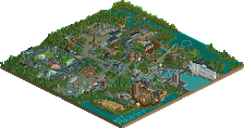
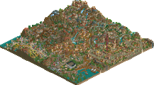
Review from the stream today:
Part 1:
https://www.youtube.com/watch?v=E1OU7ULbufo
Part 2:
https://www.youtube.com/watch?v=bUd-H7jLpRo
A little respect here guys. If you're going to give a low rating, at least give some feedback to let me know why you think it sucks. Where's the NE love?
Thanks for the video review g force.
this park was fun and well put together. I enjoyed it! theres some nice details around the park but not a whole lot of content (would explain the votes IMO). I'd give it a 55 or 60- its solid, just not massively creative or huge.
all these electric field parks make me want to try one out
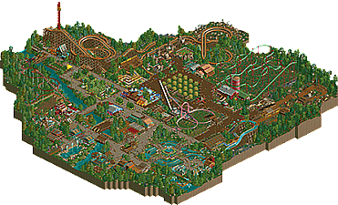
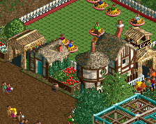
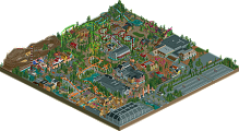
Nice park here! Overall it had a warm lively atmosphere and the architecture had the right amount of detail for NCSO I think. The foliage was generally really nice too.
Things that I think could be improved:
-Layout of the woodie (lacking in drops. 2nd half it improves a bit though) and the suspended coaster (too boxy, lacked interactions)
-Colour schemes could be more cohesive.
Details I particularly liked:
-rockwork around the entrance fountain
-the playground
-the river ride turnaround/path plaza
-the landscaping behind the woodie.
Good job!
I loved the atmosphere here and actually thought it was very well done. I really hope you win an accolade, you deserve it. I love the throwback style and you mix in some nice detailing to keep it from looking stale. I love this type of aesthetic.
Some things could have been better like some of the layouts and the splash boats taking a corner way too fast but the pros far outweigh the cons for me.
Great stuff!
I haven't voted on anything in a while so I thought I'd peruse this for a bit. The scenarios make fun little projects but are generally quite small for a full-scale park submission, and the farm theme isn't really enough to sustain an entire park. I also think you have way too much path and the coaster layouts are sadly a little lackluster. I did like the dead woods finale of Whopper, and I found the river-front section along its lift to be one of the most pleasant areas (almost ironic, how it leads to two thrill rides, while the more gentle/family rides are in very busy/noisy midways). Lasso is an okay idea but the station doesn't really... work. Plunge could have been re-tooled in a way that made it much bigger and more interesting to watch.
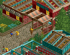
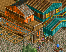
I do quite like the foliage (except for 10mil of the same bush under Crop Dusters...), but the buildings are too simplistic. I like the roofs and colors on the entrance gates. The color schemes across the park are relatively well-contained and consistent, but there is still so much brown, and a few more darker colors in the denser forest could have helped. This is right on the cusp of Bronze, but isn't technically skilled enough or large enough to get there.
@Cocoa - Thanks for your vote bro! This little side project was small, just a little change up from the norm. You should try it!
@alex - stupid coaster layouts, man alive! I should get you to do all my layouts!
@cb - thanks.
@ling - Funny thing with Lasso, I couldn't help myself, it's one of the pre-made rides from the original game. I figured if it's an original scenario, I should use an original ride, and it fit perfect in the space I had left! Too bad you don't see that this isn't at least a bronze, you have some insanely high standards bro. I mean, yeah it's no gold or spotlight, but hey, whatever, to each their own.
Turns out I was the last vote here, sorry to make you wait. Nice effort. The thing that brought it down was really the coaster layouts. If you're going to submit a park made from a scenario that's been done several times before, something has to really stand out, and nothing quite did for me.
Well that sucks!
This should have won Bronze, comparing to some of the other Bronze parks over the past year or two this was definitely good enough.
I'd like to at least defend my park. I did build it for the fun of it, to try out another NCSO park. I honestly thought this park had at least bronze quality to it (I thought it almost was flirting with Silver quality if the park had of been larger). The building construction was clean, it had a good variety of rides, decent use of trackitecture and decent themeing for most of the rides. I realize that my skill of designing good coaster layouts continues to be my downfall, but is that really a reason to not deserve a bronze (lowest tier) accolade? Was it really that poorly laid out? I think what G force said is very valid. Looking back on recent bronze winners, this is at least at an equal level, if not higher level, than many of those winners.
I realize that votes can't be reversed, what's done is done. But I do enjoy building on rct, I take pride in my work even if others don't like it, hence the reason for this post, it's not intended to be a complaint even if it sounds like one.
I would also appreciate it if panelists are taking the time to study and vote on a park, they would also take a few minutes to provide a review. Maybe that was the issue, some voted without really taking the time to have a good look at the details I worked to include. I always appreciate feedback, as some did leave some for me. Thank you to those that took the time. However only 3 of 10 panelists who voted told me why they liked my park, what I could have done better and why or why they didn't give it an accolade deserving vote. And only one review stated they didn't think this was bronze quality, while the rest felt it reached that level of construction to deserve an accolade. I honestly hope to see improvement with the new panel, and not just for my sake, but it seems like activity on NE is on the decline, so the more community support, the greater possibilities that we'll see newer members arriving, or have members keep on building on rct.
Wow, that was pretty tight. I thought this was a pretty nice little NCSO park and i really enjoyed it. You hit the farm theming pretty well. My favourite spot was definetely the interaction of the Suspended Coaster with its station and the silo. Hopefully you will reach the 50 % next time.
My game crashes whenever I try to open it ;(
This park was robbed #justiceforbigshootergill