Park / Archipelago
-
 13-September 15
-
 Archipelago
- Views 6,664
- Downloads 764
- Fans 3
- Comments 35
-
 81.25%(required: 70%)
 Gold
Gold

chorkiel 85% yes inthemanual 85% yes Liampie 85% yes posix 85% no 5dave 80% no Cocoa 80% yes Louis! 80% yes ][ntamin22 80% no csw 75% no pierrot 60% no 81.25% 50.00% -
3 fans
 Fans of this park
-
 Full-Size Map
-
 Download Park
764
-
 Tags
Tags
![park_2420 [H2H6] R4 - Reservoir Dogs - Atlantis Resort](https://www.nedesigns.com/uploads/parks/2420/aerialt2160.png)
![park_4230 [H2H8/8] Celtic Legends](https://www.nedesigns.com/uploads/parks/4230/aerialt3992.png)
I saw, and voted. We have a Gold winner. Congrats Poke. I hope you're satisfied with this. I think it's a fair result.
This park was beautiful. My past life in front of my eyes. Thank you, for continuously bringing it back, for the statement that I wasn't alone in how I saw the game, for your talent and appreciation of LL aesthetics, and for the tremendous contribution this means to the site, and us.
I loved looking at this.
So close to spotlight
(or not i honestly don't know exactly)
But congratulations anyways!
Also posix, how do you see LL then? Maybe i'd agree too.
Thank you guys for the gold, this is quite exciting. I'll reply individually at a later date
Does this mean I'm a park-maker now?
Yes, welcome to the club.
Gratz on parkmaker Poke!
Disappointed this didn't get spot.
What kept it from spotlight from me was the lack of a "wow" factor. All of the areas were well-composed and of high quality, but nothing jumped out at me and made my jaw drop. That's an important factor of spotlights, and this just didn't quite have it.
You did build a >80% park though. Still quite an achievement.
Liampie: Still expecting that review.
G-force, Cocoa: Don't know what everyone sees in that Bazaar area. The only difference detail wise from the other areas is the monorail cars.
Chorkiel: Thank you.
Alex: thanks for the review. I understand your reasoning but with the limited palette in LL it's difficult to come up with new, inspired themes.
G force: I've listened to your review. Personally, I disagree with some of your points. You shouldn't view a park as a spotlight you should view it as a park and then come to a conclusion. Yeah, your tone was a bit mean: to say entire areas were thrown together and my layouts lacked effort is unfair honestly.
Posix: I'm glad I have that effect on you. I think the score is reasonable, shows that if I ever a make an LL park like this in the future, a spotlight could happen.
Wouter: thanks. It was close, you need 70% spotlight yes. I had 50%.
Louis: Yeah. same tbh, lol. I know his vote is discounted, but pierrot's votes are always the lowest on these kind of parks, wonder why.
Stoksy: thanks.
csw: Tbh, a lot of past LL spotlights don't really provide much wow factor, in my opinion, especially natelox's spotlights. I know times have changed but meh. It's fair enough though.
Well done on the gold + parkmaker Poke!
Panelists - lets see some more reviews otherwise I fear LL releases are gonna become much rarer.
Looking back on this park, now having much more knowledge, understanding and appreciation of LL and the "old school LL spotlights" my opinions have slightly changed, or rather I am more able to articulate my reasoning for my opinion.
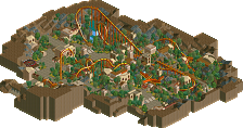
Now, I dont want you to take this the wrong way at all, and based on the description of the park this might be quite accurate. I really think the issue with the park is that it all feels like its trying to replicate something rather than just being its own thing. It kind of comes off as a new builder trying to replicate the old school "NE Style" without truly understanding it. This is mostly why I would refrain from voting spotlight as it doesn't really stand up on its own, you have the know the old classics in order to appreciate this. Part of this is probably just a result of trying to emulate the old style but I also think its due to a lack in it being a true unique creation.
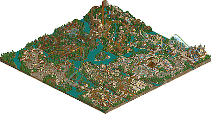
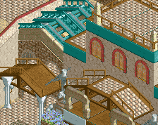
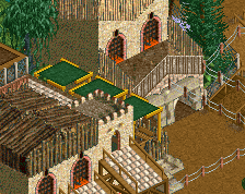
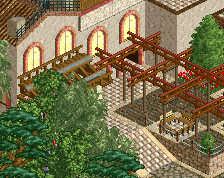
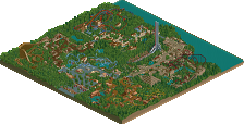
The park itself is great, but when you compare it to the parks its trying to be like (or I assume its trying to be like) it just falls short. There just seems to be some sort of atmosphere or personality missing, almost that it comes off as a calculated and manufactured park intended to be as much like the old style as possible. This is a problem with a lot of LL from newer members, it all seems like someone trying to be like the old "masters" rather than creating their own style. This is a problem in RCT2 as well, however LL is much more limited and therefor much more difficult to make unique and different. RCT2 also lacks the huge number of old classic parks that LL does, especially from the 2002-2004 era. RCT2 is a constantly evolving beast which is almost limitless due to CSO, while LL is a very small box that just about has been maxed out at this point. It almost feels like this is the safest possible interpretation of the old style as well, not a lot of risks are taken. Now I'm not trying to say its boring, but it doesn't really attempt to stretch the limits of the game even of the "style" its being built in. The station for the B&M and the Atlantis (Poseidon) are the best areas in the park, the architecture is grand and awe inspiring. However, it just gets overwhelmed by the rest (especially the stadium), its hard to tell where it begins and end it all morphs together and become one giant thing that is just to much to take it. Give something like this space to breath, move some of the buildings around it to the other side of the path or areas completely. Density is great if that's what the park is about (think about Audrix Towers or San Simeon), but in cases like this the park cant quite decide what it wants to be. Some areas are dense as fuck (the Egypt and Bazzar area) while others (the entrance even the Ironworks area to an extent) are really simple and lack any sort of micro detailing. This is an issue I think a lot of parks have currently which I'll talk about later.
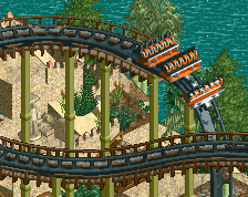
The real thing holding this back however, which is almost completely separate from anything I've talked about so far is the coaster layouts and theming or placement. In a park like this, the Coasters need to be top notch in order for it to be considered Spotlight, this was especially the case with old LL spotlights, Coasters where the focus (or at least a themed tracked ride) of most themed areas. Two things really hurt the coasters outside of theming/placement which I will talk about later, that being layouts and coaster types. Now exactly pinpointing what is considered a good or even great layout in a park like this is very difficult, but two things are prevalent in older spotlights. That being opportunity for interaction and unique coaster types. The opportunity for interaction is really important for the top or "E-ticket" attractions in a park. Being able to see them from the midway or their silhouette in the distance is important, a major attraction should captivate and draw guests to it. In this park, the only coaster that really does this is Trident and maybe Horus, while the other 6 just seem to fall a little short. Now I understand not every coaster needs to be great, but in a park that isn't really trying to be realistic in a approach I'd like to see coasters that have more personality or are a little better executed. Contraption and Factory line are almost completely unseeable from the midway or really any place in the park, Contraption slightly less so but its still isolated with the lake on each side of it. A with the coaster as the centerpiece would have been much more pleasing and probably worked a little better at giving the area a memorable image and identity. Guardian is similar to Contraption in that it does have some moments, but the whole coaster is pushed up against the edge of the map and away from the midway. That whole side of the coaster also lacks any theming, forest isn't really all that interesting and again doesn't really do anything for the park or coaster. The log flume also suffered from being really cramped and being basically hidden in the terrain and theming, the station also felt completely out of place against all the stone architecture. Caballero is probably the weakest coaster in that it has no theme, theming or any identity. It could of have been really cool with terrain and a interesting theme as it has great interaction, but its just super boring as a whole. Also, as a personal preference, there is just way to much diagonal in this park, the Wooden coaster is almost completely diagonal while the Dive machine has the diagonal lift. Kind of seems out of place in an old school style park like this and make for award viewing angles 50% of the time in my opinion. In a more modern style park or an RCT2 park this isn't as big of an issue as the macro nature of RCT2 allows for more "grid-breaking" than LL does, at least to the extend you tried here.
Now back to my earlier point about density, which is really an issue with planning as a whole. Parks now just seem to evolve so much more during their construction than parks did in the past. This can be attributed to three things, the first two being bad planning (lack in a singular vision when the project began, modern example of a park that had a singular vision:Thorpe Park or SFC), or simply the lack in experience in creating full scale parks. Now these things can be fixed by massive re-works of the park (which is why modern parks like Starpointe or even Lake Cronus feel very well spaced and planned), but I can't blame you for not wanting to do this. It just seems like you learned so much while making this and you really improved, but didn't go back and improve the older areas (I'd assume the entrance and Ironworks areas). If those areas would have been as good as the others, its possible you could have sneaked out a Spotlight here, it definitely wouldn't of hurt your chances.
So basically, better planning, better coasters, more memorable themes and areas, or a more unique style would of made the difference in the park, maybe just an improvement in one area could have made the difference.
Sorry to bring this park back up if you dont want to think about it anymore, or if I just come off as thinking to hard about it. Its a real shame though that you aren't building LL anymore, this park was really close, one more try could be all you need if you really work at it. Although I do like your RCT2 stuff because it feels more honest and real than this, where you're tying to emulate a certain style.
Anyways, hope this explains my views a little better than the video, being one of my first video reviews is probably not as organized or easy to follow as my newer ones.
Sorry to bump this, but on the other hand... Not sorry at all.
https://www.youtube.com/watch?v=242NmC753RI
Was nice to look at this park again, through your eyes. In the first few minutes I thought "Yes, Gold is the right accolade for this." Then the video got to the desert, and I was like, "this is as good as any spotlight". The classical area was 50/50... Jungle area? Fantastic. To make a long story short: it seems like this park is joining the tier of eternally conflicting borderline spotlight parks, joining Brighton Glen.
edit: I swear that I wrote a lengthy review before, but I can't find it.
Hey g force. All your points and criticisms are incredibly valid. Thanks for writing such a detailed and intelligent review. The thing is all of your criticsms are not really what I play the game for; I don't know shit about coasters, I don't really wanna plan (I just wanna build you know?) and I don't really have the creativity and inspiration in general to come up with new themes. It's difficult cause these are what makes a LL park a spotlight nowadays but these are things I don't really care for. It's all to do with timing really, if this was released over a decade ago this (probably) would've won but expectations have changed...
I'm sorry if I sound whiny, it's that even with criticsm I don't think I'll ever produce a LL park of this calibre again. I have zero inspiration and motivation to produce LL like this anymore.
Well said! I can copy and paste this on most of my criticism too Poke!