Park / Fabritius Delta

24 Comments

  • Cocoa%s's Photo
    Single, double, triple, home run

    For the celebration i shoot my gun

    Grats on 3 big LL golds, now give us a spotlight :)
  • Liampie%s's Photo
    Thanks for all the comments, everyone. Especially Poke and ][ntamin for their wonderful reviews. I think this park should've been a silver, but I can't say I don't like that it got gold. Third full scale LL gold! :D


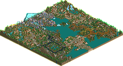
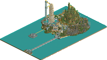
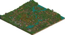
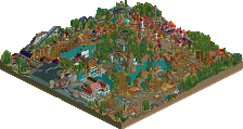
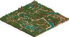
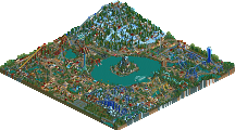
    Full aerial map is now available! Check it out, Faas and others!

    With the exception of the Mexico area (great fatha work) and maybe the industrial area, it all was very Liampie, which is great because I'm a big fan of your LL.

    Funny that you say that, because I'd say the industrial area and Japan are the most me. What inspirations did you see in the industrial area?
     

    Rougpelt
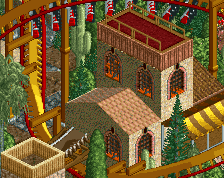
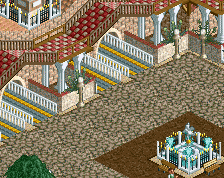
    I still liked this area although compared to the other areas of the park, it definitely felt a bit weaker. it was definitely an interesting 'fantasy' theme with the use of the roman temples. I just think that some colour unity could have come a long away, like not having every window a different colour.

    The wacky colour scheme is what saved the area. Without it, the area lacked any ideas and direction at all. It was the push csw and I needed, at least that's how I feel about it. Though csw is mostly responsible for the foliage I think, I think it paralleled the wacky colours in the archy well.
     

    Mexico
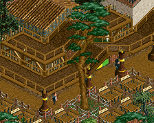
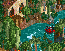
    The truck ride was so cute and it was great to see the car ride used twice in this park, you don't see it used all to much.

    Haha, I didn't even realise that until you pointed it out! Probably because the car ride in Japan was actually a helicopter ride almost until the end.
     

    A thing I disliked about this area was the pathing that went over the little lake. What was that? I just thought it didn't look good.

    Adding single wide adventure paths is a weird habit of mine. Sometimes it works well (see the autumnal area in EE), but I should've left out this one, definitely. :P
     

    Overall, a fantastic park that should win gold in my opinion. My advice for next time would be to build bigger. Maybe it's just the way I build but coaster stations are a great way to build really big structures to give your work that wow factor.


    I will try! Though I won't build as big as you do. Your stations are beautiful, but ridiculous too. :P
  • Liampie%s's Photo

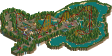
    Not sure I really follow the story of the area. The feel is dark and a little grungy, but not outright dystopian - except for maybe the green goo puddles? (aside - it has been forever since I've seen somebody use them and they look great) Is the Union good or bad, and what about a labor union merits a rollercoaster? That's like naming a ride "Ballpoint Pen." Even something like "Union Uprising" or "Union Dues" would have told a better story.

    There's not really a story to the area, or any of the areas in the park actually. Like posix says, the park has little heart, he's right about that. What you are looking at here is not a dystopia or a pure industrial theme, it has some urban and social vibes. The apartment buildings around Union are no coincidence. If there would be a story to the ride, it's about the people coming together to cope with the forces of the dawning industrial age.

    The back half of the invert meanders in a way that's appealingly non-standard - takes me back to when we weren't afraid to build layouts that B&M hadn't already built.

    Shout-out to Richie!

    The jagged rocks and treespam only feel outdated when they're the dominant feature on the screen; this is one area where I think dialing things back and leaving some bare earth like you did in Babylon for EE would have been a better route to take.

    That is definitely something I will have to work on. Open, barren areas are not easy to do in LL. I'll probably look at the Ottoman area in Kronekraft's a lot for my next attempt. (not that this was an attempt)

    I don't really get it, even after looking into what I assume is the reference.

    There's not much to get... I played Total Annihilation a bit over the summer and it helped me with the naming. That game has a red planet with weird foliage called Rougpelt. This is a red planet with weird foliage. Okay, nice! The only good thing that came from that inspiration source is the name for the bumper cars. Total Annihilation. I like that.

    The alien trees/cherry trees is a great trick.

    Shout-out to csw!

    On that note, though - Something that's missing from Fabritius Delta that doesn't follow the old-school pattern is a kind of concept-first building style that lead to parkmakers trying to tell stories through their banners, shops, and ride names. Stuff like the Aviator/Ozone parks that are desperately trying to get you to follow their biblical narratives, or even Atomkraftwerk or Slime Meridian. There's such a wealth of imagination behind all the aspects of the park that they have to name everything so you can try to catch up with how rich the picture they have in their head is. In a lot of places the Delta feels like it has the kind of cursory "well, I guess there ought to be a restaurant here" feeling with no heart behind it. Fatha and nate are just as guilty of creating an empty-feeling park when they were just following their patterns and filling out an area, but at their best everything has a little piece of story behind it to help suck you in. I think that's a major part of why Disney parks did so well for years of classic LL work. Everybody expects a Disney property to have life and story baked into even the trash bins, so parkmakers are much more likely to give every building some personality. It isn't just a Disney thing though - its clear Nate had almost every single structure in Ouest pegged to a particular place or story or purpose, and that's what led to the ridiculous density and detail there. Maybe that's the difference between just copying a Rembrandt and being the pupil who takes on their own vision? I can't help but think you're aware of this angle I'm taking, considering the same is true in your own works. The stuff you really put some creative energy behind - Tenochtitlan, Leijang, Thoughts, hell even the Inspiration Well - all show a stronger sense of artistic vision that drives them to grab the viewer instead of just sit there looking pretty.


    First of all, I enjoy your analysis a lot. The part I quoted and the part I cut. I think you're hitting the nail on the head, and it's definitely something I will have to think about. Sometimes I'm just too caught up in creating a nice macro picture. I love large panoramas showing entire cities and landscapes and stuff. In trying to recreate that, I often don't give myself the time to create the story. I just want to see the end result, but as a consequence the end result suffers. I lack patience. I'm the McDonald's and Burger King of NE. Fastfood parks. Attractive and very tasty, but in the end unmemorable and cheap.
  • alex%s's Photo

    Well done Liam!

    I will add the aerial after the accolade score, as an experiment. The map is ready. :p


    what were the findings of your experiment?
  • Liampie%s's Photo
    A failure. :p