Park / Northology
-
 10-September 15
- Views 3,944
- Downloads 856
- Fans 2
- Comments 15
-
 51.25%(required: 50%)
 Bronze

tyandor 70% 5dave 65% posix 60% Cocoa 50% Liampie 50% Louis! 50% Ling 45% Pacificoaster 45% Stoksy 45% FredD 40% 51.25% -
 Description
Please not: Northology is meant to be a theme section, and not a stand alone Park.
-
2 fans
 Fans of this park
-
 Full-Size Map
-
 Download Park
856
-
 Objects
1
-
 Tags
Tags
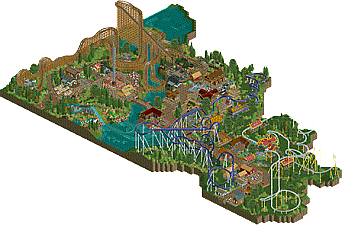
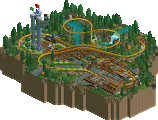
![park_2390 [H2H6] R2 - The Replacements - Tivoli Gardens](https://www.nedesigns.com/uploads/parks/2390/aerialt2133.png)
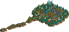
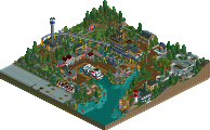
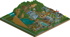
this park is... interesting.
on the one hand, there is some quality stuff here. some good instances of architecture, nice layouts, some nice details here and there (even if much of it feels ripped off of Park Edda).
but the park itself doesn't make much sense to me. its sort of a long strip without a real entrance or context- you've cut the border off waaay too close to the rides so it feels very small and enclosed (look at the blacktiling around the coasters- in many places its needlessly only one or two tiles away- don't cut out sections, fill it with stuff!) . If something doesn't have path, then its just plain grass. It just feels not-quite-finished and rushed, like you were going to build a larger park and then was like 'nah, fuck it'.
for me, the good stuff doesn't quite make up for the lack of refinement/finishedness/sensible layout. I'd give it a bronze, probably. I definitely feel also that the woodie and its area was by far the best park, you could repackage that into a standalone ride and (with a bit of time and care) turn that into a quality design.
It does feel like you took 3 layouts and tried a design with each of them, with the same theme, and weren't worried about the actual setting hah. It gets better the further left you go (from the overview's perspective)
I also think as a whole your layouts are a bit awkward, a future endeavor of yours might benefit from putting more time behind having a more solid coaster design.
The woodie is definitely the highlight of the park. The buildings all seemed very samey, despite a few good touches, like the entrance hut roofs and the columns on the building housing Riders of Rohan. On the whole though, the layouts are a little sloppy and seem poorly thought-out. The part where Loki cuts through its own station looks very much to be an afterthought rather than a design goal, and it looks very awkward. Baldur's Blade's ending is very repetitive while simultaneously not being long enough, somehow. Its transfer track is also not long enough to hold its own trains, but this is really more of a nitpick. The park is overall too brightly colored. Being colorful is one thing, but here it's not done in a way that makes the park feel lively or atmospheric, it's just loud.
The foliage around the perimeter of the park is okay, but you need more in the middle. A darker palette would have worked well in your favor, too. Loki and Baldur's Blade have "just enough" in terms of details, the catwalks are there and they're supported, but they're over-supported in places and under-supported in others, and the colors are boring. Also don't color the flanges differently from the main tubes - this is another nitpick, but it's something a lot of people seem to cling to.
I'll return to Wrath of Fafnir to end this review on a high note. It could really do with some love in the custom support department, but the roundabout side path that hugs the mid-section of the layout actually works quite well and the layout as a whole is well-done without feeling quite like anything else I've seen. You've made very good use of rapid airtime hills, as well as hugging previous track in a way that doesn't feel boring. A water feature in the lake near the final helix could have been cool to see. Maybe have it interact with the splashdown in some way. Overall a lot of areas feel sparse, but this design was definitely a high point.
I think this park will probably end up just around 50~55%, depending on how much people value the layouts over the total composition, but I have to give this a 45. Focus on something smaller-scale, hone the details, and give your creations some meaningful surroundings.
EDIT: I almost forgot, Loki was glitched out when I opened the game. Had to be closed and re-opened to load peeps. Check your file, and if you don't see that just ignore this. If you do, be sure to check your files in the future for stuff like this (it can affect flat rides too, particularly when using a lot of ZC).
I'm with Ling on this, there were some decent ideas but nothing was really fleshed out as much as I would have hoped. The initial entrance area (despite those monster truck track roofs being one unit too high) was interesting, cozy, and a relatively good start. Had some interesting archy, was well-defined with the coaster layout but none of the rest of the park really complimented or followed any of the strengths of that area.
The purple coaster and the launched coaster just had very little context I felt. Some archy along the main street and then spread out grass and foliage. You can maybe get away with it in a full-scale park but even then it's not particularly pleasant to look at because you're relying so much on having an interesting layout. I felt the purple coaster had some awkward transitions and the launched coaster was quite unnecessary.
The archy, while relatively simplistic served its purpose well. The biggest problem was park layout though, it was a plaza followed by a mainstreet; not quite a sectioned-off park like a design nor having enough content for a park. Unfortunately, this was stuck in an awkward place where it was too difficult to understand what it was trying to be. Some better planning and a more defined "this is a park" or "this is a design" will help you in future.
45%
Really?... I'm no panelist, but it's not even bronze worthy?!?!?!??! That's insane!... what kind of crazy high standard are you setting here guys?!?!?!?
+ the woodie layout looks spectacular, those parallel turns in the middle are fantastic. Just a shame that the second half of the ride is so slow.
+ Architecture and landscaping weren't half bad! Meduseld was well done I think.
+ The woodie's station
- Almost everything you did is a ripoff from Robbie or Dimi.
- I thought the Nordic theme overall was done poorly. It looked like you scraped together everything that is loosely related to vikings: Nordic mythology, Marvel shit, Lord of the Rings... And still you managed to insert some generic naming like the ship or the slide (Meduslide!?) Apart from the woodie station, the mine and Meduseld, all the theming was very generic for the theme and it told no stories.
- Park looked unfinished/rushed in places, most notable the path under the parallel woodie turns.
Overall a fun park with some fun content that show some skill, but conceptually it's poor. 50%!
Kind of borderline for me, but then felt you actually put in a certain effort.
It's not bad, but super sterile. Everything is too neat, too clean, too perfect. "Organic" is what you want to approach more.
Whoa! Fred lowballing a vote... quite unusual! Glad to see you received an accolade for this, judging from some comments I wasn't sure if it was going to happen. Congrats!
i would have voted 35-40 myself, but it's still glad to see another bronze
I thought this was good. Just don't understand the use of the steel roofs for a Nordic theme. I would have gave it 55%.
Second I'll shortly review my own park by answering some of the comments. Not that I'm too disappointed, I thought people would like/ appreciate this more. Of course there were some buildings - 2 to be correct, also one of them was built 3 times -, which were intentional 'rip offs' from Edda and you are right to point this out, though I wonder what big a deal the whole copying thing seams to be. Honestly, the other buildings weren't intentionally ripped off but rather influenced during building.
What I liked most when building this was - likewise to the community - the Area around 'wrath of Fafnir". This was also the part I spent most of the time on, which pretty much paid of on the one Hand, but also fired back on the other Hand, because the two other coasters didn't get as much time and intention from me, though I pretty much like the first section of 'Baldurs Blade', the second Second after the MCBR was kind of tough to built. I wanted this coaster to interact as much as possible with the Area(s) around it as possible. Maybe that's why I didn't think for an area for the coaster itself. That, I got to admit leaded to a major lack of concept.
The launched coaster - my bad to not check its functionality before submitting this - was also a consequence of 'not knowing what to do' and 'I never built a launched coaster, so why not". So most of the comments are true about a lack of Concept concerning 'Loki' as well.
@Liam: I actually never though of Dimis ProTour entry while building it, and I think that archy-wise this cannot be considerd a rip off. The choice of colore was influenced by an other screen I just can recall at the moment, though I think that Color Choice can't be seen as a rip off, because of the limited color range in RCT...
What I didn't stressed out early enough, was that this was rather meant to be a Section of a bigger Park, and Austin and Cocoa are right, I wanted this to be a large 'chronicle Park' from "Vikings to the Discovery of America over the Wild West into the 20th Mafia Era" but due to lack of motivation I cancelled this huge plan and ended up with that... Maybe I should get back to this plan, but I'm not sure by know.
So, most of the critics were right and fair enough, yet I still am a little disappoint that this ended up almost the lowest bronze possible, because I like most of the archy and would have considerd it 'silverish' and I thought that the second tier attractions where built and placed pretty well and where also believable.
Anyways, thank you all for your comments, I'm still glad enough for merely winning my first accolade and I wish you guys a nice weekend.
Be good and 'Auf Wiedersehn'
^ csw & I both got 50.00% right on the nose, so not the lowest ever (that's a record we can proudly bear!)... mine was on a park that I personally felt was higher than my first bronze accolade but it scored lower, so that's how it goes bro! You did great, you showed tons of potential, the community recognizes your skills! Looking forward to your next release. Congrats!