- Views 3,924
- Downloads 684
- Fans 3
- Comments 7
-
 73.75%(required: 65%)
 Design

5dave 85% posix 85% chorkiel 75% Cocoa 75% disneylandian192 75% Liampie 75% csw 70% ][ntamin22 70% Ling 65% Louis! 65% 73.75% -
3 fans
 Fans of this park
-
 Full-Size Map
-
 Download Park
684
-
 Tags
Tags
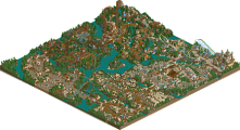
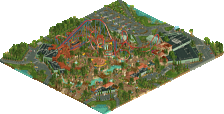
![park_3376 [H2H7 R5] Area 52](https://www.nedesigns.com/uploads/parks/3376/aerialt3839.png)
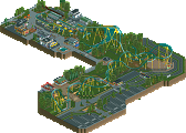
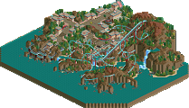
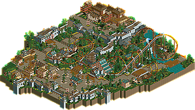
Nice design here, your work continues to improve. You're beginning to hone your architecture skills and it shows. Keep it up.
All in all, well done. Voted 70%, but it was very close to 75%. Could've gone either way, really. Can't wait for your park.
edit: Voted 75% anyway... In the end 70% felt just a little too low. Couldn't do it.
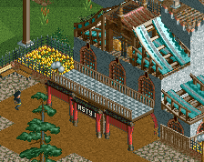
this design is fantastic. the layout is really fun and unique, landscaping/foliage is solid throughout. I didn't think the theme was so vaguely asian- it felt a lot like the medieval walled city stuff in Kyoto. There was some refreshing asian architecture (like the group of smaller buildings in the corner with yellow walls) and some really well-pulled off grand-buildings- I especially like the giant one at the back. I think it worked really well as a section of a concentric walled city. two thumbs up from me.
Gonna echo posix a lot here. The surroundings were very pleasant and enjoyable to look at. The palace in the back was particularly exquisite. The layout feels a bit cookie-cutter somehow and I would have liked to see something more than just the generic Asian theme tropes for set pieces.
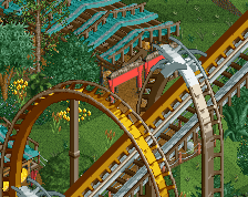
Congrats on the accolade, definitely well deserved. Personally I didn't enjoy this quite as much as the AP voters, but that doesn't mean I didn't like it. The layout was really the only thing that didn't impress me, it felt uninspired and didn't seem to fit well into the surroundings during the first half. Personally I would have liked to see more time spend on the supports and details on the ride to really make it stand out, the default supports just look ugly in my opinion.
I'd rate this at about a 70%, definitely could of broken 80 if the layout was slightly better and more time was spend on the supports and details around the ride. Definitely looking forward to your full sized park.
This was brilliant, lovely architecture and the coaster had great pacing and flow. The ride had a unique but believable layout which is tough to pull off with a B&M.