Park / Dress Whites - Rozycoon
-
 08-September 16
- Views 1,334
- Downloads 381
- Fans 0
- Comments 3
-
 No fans of this park
-
 Download Park
381
-
 Objects
1
-
 Tags
Tags
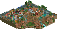
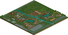
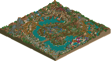
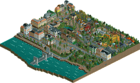
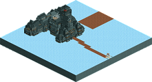
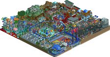
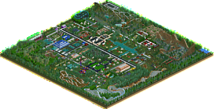
Admittedly some of the objects you use are pretty terrible (not that I'm one to talk) but nevertheless this was a very fun park to explore. The wooden layouts were fun to watch and you seem to have a unique style.
One critique I'd have would be that the entire park seemed too 'clean,' especially the same foliage in specific areas, if that makes sense. Try building something dense and chaotic, that'd be really cool.
rozycoon Offline
Thank you Jaguar I appreciate your feedback. I guess I am set in my ways with rct. I get confused when things are too close on the map is the reason I make parks the way I do. I prefer things symmetrical and neat. I realize my parks are different. i have been playing since 2005 and have not had a mentor or someone to help me learn how to make parks. I looks at other parks all the time and wish so bad I could be like everyone else but how to do that eludes me. So..i have done the best i could on my own.
The objects you use are a bit distracting, lots of super saturated colors and ugly textures. Perhaps try and old Pro-Tour bench or maybe NCSO, that might be a good start.
Even try and implement diagonals and curves into the path layout, everything being on a grid can work, but its definitely harder to make it appealing than a path with curves and bends.