- Views 2,537
- Downloads 604
- Fans 1
- Comments 11
-
 56.25%(required: 65%)
 Design Submission

csw 60% Fisch 60% RCT2day 60% Xeccah 60% 5dave 55% FredD 55% inthemanual 55% Liampie 55% Faas 50% Poke 45% 56.25% -
 Description
Welcome to Valhalla! Thor wants to thank Jonny93 for fixing some nasty blackholes in his favorite drinking hall!
-
1 fan
 Fans of this park
-
 Download Park
604
-
 Objects
175
-
 Tags
Tags
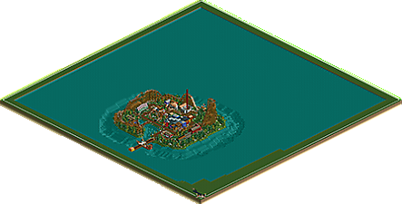
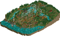

![park_2859 [PT4 R7] Medieval Climate Optimum](https://www.nedesigns.com/uploads/parks/2859/aerialt2509.png)
VALHALLA
DELIVERANCE
WHY'VE YOU EVER FORGOTTEN ME
ok
I have to say, this is a real sleeper hit.
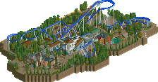
I like NCSO, but by it's very nature it usually comes out looking like a slight clusterfuck but this is actually really beautiful. It's a throwback style (ignoring the fact that it has an RMC), but it doesn't feel dated.
I love the station and transfer area, I love the lift... the foliage is subtle but really nice, the layout flows well and is a ton of fun, the lift and drop are visually excellent, I don't have anything bad to say about this.
I kind of get the feeling that I'm overrating this but I really don't care, 75% and I hope it gets design. We need less of the busy bullshit (see Whispering Pines lol) and more NCSO that looks like this. I like the little details like the viewing platform near the pretzel and I love how everything around the coaster helps make the coaster look more imposing, but not overpowering and the colors blend really well throughout. From every angle this coaster is seriously stunning.
Anyway, I don't know what got into me. Based on the other votes this might not even be design worthy but whatever... I love it, and it kind of makes me want to go and build something in this exact style because it looks incredibly fun.
Awesome work.
Also, it wouldnt hurt to play with CSO a little. Perhaps it would give your some more perceptive on objects and help your develop your skills further.
BigB Offline
Having a custom soundtrack like this one, the overall atmosphere should have been a bit more epic and nordic, partly Wodan is a good example for that.
Nevertheless, the layout of the coaster is definitely design worthy IMO. I really loved the Zero-G turn and its interaction.
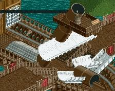
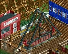
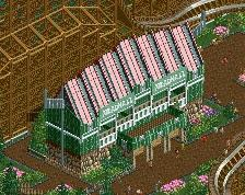
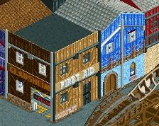
As pointed out above, the whole island lacks an epic/nordic/mystical feeling to me. The only building looking really nordic is the meadhall. The station, which is beautiful itself with the transfer tracks and stuff, looks more like a classical Scandinavian building to me, as well as the facades in the middle of the island. Maybe those would not have been bad in a real park, but where is the context to the story of Valhalla? Also, what is the castle supposed to be? Is it the gods palace Valaskjaf, since you placed Hlidskialf there? If so, again it lacks epicness. Furthermore I don't get the meaning of the pirate ship in the back of it, if you just wanted one more ship, a self-constructed would have been more beautiful
Still I would rate this a 65%, because the coaster (as well as the soundtrack) is great. The theming was not bad, but it lacked context to me.
B'B
Some turns could be smoother but the layout was really great to watch overall. I'd argue that the geometrical shape of the coaster which it gets from wraping itself around a square area is a bit awkward. But oh well, certainly a fun layout, good pacing too! The architecture was indeed not overly nordic but it's probably tough to do without cso so that's also alright. What I find sad is that you didn't play around with the landscaping much more. You could have added rocky landscaping under some of the airtime hills or played around with some bigger tunnels. Overall a good coaster though, but I find it very difficult to judge ncso nowadays. Definitely looks like you had fun while building too which is great!
I liked the coaster layout except for how forced the pretzel element was. Post-MCBR layout was a lot weaker than the previous half, but still passable. You've started to grasp how to properly theme as well. Mead hall, pirate ship, and station were all great and gave the nordic vibe. Others were plagued by 2x2/2x3 structures, cheap facades, and no cohesion or bonding element and sadly that was most of the architecture on the map. This could have been a little more spaced out and more organically laid (as far as pathing goes) and would have helped as well. You're showing skill now, but you still need to learn to compose a bit better than here to make this design-worthy.
First of all I want to thank Gee for approving and releasing my submission!
@Pizzawurscht: I´m still trying to figure out what exactly your message is, but I just dont get it. Is my submission "okay" in terms of "neither good nur bad"? Please help me out there :/
@Coasterbill: Thank you so much! I´m really glad you enjoyed it.
@G Force: Well, I wanted to have a second train, too but in the end decided against it. Why? I know I´m the only one around here caring about a working BBS on every coaster. This coaster is obviously merged so there is only one way to get the "continious block section mode" working on this coaster. Although I understand the basics of this specific hack (5Dave made a tutorial somewhere) and I used a couple of times in LBaTP but there is one crucial part of the hack that is just not working. That means no working BBS wich leads us to this conclusion: If MCI is not able to get a BBS going, there wont be a second/third train.
Does that explain anything or is it just confusing? :/
@BigB: I understand your point and agree on the facades in the middle. The station looks fine for me though. Actually I dont know what I wanted to archieve with the pirate ship, but I guess I had an idea at some point
@Fisch: Glad ypu liked most of it! I thought about adding some rocky landscaping myself, but since my rocky landscaping mostly leads to a gumdrop-invasion I did not do it. Version1 would have killed me if I´d have used more gumdrops in this You´re right about me having fun building this. I really enjoyed this project and it was a nice diversion from LBaTP. Those huge parks can get kinda boring if I´m not haveing something else to build on one in a while.
@Shogo: Glad you liked the same buildings I´m "proud" of myself and basicly agree on the rest you´ve said about everything going on in the "infield". I´m still waiting for the pm you promised me in my stream yesterday
Didn't really like the layout. Seemed like you were trying for RMC, but didn't really get it. It misses a lot of the biggest RMC motifs, like overbanks, and fairly compact layouts.
The structures were ok. Nothing spectacular that jumped out as amazing, but it showed some obvious growth from where you were at the beginning of this.
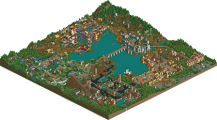
The overall area seemed weird. If it were meant to be a park, it needed context, if it were meant to be fantasy, it needed context, some magical floating rainbow bridge, or something that leads more into the nordic story. 55%
I liked the roller coaster. It looked very cool. Also a good thing that you based your submission on music (although I'm not a big metal fan).
I didn't like the foliage and rockwork. It didn't fit the rest of the submission. I didn't like most of the architecture as well. It made no sense to me in most parts.
You could also have left some room for some patches of land around the coaster, now it felt too boxed in.
50%
So I was the high vote on this one, hmm. I think in order for you to breakthrough you'll have to change up your style a bit. Make something more fresh and exciting. You've got an eye for color and landscapes, just try to put them together in a more unique way.