Park / Roman Epic
-
 17-December 04
- Views 16,760
- Downloads 957
- Fans 0
- Comments 28
-
-
 68.75%(required: none)
 Silver

5dave 70% alex 70% CoasterCreator9 70% Cocoa 70% G Force 70% Jaguar 70% Sulakke 70% ][ntamin22 70% Liampie 60% Dimi 55% 68.75% -
 No fans of this park
-
 Download Park
957
-
 Objects
335
-
 Tags
Tags
![park_3607 [NEOlympics] Abu Al Sheikh Amusement Park](https://www.nedesigns.com/uploads/parks/3607/aerialt3220.png)
Corkscrewed Offline
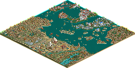
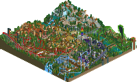
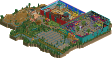
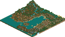
About a month later, we have three very fine Runners Up for NE. ride6 finally puts some mustard behind the talk with a fantastic International Waters, while AustinPowers comes in with a really nice park in Roman Epic. And finally, we get to see a bit of JKay, a man who's been absolutely on fire recently, with Universal Hawaii.
Congratulations to the Runners Up! It's fine parks like these that reaffirm NE's reputation as the place where the finest parks are showcased!
International Odyssey
Roman Epic
Universal Hawaii
Universal Hawaii !
I like this a lot..
because themeing and color.... perfect and sweet..
Coaster station is Original Archtectures..
and Others... very nice.. each other have UNIQUE THINGS..
inVersed Offline
International Odyssey: a great park with nice rides an archy. The only thing I didn't like was the foliage was just... odd looking. still a great park.
Roman Epic: A very nice park AP, i have no complaint except the fact that the Archy gets repetitive.
Univeral Hawaii: My favorite all time park!! It is an amazing park JKay, every thing was perfect. Your 1/4 work stuns me. The colors take the the park to another level. The rides were nicely placed and all. It didnt really capture the Universal feel but screw that, i have no complaints about the park. Great job!!
R.A.S.
International Odyssey was decent.
Roman Epic is by far AP's best work to date.
Universal Hawaii blew me away though...
JKay, you are the man.
Raven-SDI
§
RE --- had it too. Your review will be made soon
IO --- very cool park with tons of atmosphere, but not too much refreshing though. Most ride designs were good.
Roman Epic - I didn't like how in parts, it looked uninspired (the same roof & buildings repeated over and over again, which stuck out in areas with lots of the same thing in a long row), but it did have some really nice ideas, and generally looked like a lot of effort had been put into it.
International Oddyssey - Nice enough, but a little bit uninspiring, and "been there, done that" in places. Nice to see some new ideas, as well as the standard oldies being done in a very nice way. I was impressed by the way the Chinese section was created, but ultimately, it's been done to death. One bit I really did like was the rocket coaster at the rear of the park. I like how it wasn't a typical racing themed coaster, and had a nice layout. Really shows the possibilites for these coasters, outwith their race-car stereotype.
Universal Hawaii - My favourite of the three, although I still have mixed feelings. I *love* everything to the right of the main entrance, but parts to the left feel rushed, and crammed in. The right hand side is amazing. The colours look brilliant, the shops are lovely and detailed, and some of the smaller details around this part of the part are just great. However, the left hand side seems somewhat amateurish... I don't mean that as in they are.. I mean that they look like the old mega parks that used to pop up. The MIB area's right there, in your face, RIGHT next to a couple of big tigers, all enclosed by some Hawaiian themed water ride.. I'd have liked to have seen more seperation, and subtler changes between themes.
The Shrek area looked really nice too. At first I didn't like it, but when I read that the theme was Shrek, it all made sense.. Maybe a *little* too much green.. Although some of the architecture here was really, really good, it did all feel like flat green at times. Despite this, I still think it's easily the best of the 3..
Overall, a great round of runner-ups.. Great quality work this time
IO, one of the better full sized parks i have seen. Nice coasters, and some impressive buildings. the entrance area, looked a bit too similar to your PT park but for the rest i really liked it. Congrats on the runner up.
RE and UH were both very good, but i should still take a closer look at it. I loved the palm tree by the way in Roman Epic.
Splash
Wicksteed Offline
I only looked at IO for ten minuts so far...it looked very nice
Wick
btw: I have the same problem with the unzip
*Roman Epic was okay, the park itself was huge. I had no idea what to look at first, after about 15mins looking at it i did start getting tired seeing the same style of archy everywhere. The coaster layouts were very professional, as was the foilage. I felt this park was a little too spread out in my opinion- it all needed to be closer together and linked up. Overall, a pleasure to look at. 8/10
*Universal Hawaii was fantastic, loved every bit of it. The colours were amazing and the techno area thingy in the centre of the park has to be the best architecture i have yet to see. JKay for parkmaker!
-X-
Universal Hawaii: Very nice park. It was very fun to lok at and see all of the stuff in it and I can tell I will look at it more in the future. Magmus and the Shrek coaster were my favorites, but the mine train coaster was also very nice. Some of the ideas were just amazing, and the architecture and sculptures were very very nice. Great job on this Jkay.
International Odyssey: Probably my favorite out of the three. I loved the atmosphere throughout the park. Your buildings were all very nice, not too detailed but just perfect. The only part I didn't like was the boardwalk area. It seemed as if you just stuck it in there, and doesn't suit the park imo. Geschöpf- The Creature was my favorite ride. The way it went around the area was awesome, and I loved the lanscaping around it. Samari (Samurai?) was another very good caster, but I didn't like it as much as Geschöpf because it seemed to be lacking something. But I don't know what. This is spotlight quality in my book, so great job ride6.
all the 3 parks are great, but the roman epic caught my eye!
It was a very nice, nice park. I particularly enjoyed the Northern-ish area and the landscaping around it. I thought it had some nice features, although I wasn't crazy about pink on wood, and such. I thought the best area was Pagoda Point. To me, it had the most atmosphere of any of the areas of the park. Samurai was great, it flowed very nicely. The buildings definitely felt oriental to me, great use of the 1/4 tile tile roofing and that one layering wall. I wasn't too keen on the second lift of the Arrow coaster, the castle area all together (I thought the colors didn't work), and the fact that there were 2 rapids rides! Aside from that, I thought the WWII little nook was interesting, the Forgotten Kingdom was ok. It looked like you tried to make it look "detailed", and I thought you over "bushed" and "flowered" the area. The B&M was great, though. Also, I enjoyed a lot of your track usage as architecture especially in the Roman area, specifically on the boat. Anyways, all in all, great job. You're just a little bit away from a spotlight, just need the consistensy in detail-whether it is subtle, or like it was in Forgotten Kingdom, to make it there.