Park / Jaguar
-
 09-June 15
- Views 4,510
- Downloads 929
- Fans 4
- Comments 16
-
 73.13%(required: 65%)
 Design

FredD 80% RCT2day 80% wheres_walto 80% Cocoa 75% MCI 75% Stoksy 75% 5dave 70% Faas 65% inthemanual 65% Xeccah 65% 73.13% -
 Description
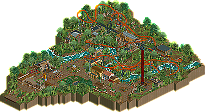
South American inspired design
-
4 fans
 Fans of this park
-
 Full-Size Map
-
 Download Park
929
-
 Objects
322
-
 Tags
Tags
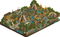
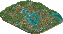
![park_3325 [H2H7 R1] Tenochtitlan](https://www.nedesigns.com/uploads/parks/3325/aerialt2925.png)
Music isn't working for me, just a bunch of very loud static. I'll try to do a full review later, but this is definitely very well done. Not quite as good as Ayers, but still very good.
This needs some attention.
Excellent design. The layout was great, though it had its flaws. What you have after the first launch is a little unorthodox and rough it seems. I think a Cheetah Hunt-esque tower would have been better. The queue and station are fantastic.
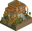
Architecture is likewise great. Clearly inspired by Teno but that's ok. Your buildings are still original. I would have liked to see more architecture though, especially in that picnic space. Seemed like a rushed move and a hugely wasted opportunity.
Foliage was excellent. The river was good but I did not like the splashing effects.
Overall, excellent design. I'm hovering around 80% for my vote.
On another note, I was hoping to see the coaster duel itself but I followed your directions and got an error trapper.
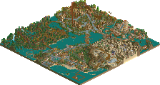
^If you're referring to inspiration by Teno as in Tenochtitlan, then this was made before H2H even started.
Agree that this should be getting more attention, it's a great design. Maybe consider posting another screen of it or bumping your old screen so this gets some more attention(?)
He cites Teno in his ReadMe as inspiration for finishing it and as the source of some borrowed ideas.
^Oh really, okay then. Disregard what I said then haha.
Aztec/Maya style is hot lately, case in point. Jimmy and Airtime also have both done recent takes on that style as well.
I really enjoyed this. the layout is fast as fuck but still really nicely put together, and I liked how the 2nd launch sort of separates it into two different sections. that would be really fun for riders I think. the atmosphere was solid, nice detailing, felt real and interesting. good details all around. the only bit that felt super like tenochtitlan was the entrance building, overall it felt like its own thing because the two maps are in different contexts- one is a fantasy/history thing, and this is a realistic park section. good work all around, I've always thought you were a solid parkmaker and you continue to show it.
only the entrance was inspired by tenochtitlan, the rest was all made 5-8months before h2h, just never got to finishing this to an extent at that time and building on raubritter gave me the boost to finish this during the raubritter build since I needed something else in front of me at a certain point in grinding that park...
thanks for the kind words...It kinda duels itself when you play with the timing, the real meeting moment is the loop and the launch...
Overall good, better than hurricane but less immersive than ayres. 70%
This could use some more replies.
It looked good and all, but I kept thinking about your last design. Launched coaster with intamin track and a launch/drop tower as supporting ride. Would have loved something more original somehow.
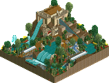
The design itself was pretty cool. I liked the layout (when I tried to put it in test mode I got an error trapper by the way). I liked the archeologists expedition and the entrance area. The seating area was also pretty cool, although I felt one in the corner of the park missed some fencing on one side, but that's nitpicking.
65% from me, I would love to see you do something a bit more crazy or 'fun' next time, but I feel that I don't have to worry about that.
well if by fun you mean something like your style that's just something I'm never going to do since I don't enjoy it myself, I agree I have drop or launched tower rides in practically every design I make since I like the vertical element and lineair contrast it gives to most rides and paths... I am kinda baffled this isn't getting any higher scores to be honest, I mean a 65, that's just barely design quality and this may be me being arrogant but I feel that this is beyond barely a design accolade worthy design. might just be me but I don't understand the votes given here anymore, I mean a great realistic themed park will often get the same score as something that is cute, but less skilled and well thought out lately... I think the great inlflux of less veteran players being on the panel has shifted the vote % in a weird way and I don't think I'm the only feeling like this lately.
The curse of during and post H2H releases, usually have very big impacts on ratings.
Personally I think this is 75-80, just slightly below Ayers. But who knows anymore, the fact that this has a lower rating than some unfinished H2H parks is beyond me, this is definitely quality work.
I love this, the queue is very atmospheric and interacts with the ride nicely, the station is great and the layout is tons of fun. I loved the little details like the trash cans in the queue lines (which seem simple but you rarely see that), the archways and the unstable looking bridges. The theme here was very well carried out.
If I had to critique anything, it would be the fact that I don't think you could fit more than 2 trains in transfer (maybe 4 but I don't quite buy that) and that having the coasters duel forces you to have 2 trains in the same block. This ride in general is a huge "fuck you" to block sections with the current state of the minimum dispatch times. lol
Still, those are minor nit picks of course... this is excellent and personally I think it deserved 75-80% (and closer to the higher end of that range).
Congratulations on the design! I really liked the coster. The Layout was fast and flowing and the surroundings were beautiful. We did a little video Review of your design, the video should start at 1:02min
https://youtu.be/UUUChrm1wAA?t=1m2s
I know it's a bit late but I appreciate the tribute park... definitely one of the best designs to ever grace this website. 10/10.